The Barre Room identity is built around a clear position: soft surroundings, controlled strength. Its direction pairs low-impact movement and physical effort with warmth, confidence and a shared studio experience.
CASE 03Brand identity / Movement studioStudio identity & application concepts
The Barre Room
Soft surroundings. Controlled strength.
A movement-studio identity that makes room for both effort and ease. An expressive wordmark, connected BR symbol and warm material palette carry one idea from the class to the objects around it: burn, strengthen, connect.
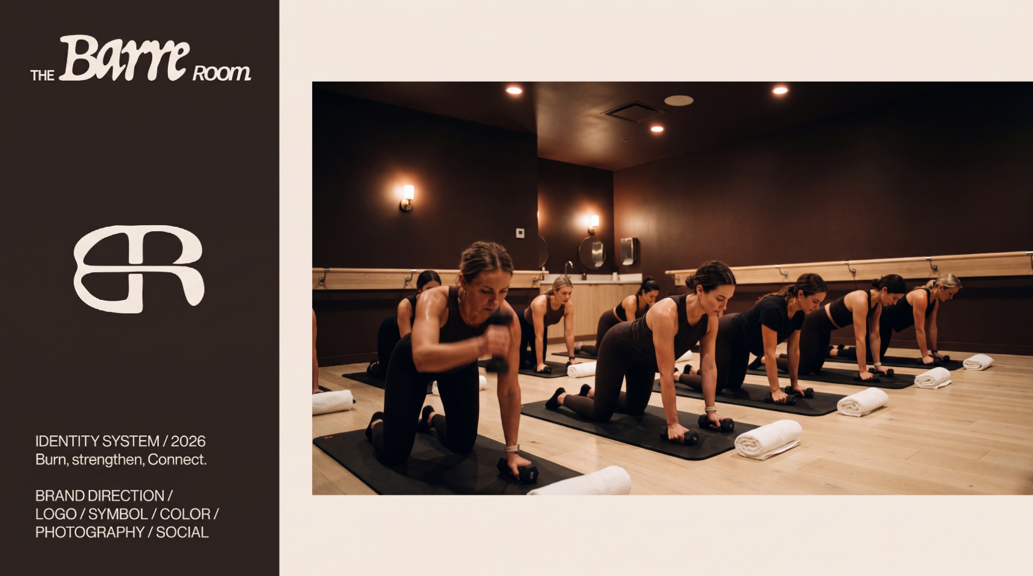
- My role
- Brand direction · Visual identity · Art direction · Applications
- Project credit
- Brand identity & art direction / Kheireddine Smaili
- Year
- 2026
Tap or click any artwork to enlarge and browse the full sequence.
The reason
for the work.
“The work is yours. The energy is shared.”
Make the intensity of the practice visible while keeping the brand welcoming. The identity needs enough presence for a studio wall and enough clarity for a class pass, a small digital icon or an embroidered towel.
An expressive wordmark and connected BR symbol provide two scales of recognition. Espresso and cream establish the warm base, with burgundy and deep green used as accents. Direct typography, movement imagery and tactile application concepts connect the identity to the rhythm of a class.
A sequence of decisions, shown through the actual work.
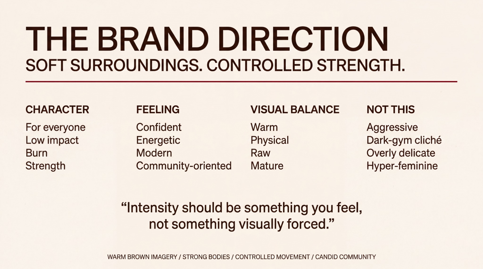
The governing idea: a warm, confident and community-oriented setting where intensity comes from the movement. This board establishes the character behind every later decision.
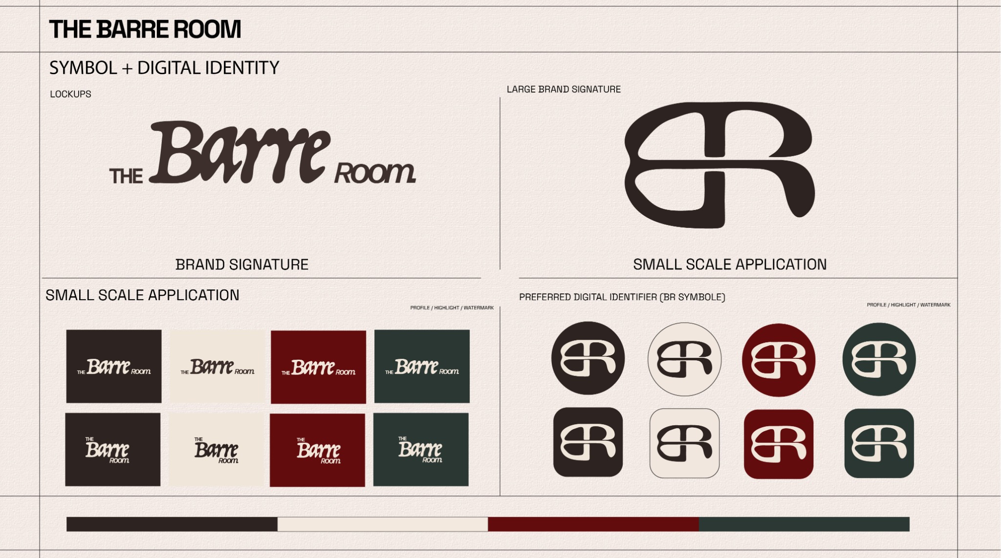
The expressive wordmark introduces the full name; the connected BR symbol carries recognition at small scales. Espresso, cream, burgundy and deep green form one adaptable family.
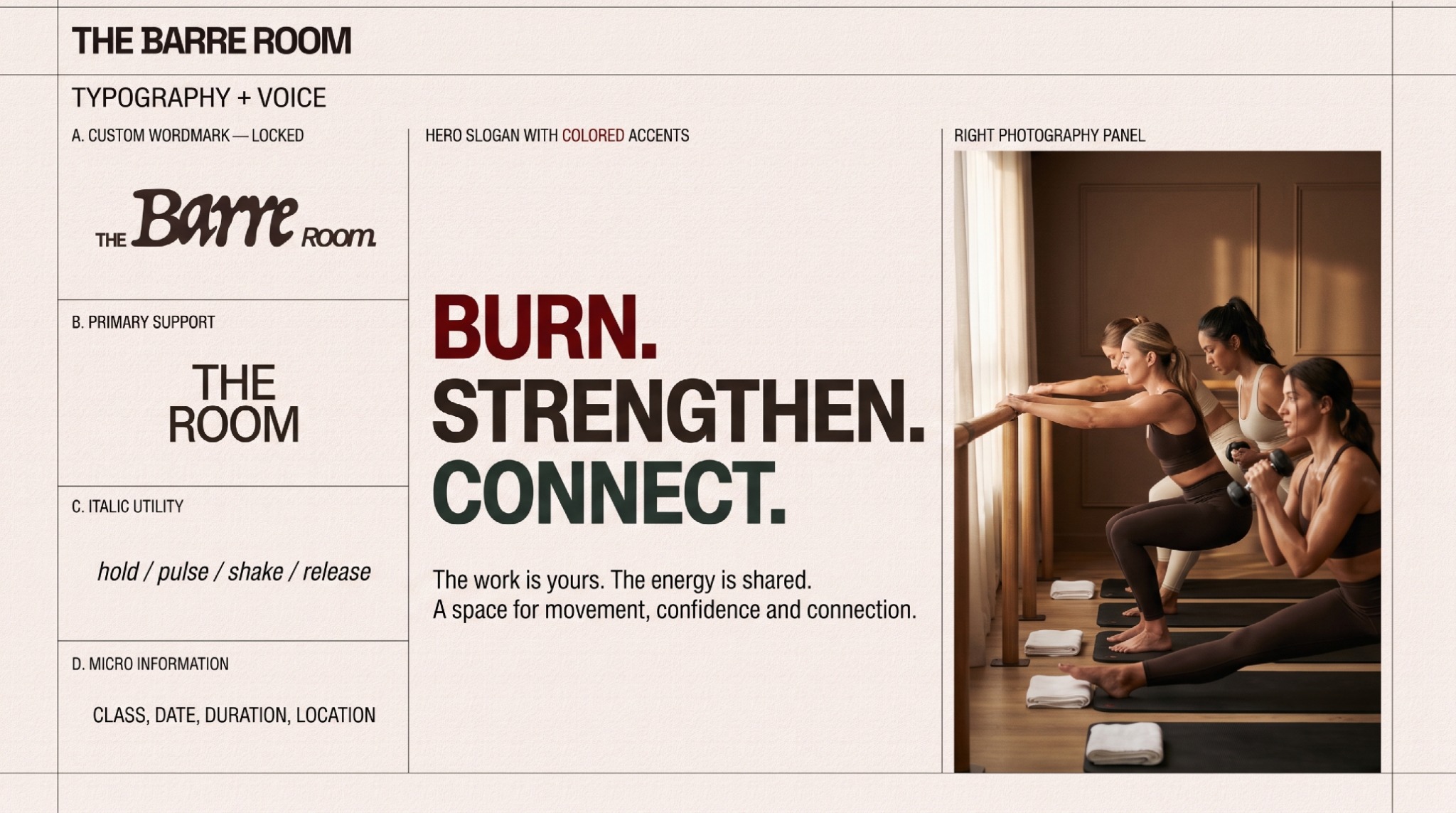
Burn. Strengthen. Connect. The voice moves from physical sensation to shared experience, pairing assertive headlines with concise class information and warm movement imagery.
What holds
it together.
A project becomes a system when each choice supports the same position—and still works when the format changes.
01POSITION
Strength with room to belong
Soft surroundings and controlled movement set the emotional register. Warm brown imagery and people practising together make the room feel approachable while the physical effort remains visible.
02SIGNATURE
Expression and recognition
The wordmark gives the name its expressive voice. The connected BR symbol condenses that identity for profile icons, embroidery, equipment and signage. Its shared horizontal stroke offers a visual echo of the barre.
03VOICE
Burn. Strengthen. Connect.
Three active words move from sensation to capacity to community. Strong headline typography carries the message; smaller utility text keeps class information practical and easy to read.
04MATERIAL
A consistent daily ritual
Cream paper and canvas, espresso textiles, timber and brushed steel give the applications a common material character. Burgundy and green punctuate the system without taking over its warm, grounded atmosphere.
The system
has to travel.
Identity is tested where people actually meet it: on a shelf, in a hand, across an image, inside a presentation or through a space.
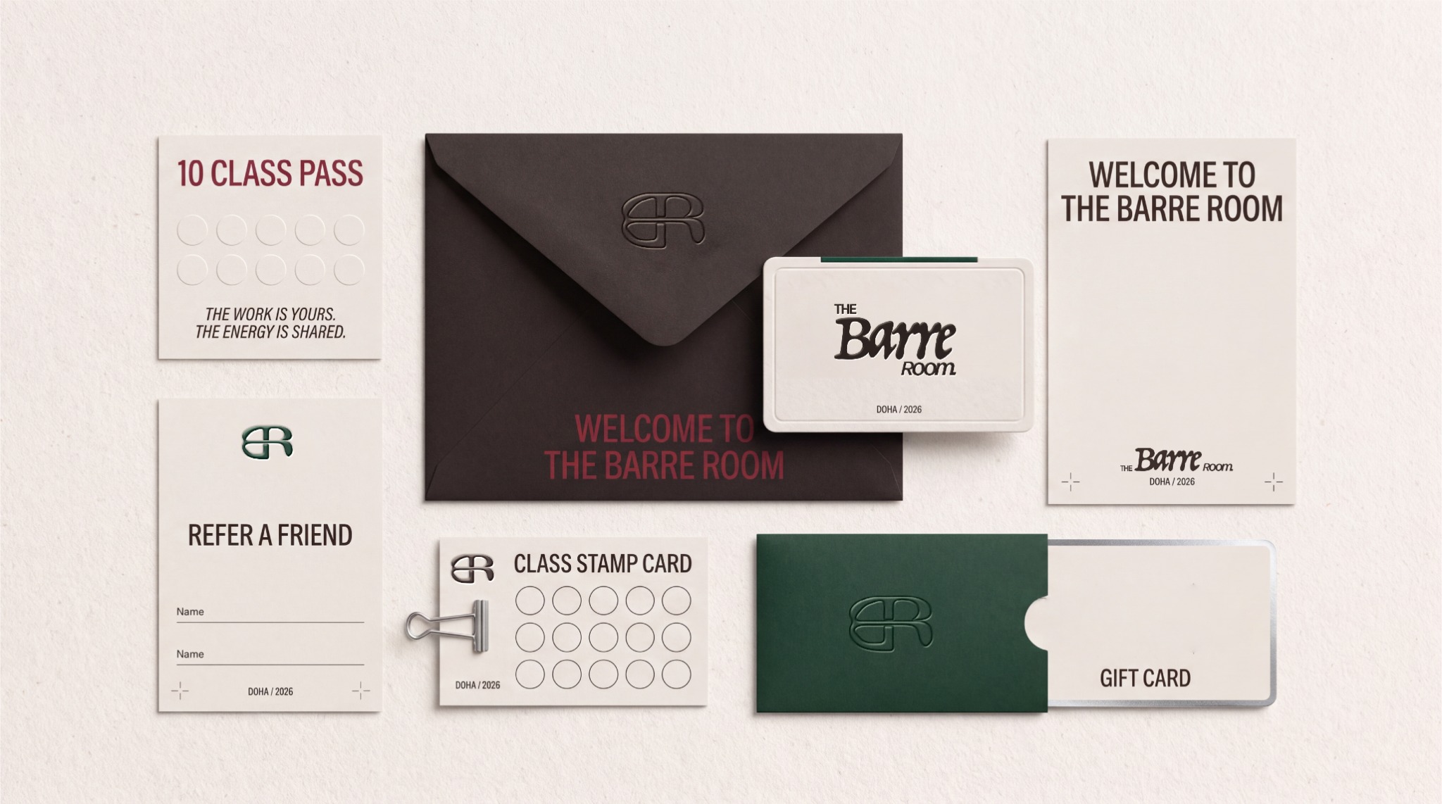
Welcome, return, bring a friend: the member collateral translates belonging into useful touchpoints. Embossed marks, restrained colour and clear information keep the printed system consistent.
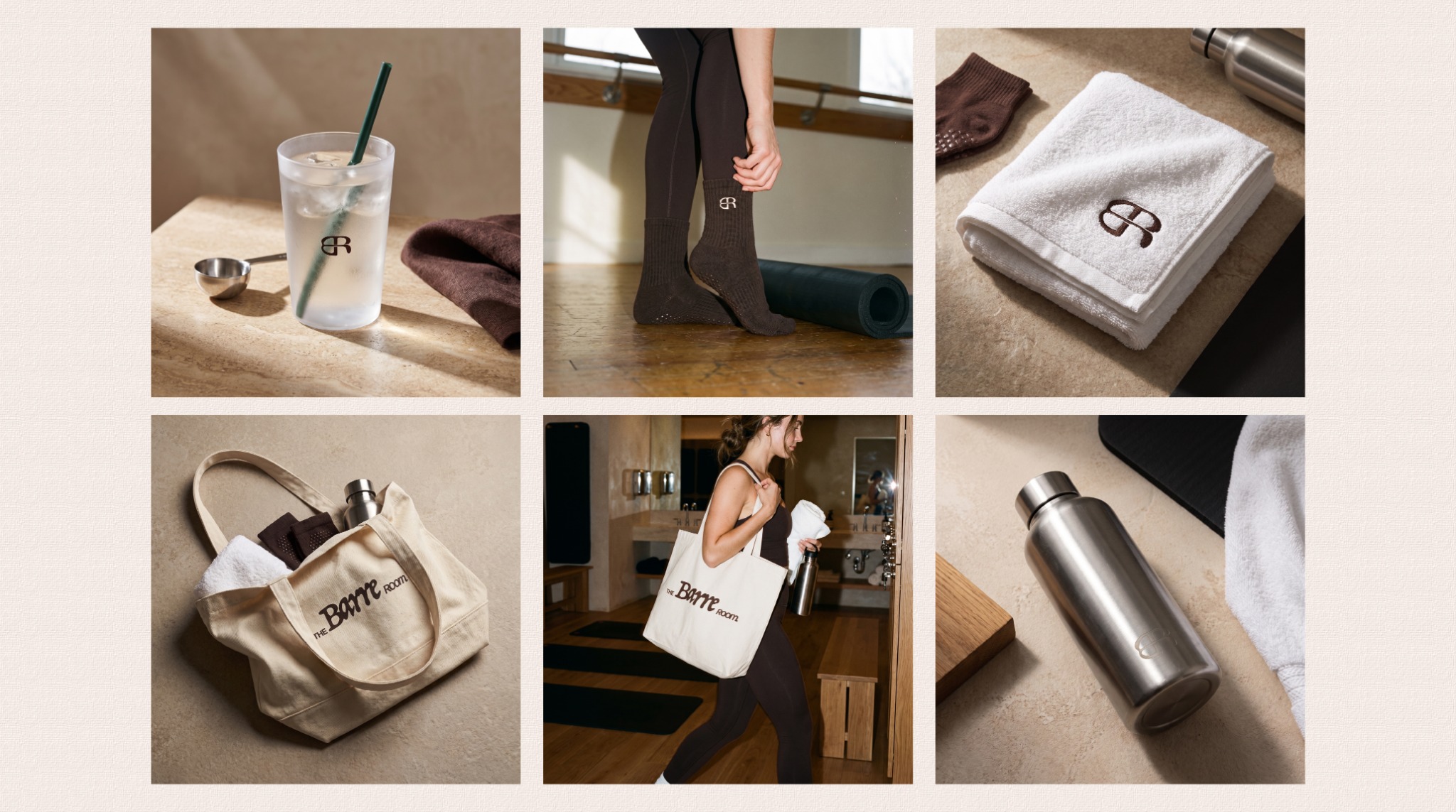
The identity follows the class into everyday rituals. Close details of towels, bags, drinkware and movement give the image direction a human scale.
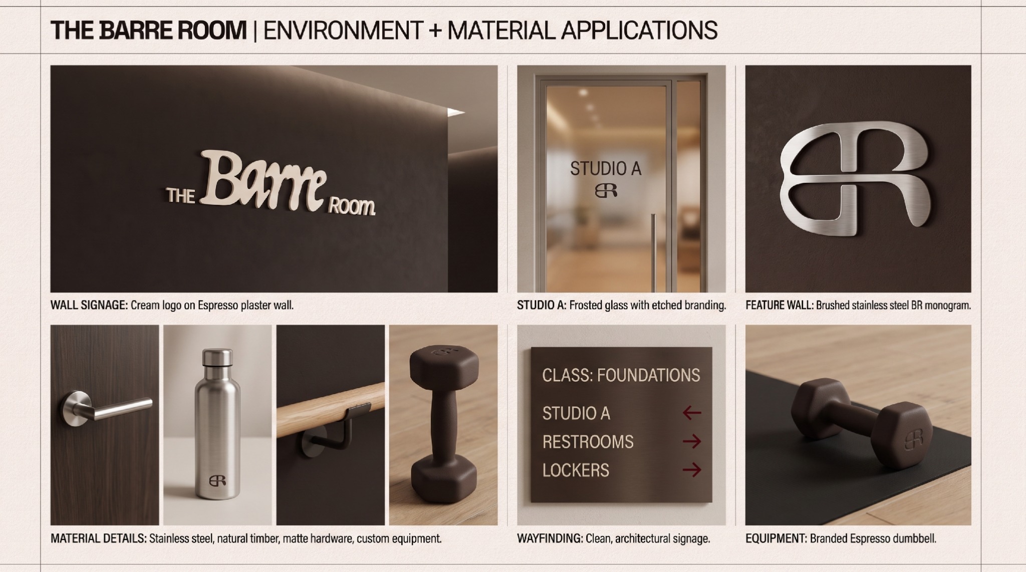
The proposed studio environment extends the same language through cream lettering, espresso surfaces, frosted glass, timber and brushed steel. Wayfinding and equipment carry the identity into use.
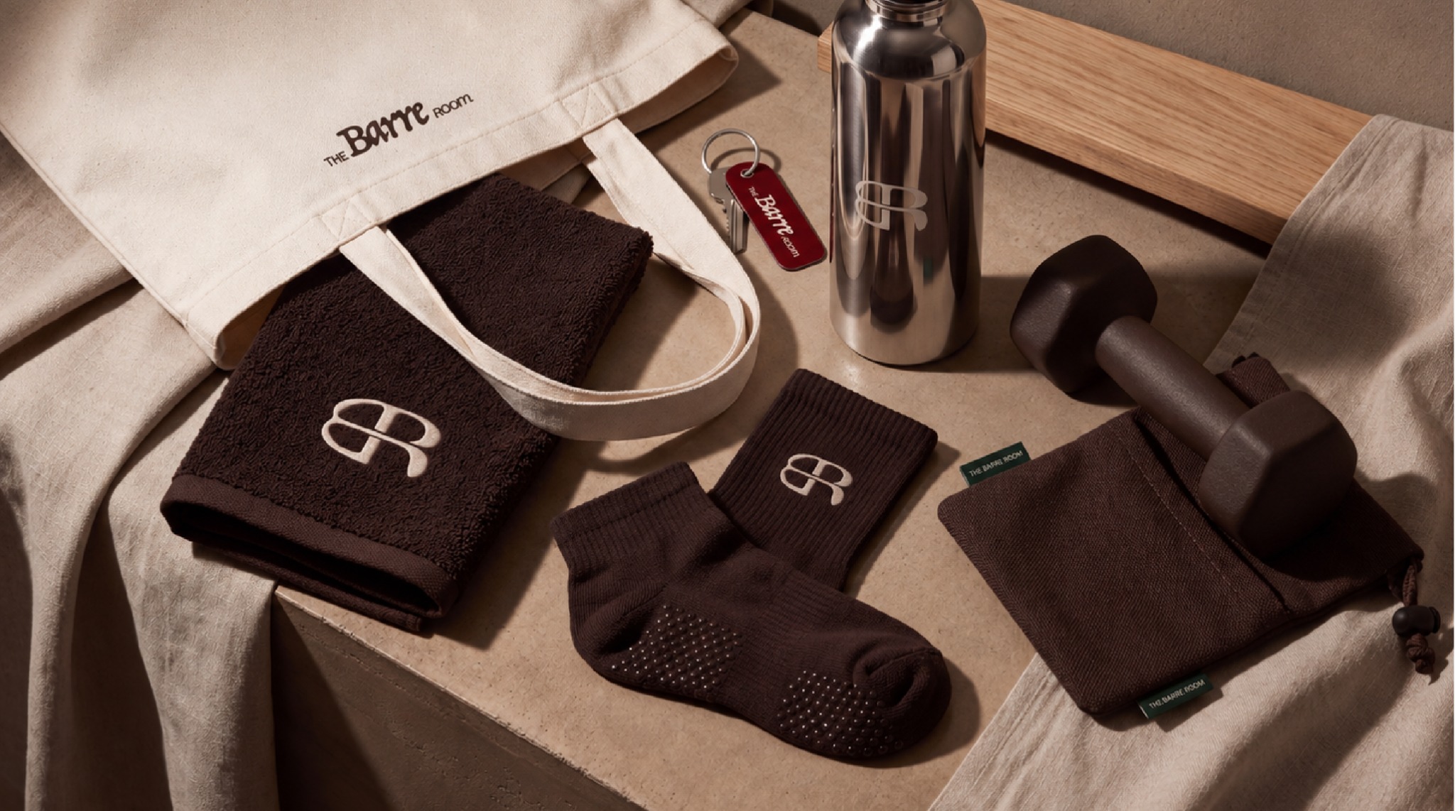
The closing kit brings the system together at the scale of the hand. Wordmark and symbol remain recognisable across canvas, textured fabric, metal and equipment.
01Brand direction02Wordmark & BR symbol03Colour system04Typography & voice05Digital identity06Member collateral07Merchandise concepts08Environmental applications
04 / POSITION AFTER THE WORK
One identity connects the studio's voice, digital signature, member materials, everyday kit and proposed environment.
AUDIENCE
People seeking a welcoming, community-oriented movement studio
GEOGRAPHY
Doha, Qatar
STATUS
2026 identity presentation / application concepts
AUTHORSHIP
Brand identity & art direction / Kheireddine Smaili
The work is individual; the room gives it a shared rhythm. The brand frames progress as something practised together, with confidence growing through participation and repetition.
The human lens informs the creative choices; it is not presented as a claim that design can control behaviour.
06 / ROLE
Brand direction · Visual identity · Art direction · Applications
PROJECT TYPE
Studio identity & application concepts
PROJECT CREDIT
Return to the complete index↗Kheireddine Smaili
Independent concept / KAI methodology