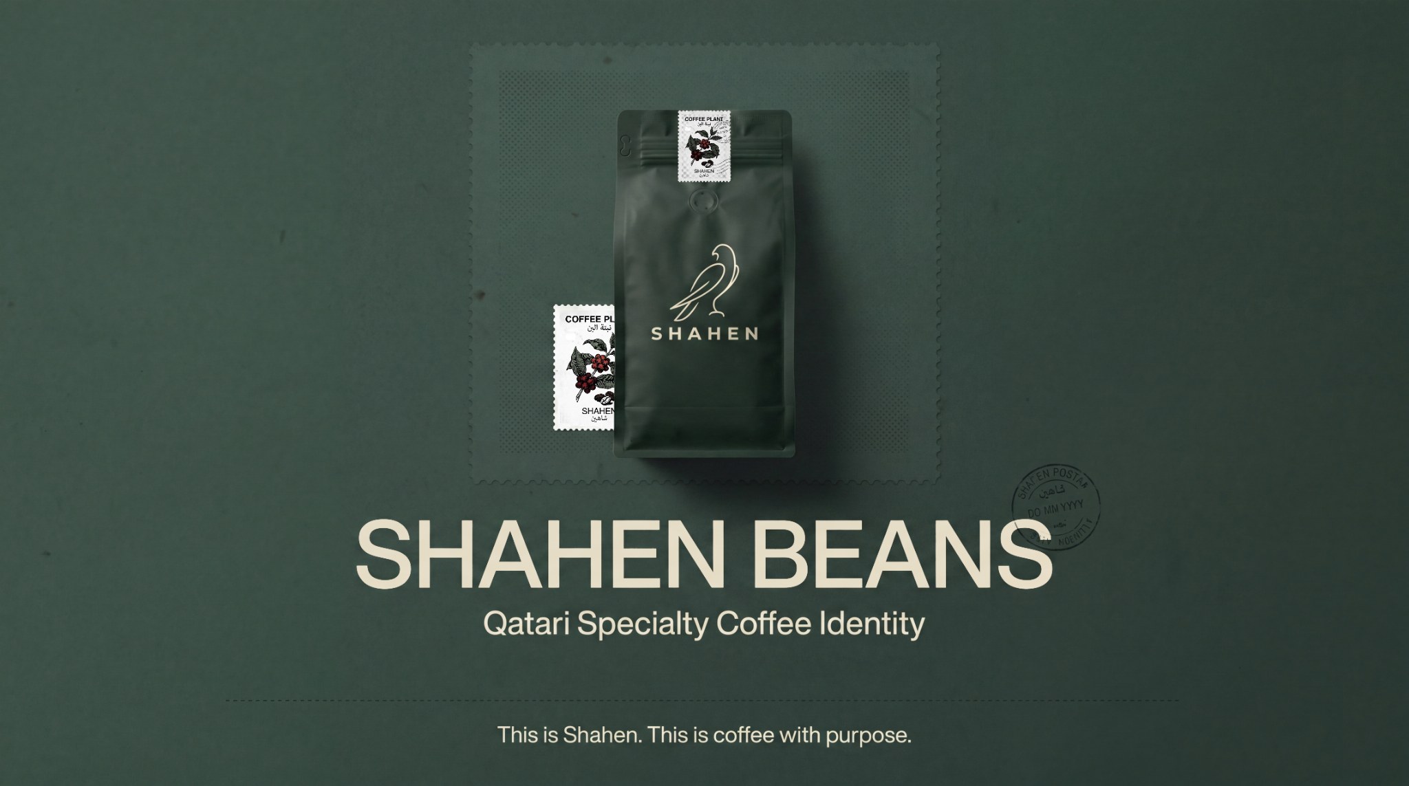
A Qatari specialty-coffee identity developed as Maven Studio client work, with local character carried through the full retail ritual rather than added as surface decoration.
CASE 01Identity / HospitalityClient work / Maven Studio
Shahen Beans
Qatari Specialty Coffee
A bilingual Qatari specialty coffee identity using falcon symbolism and postal-stamp heritage across coffee bags, cups, boxes and retail touchpoints.
- Year
- 2025
- Origin
- Created for a client under Maven Studio
- Role
- Identity · Bilingual system · Packaging · Applications
The reason
for the work.
“A Qatari coffee ritual can feel rooted without becoming nostalgic.”
Create cultural specificity without presenting the brand as official heritage or relying on familiar Gulf luxury clichés.
The system combines a falcon signal, a fictional postal-stamp language and bilingual hierarchy across the objects people repeatedly handle.
A sequence of decisions, shown through the actual work.
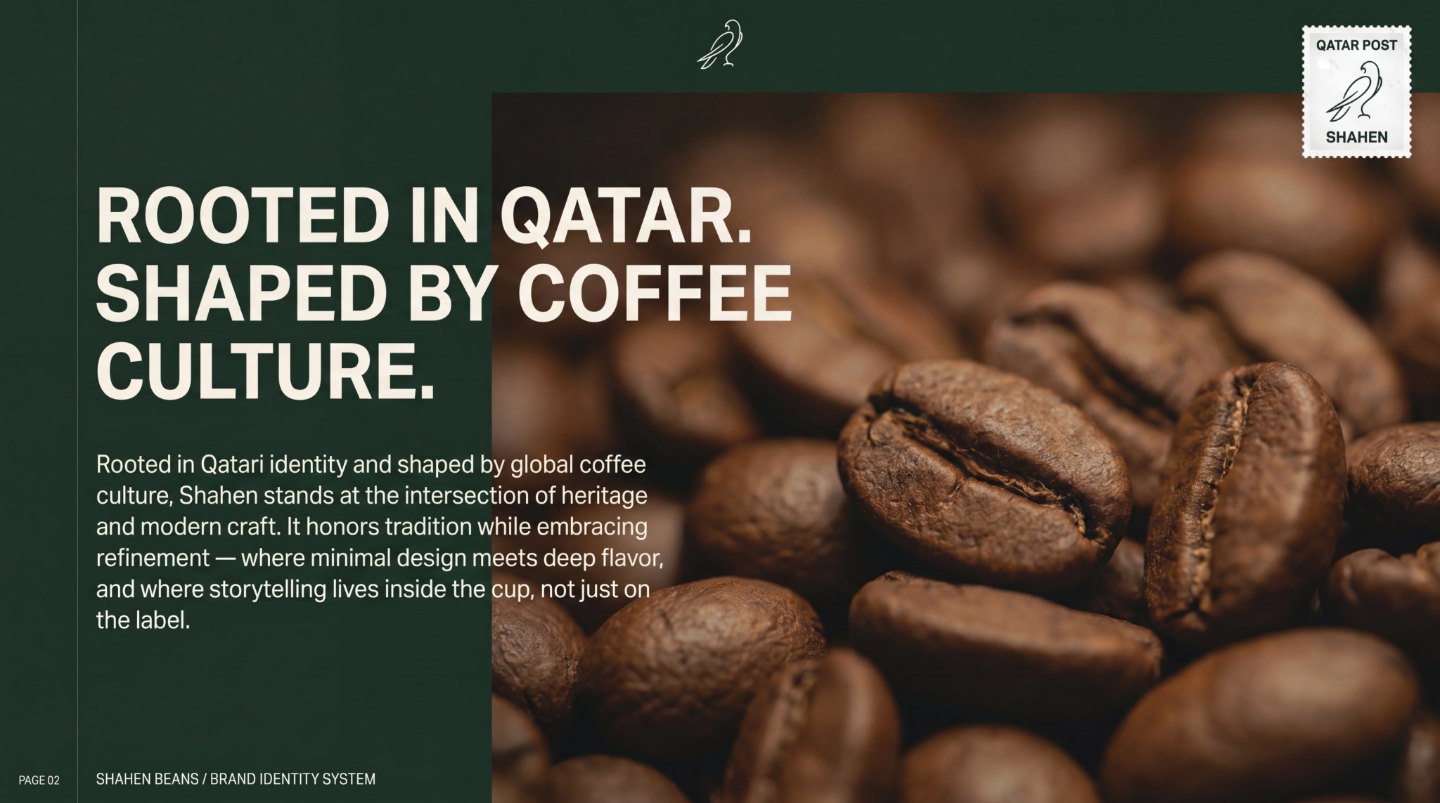
Positioning local character without relying on heritage cliché.
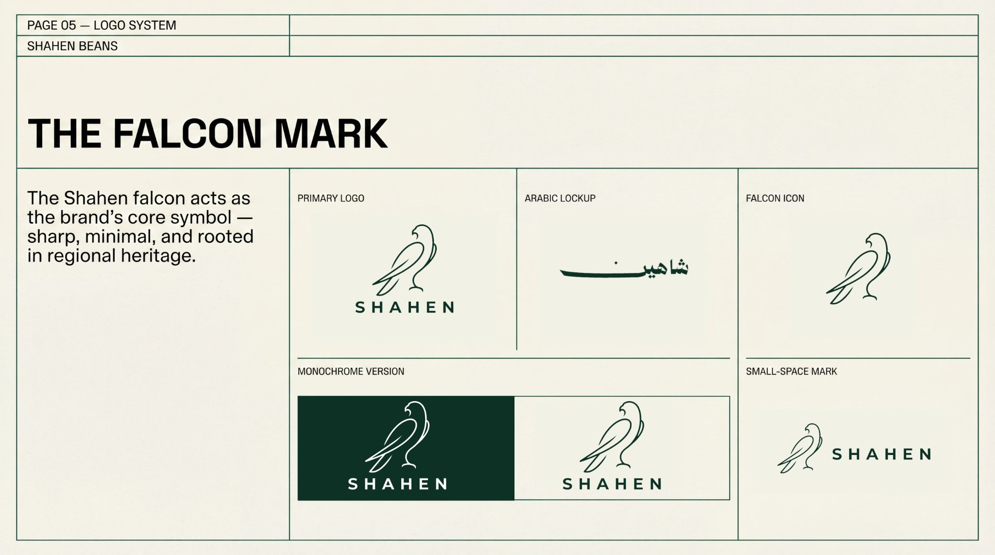
The falcon becomes a precise, repeatable cultural signal.
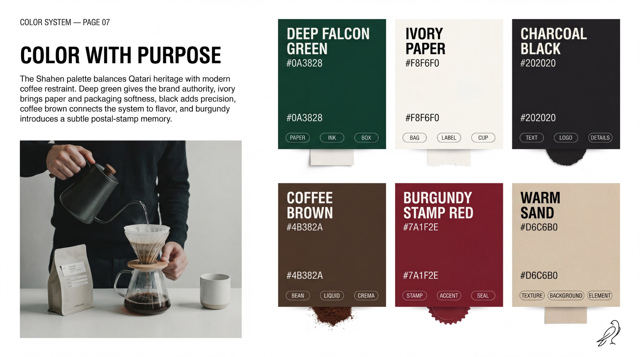
Colour, perforation and archive details establish origin and movement.
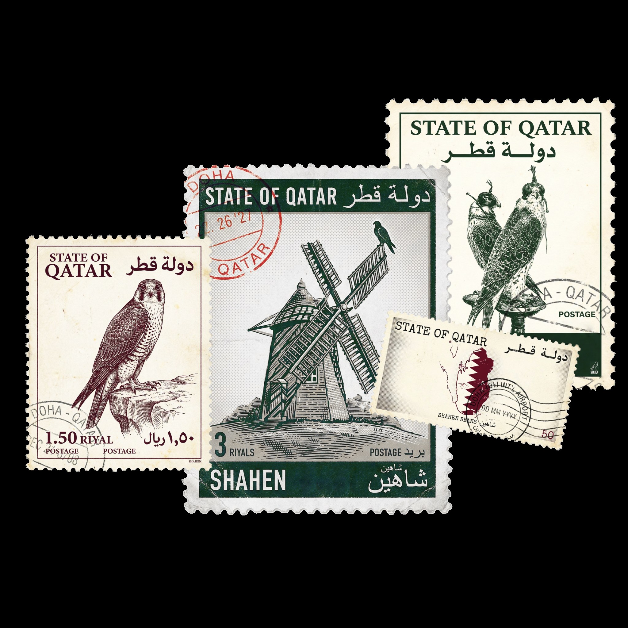
The stamp grammar gives origin, movement and archive detail a repeatable form.
What holds
it together.
A project becomes a system when each choice supports the same position—and still works when the format changes.
01CULTURAL SIGNAL
Falcon, reduced to behaviour
The falcon acts as a controlled emblem of speed, precision and local recognition—not an ornamental heritage illustration.
02ARCHIVE DEVICE
A fictional stamp grammar
Perforation, labels and postal framing create a language of origin and movement without claiming official government postage.
03RETAIL PROOF
The ritual holds the system
Bags, cups and boxes repeat the same hierarchy so the identity remains clear from shelf recognition to the coffee moment.
The system
has to travel.
Identity is tested where people actually meet it: on a shelf, in a hand, across an image, inside a presentation or through a space.
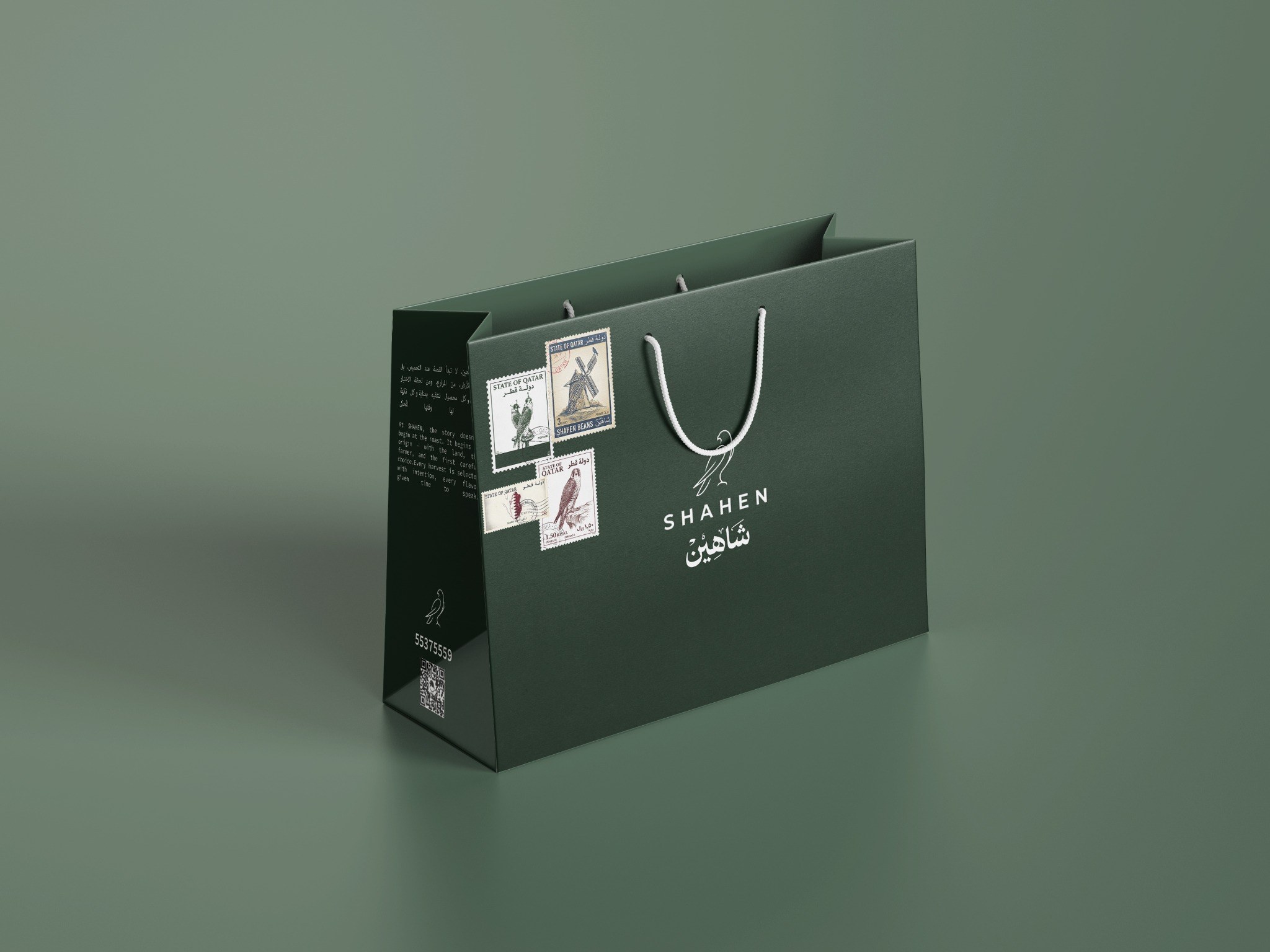
The postal language scales into a recognisable retail object.
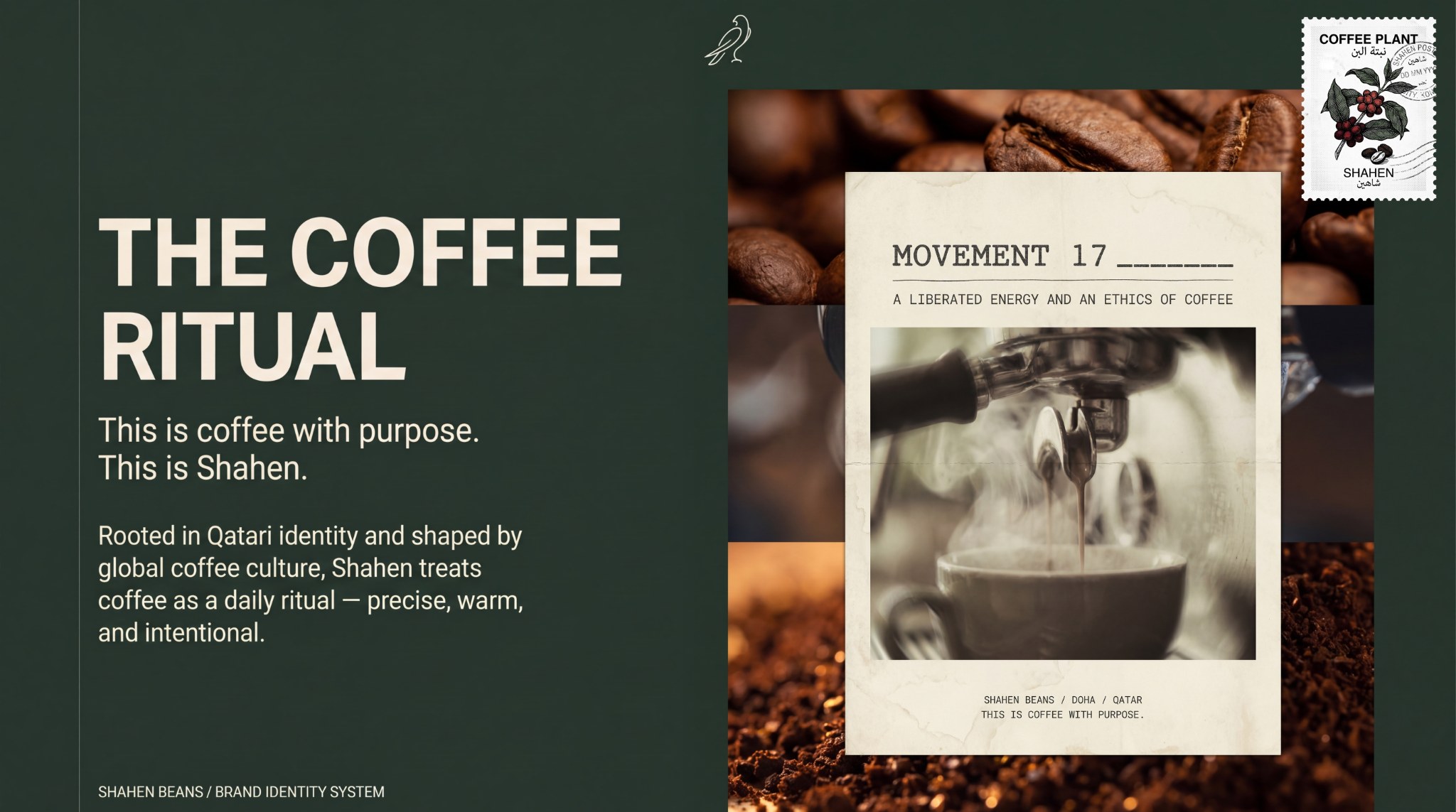
Editorial storytelling connects the identity to the daily coffee ritual.
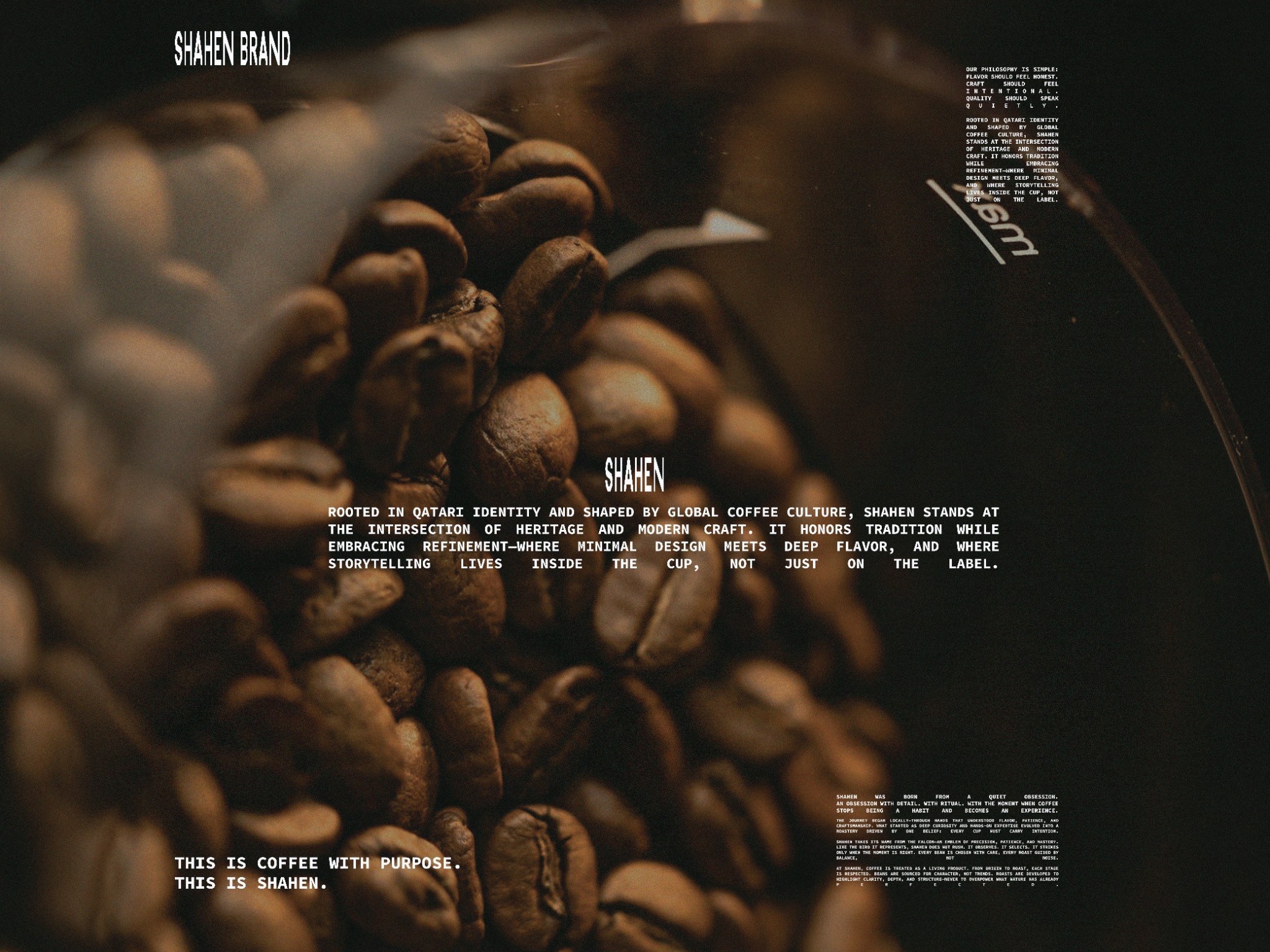
Photography gives the system material warmth and commercial atmosphere.
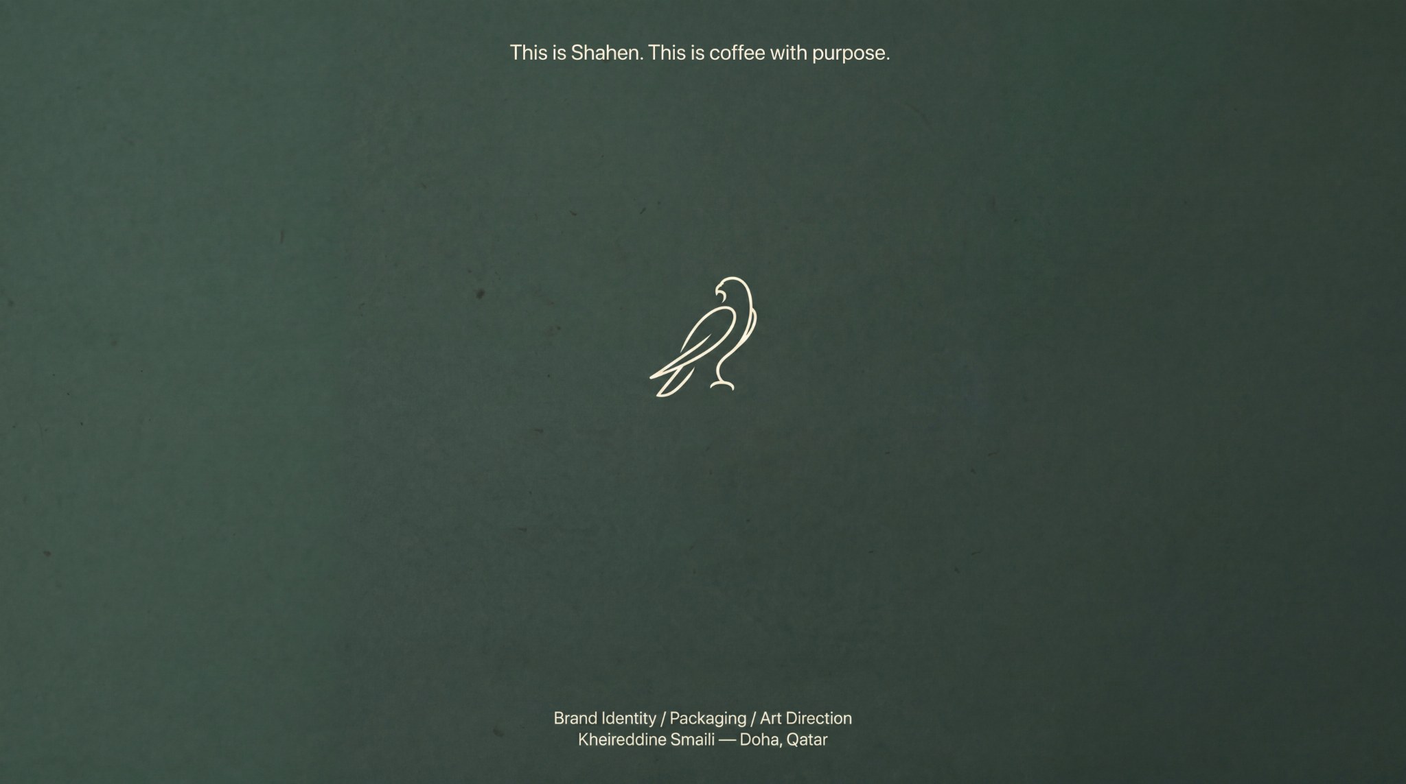
The complete identity remains recognisable across its final landscape application.
01Identity system02Arabic / English hierarchy03Coffee bags04Cups05Boxes06Retail applications07Case-study direction
04 / POSITION AFTER THE WORK
A contemporary coffee world whose Qatari reference is embedded in the system: recognisable in English or Arabic and adaptable across retail touchpoints.
AUDIENCE
Specialty-coffee customers / gifting / Qatar retail
GEOGRAPHY
Doha, Qatar
STATUS
Identity development / portfolio case published
AUTHORSHIP
Created for a client under Maven Studio
Ritual makes origin tangible. The bag, cup and box can carry belonging more quietly—and more often—than a campaign statement.
The human lens informs the creative choices; it is not presented as a claim that design can control behaviour.
06 / ROLE
Identity · Bilingual system · Packaging · Applications
PROJECT TYPE
Client work / Maven Studio
PROJECT CREDIT
View the extended visual case on Behance↗Maven Studio client work
Kheireddine Smaili / Brand & visual design