A direct café identity concept designed around modern indulgence, dark timber warmth and a premium ritual that remains calm rather than theatrical.
CASE 02Identity / HospitalityClient concept
Buen Café
Contemporary Taste. Enduring Beauty.
A refined café identity built through forest green, burgundy, warm gold and a restrained editorial world spanning packaging, service objects and hospitality imagery.
- Year
- 2026
- Origin
- Direct client concept / independently directed
- Role
- Brand direction · Identity · Packaging · Campaign
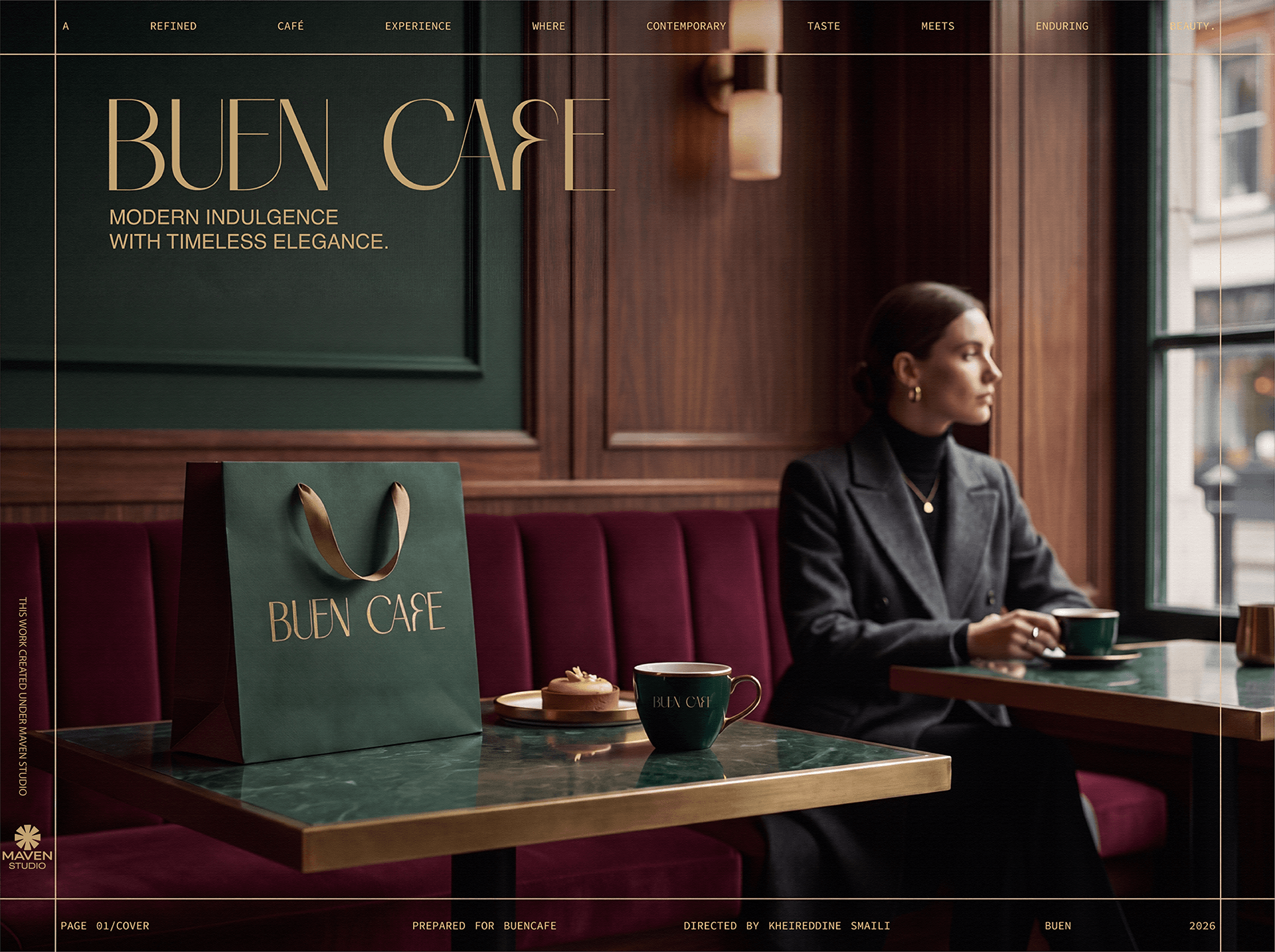
The reason
for the work.
“A café becomes memorable when every quiet detail carries the same standard.”
Build a memorable hospitality world without depending on generic coffee imagery, excessive gold or decorative luxury signals.
Deep green, burgundy and warm metallic detail connect the logo, cups, bags, boxes, interior atmosphere and editorial guest imagery.
A sequence of decisions, shown through the actual work.
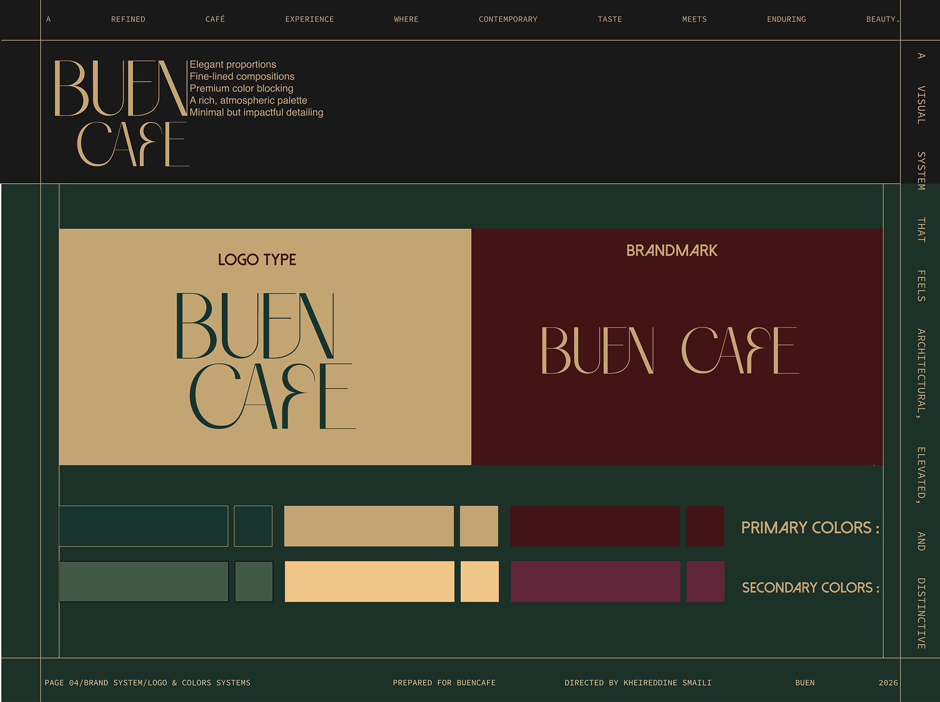
Forest green, burgundy and warm gold establish a distinctive but inhabitable premium code.
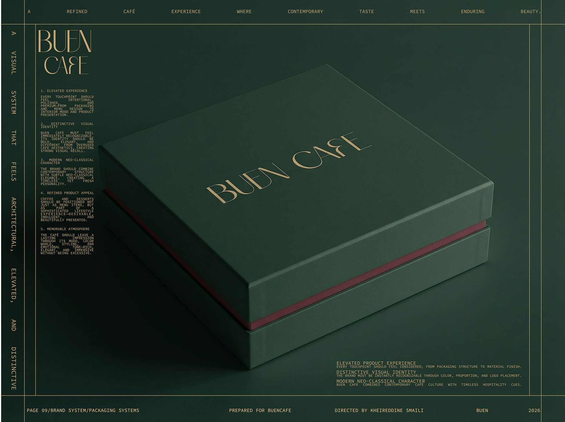
The identity begins with a controlled object whose proportion, finish and logo placement set the standard.
What holds
it together.
A project becomes a system when each choice supports the same position—and still works when the format changes.
01POSITION
Indulgence without noise
The identity uses material depth and controlled hierarchy so premium character arrives through confidence, not visual excess.
02PALETTE
Green, burgundy, warm gold
The colours connect packaging and place, giving everyday café objects a richer and more ownable atmosphere.
03RITUAL
The object enters the room
Cup, bag and box are treated as pieces of the hospitality experience rather than separate mockup exercises.
The system
has to travel.
Identity is tested where people actually meet it: on a shelf, in a hand, across an image, inside a presentation or through a space.
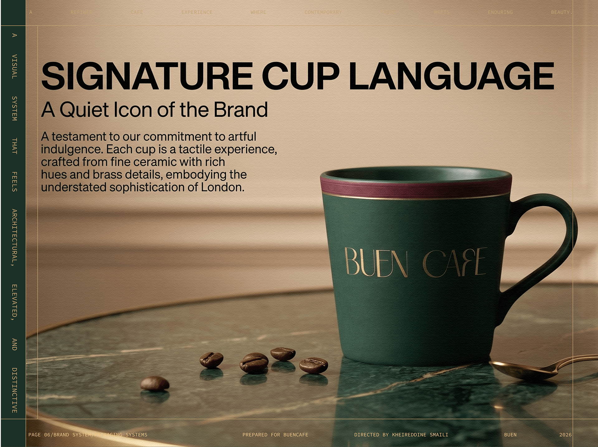
A quiet icon of the brand translates the palette into a tactile daily ritual.
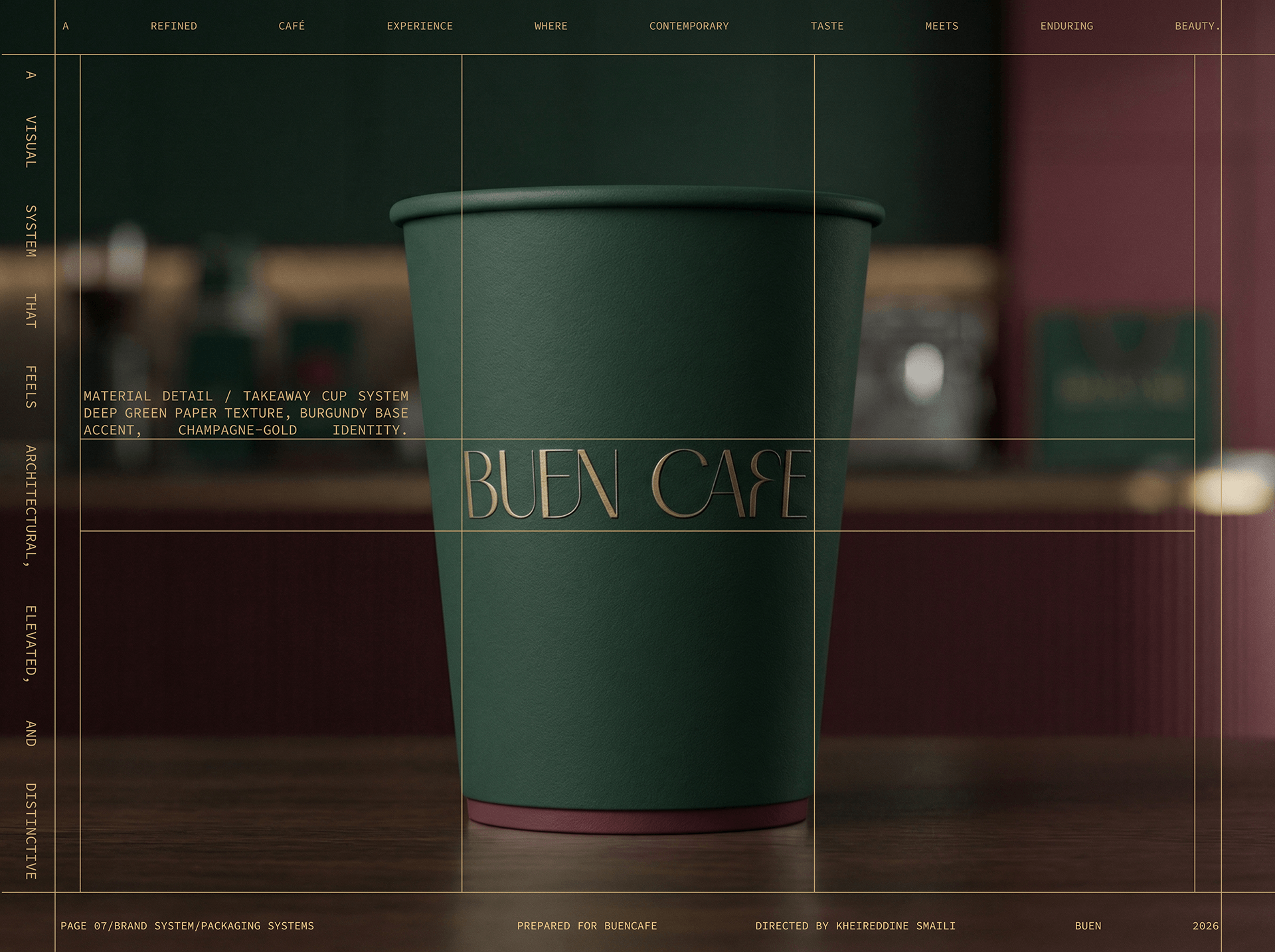
The same visual authority survives a more functional, high-frequency surface.
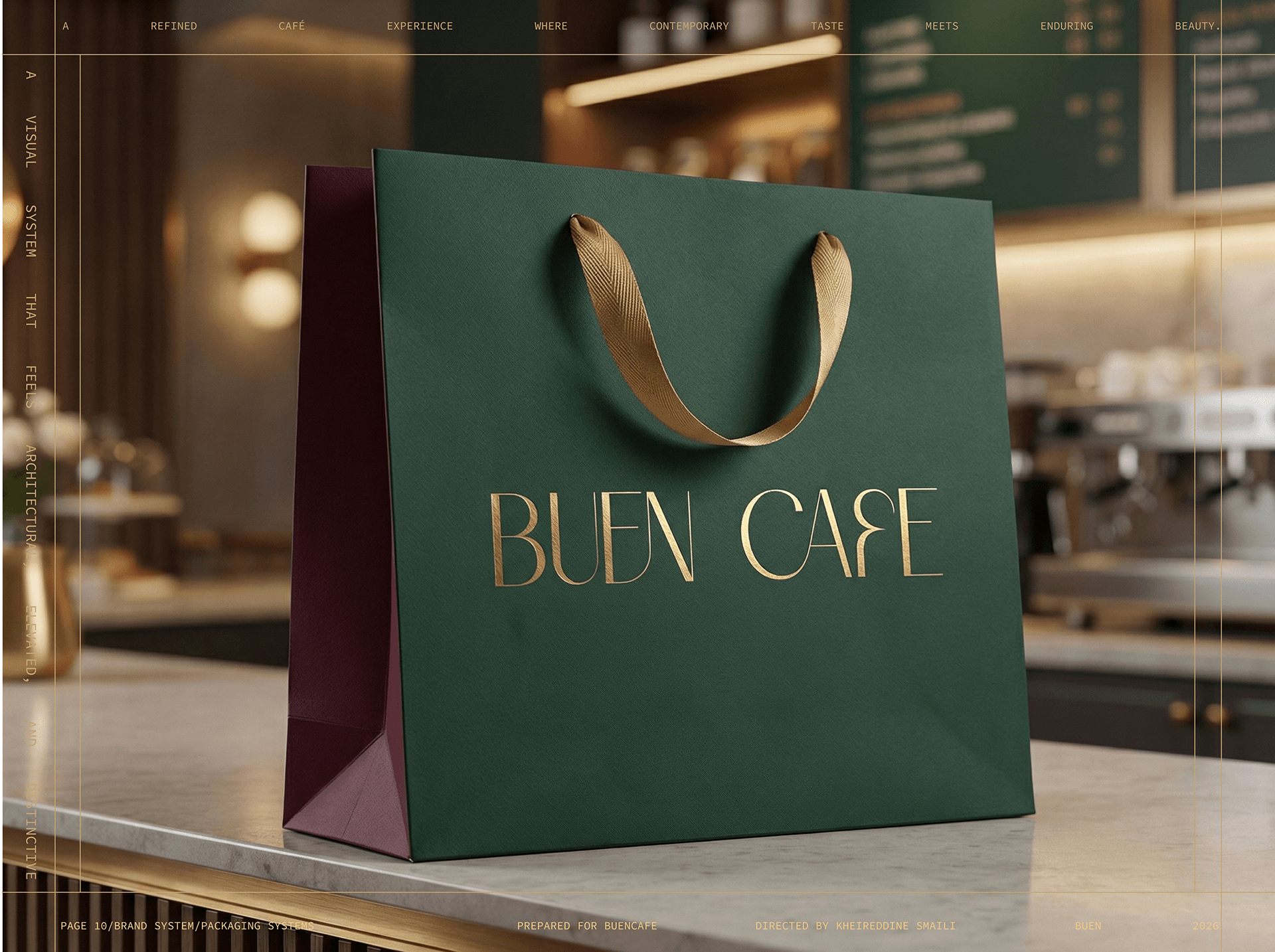
Packaging carries the hospitality language beyond the interior.
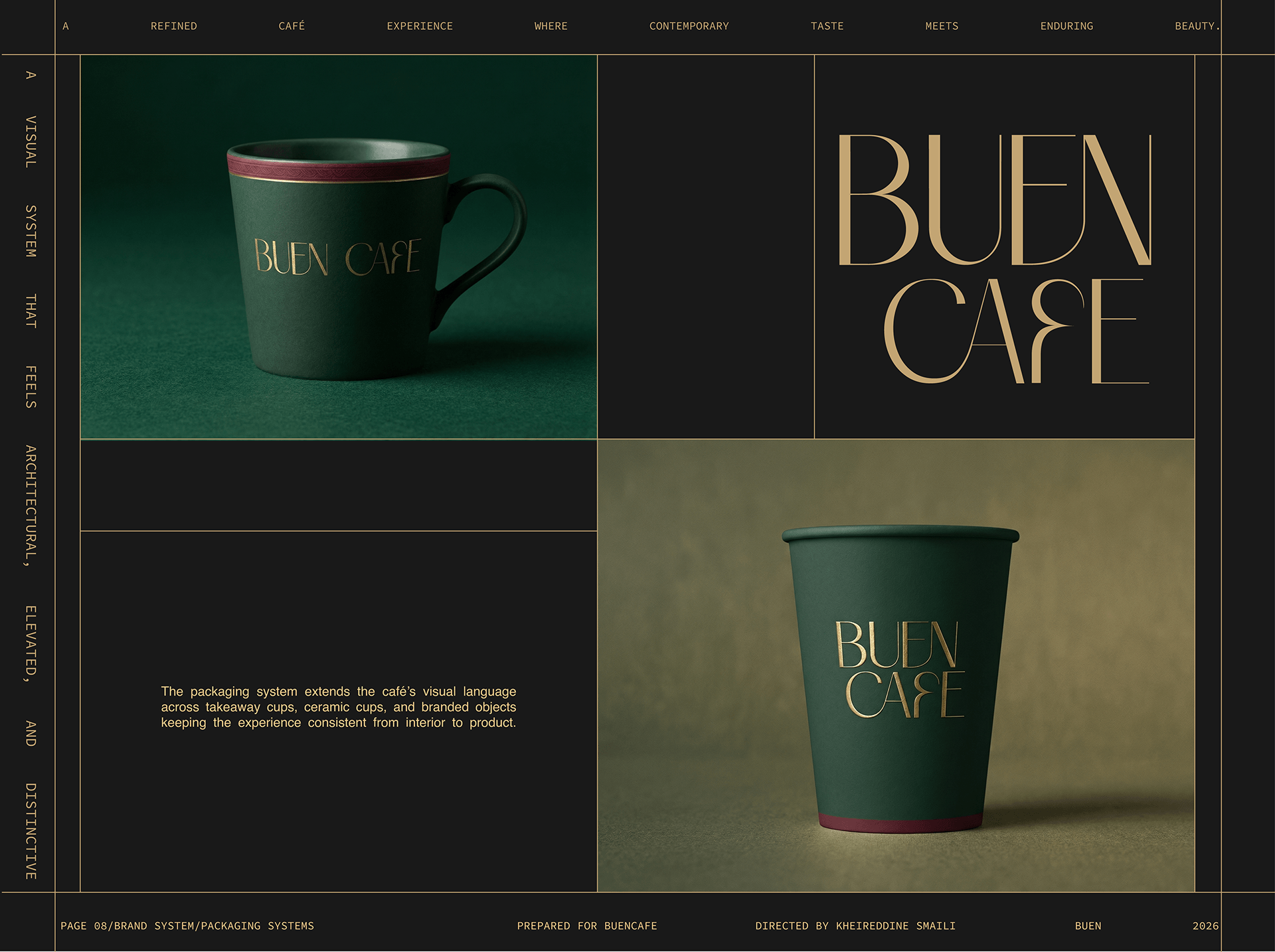
Objects and marks are shown as one coordinated commercial system.
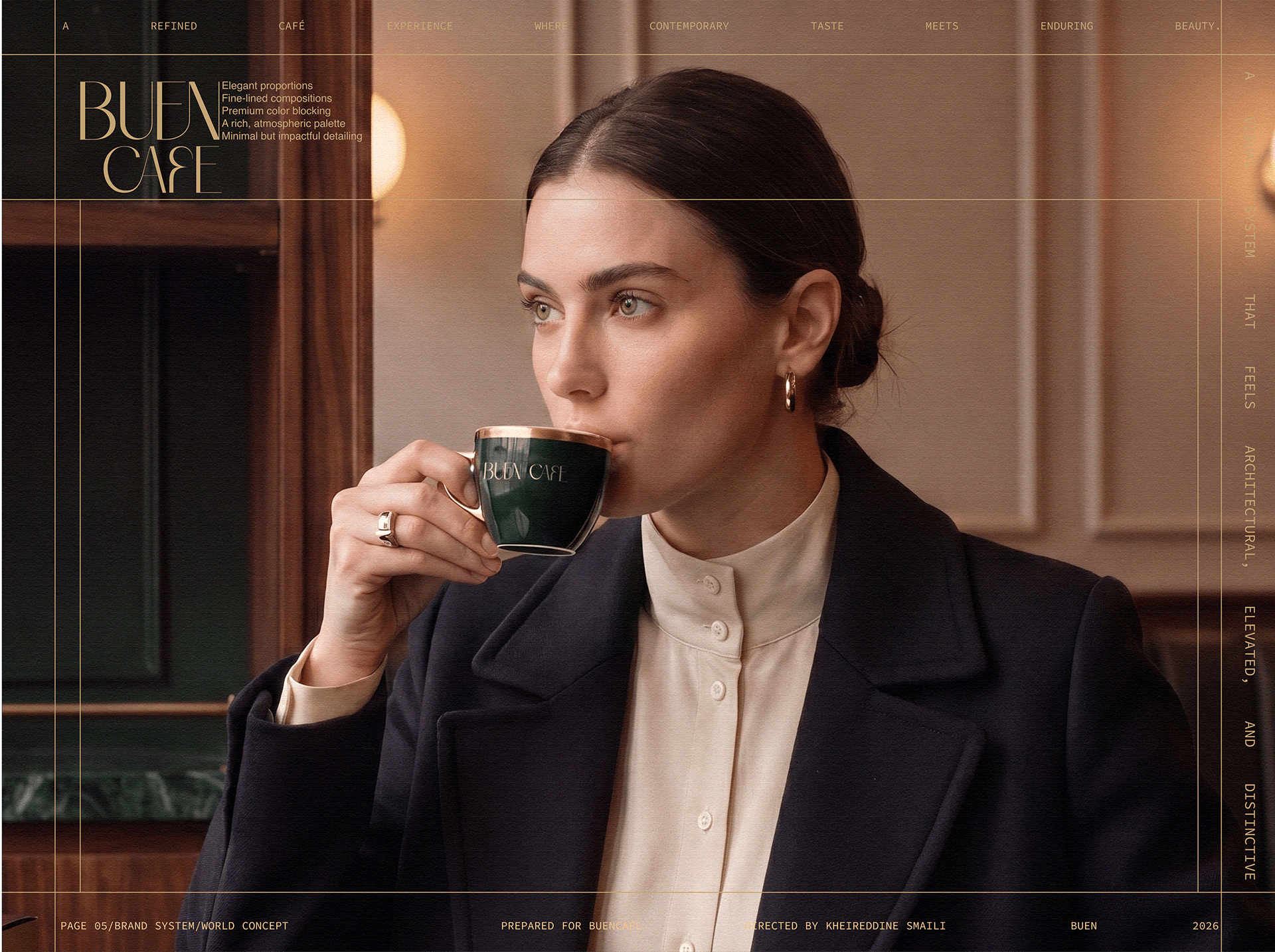
The campaign frames the guest as composed, contemporary and naturally at home in the world.
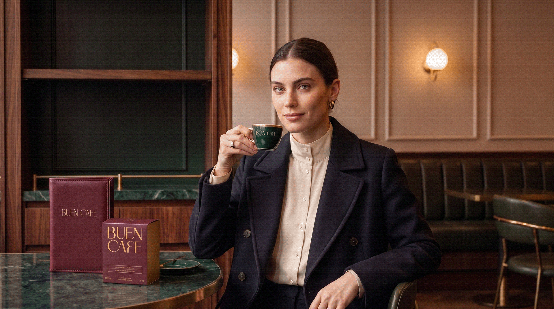
The cup becomes part of a lived social ritual rather than a detached product shot.
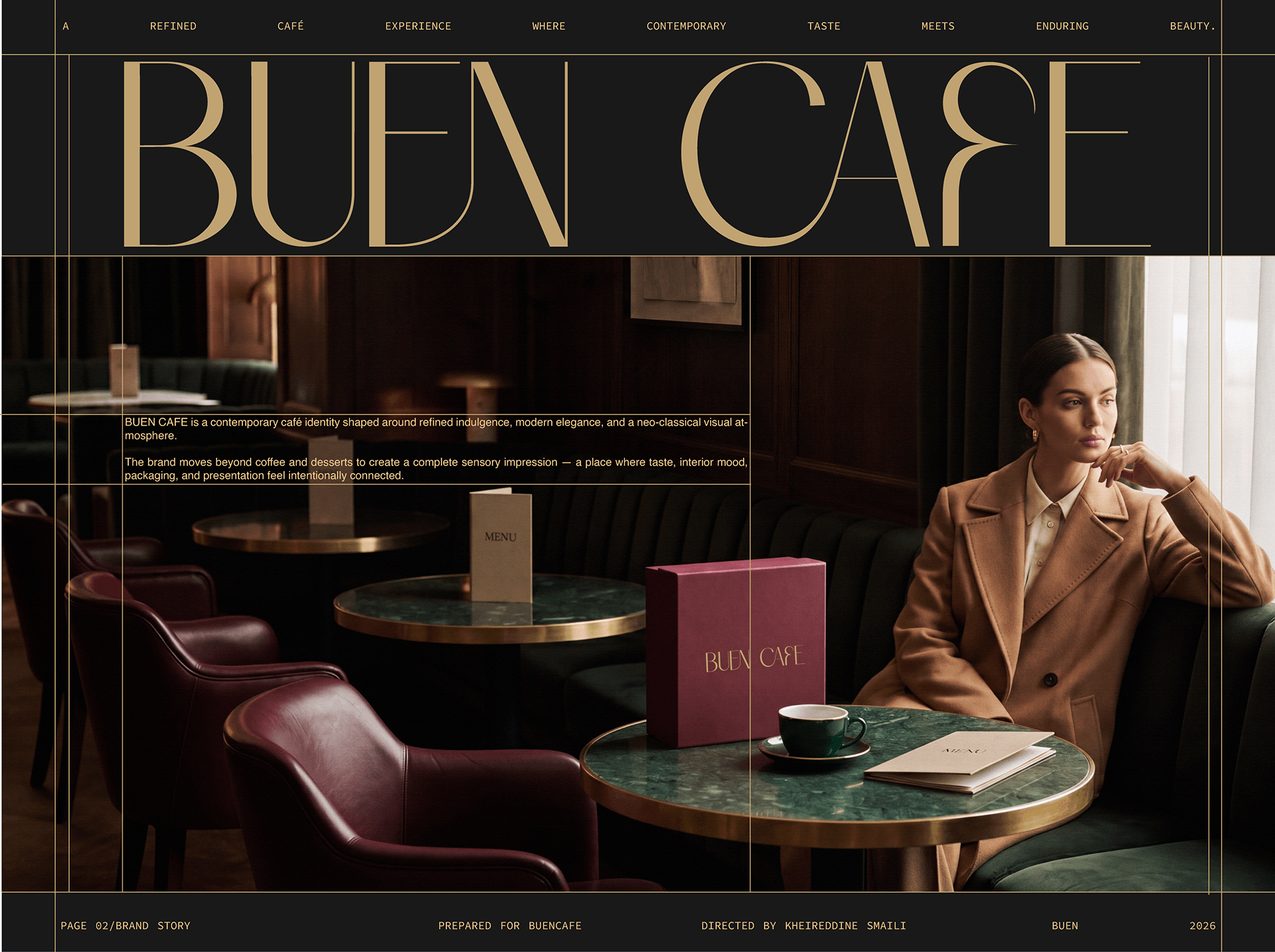
Burgundy seating, dark timber and filtered light give the brand a credible physical atmosphere.
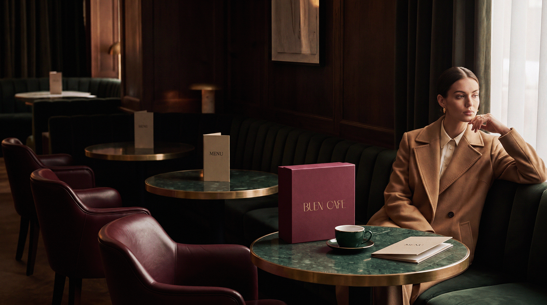
The visual language expands from packaging into a complete place and pace.
01Brand direction02Visual identity03Cup system04Packaging05Retail bags06Interior atmosphere07Campaign art direction
04 / POSITION AFTER THE WORK
A composed café world whose packaging, service ritual and environment share one recognisable temperature.
AUDIENCE
Café guests / gifting / contemporary hospitality
GEOGRAPHY
Doha, Qatar
STATUS
Identity concept / complete visual case
AUTHORSHIP
Direct client concept / independently directed
A place earns attachment when its smallest repeated objects carry the same feeling as the room.
The human lens informs the creative choices; it is not presented as a claim that design can control behaviour.
06 / ROLE
Brand direction · Identity · Packaging · Campaign
PROJECT TYPE
Client concept
PROJECT CREDIT
Return to the complete index↗Kheireddine Smaili
Direct client collaboration