A Maven Studio recovery-and-performance identity where clinical control meets the physical intensity of training and return.
CASE 12Identity / WellnessClient work / Maven Studio
LAB33
Recovery / Performance Identity
A performance identity where clinical precision meets physical intensity and restoration becomes a visible system.
- Year
- 2026
- Origin
- Created for a client under Maven Studio
- Role
- Identity · Campaign · Environment
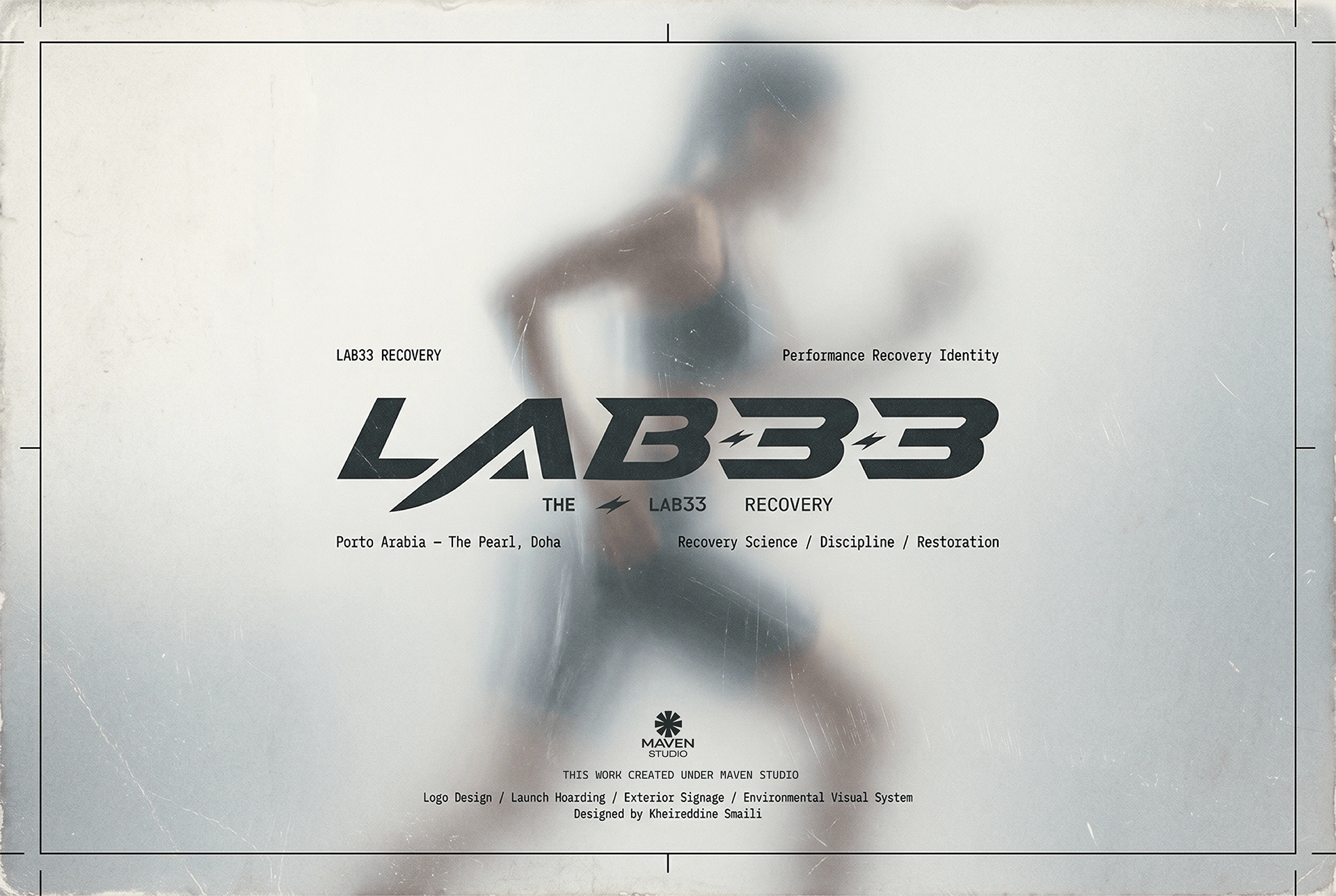
The reason
for the work.
“Recovery is not retreat. It is the engineering of return.”
Position recovery as active performance infrastructure rather than passive spa culture or intimidating medical treatment.
A sharp identity, high-energy campaign behaviour and environmental applications make repair feel engineered, measurable and forward-moving.
A sequence of decisions, shown through the actual work.
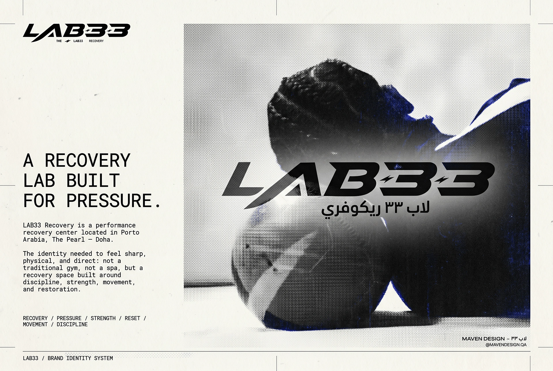
The recovery-lab premise connects an athletic body with a clinical, ordered setting.
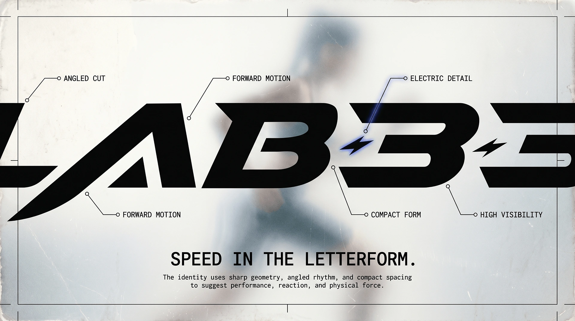
Forward-leaning cuts and compact geometry put speed into the LAB33 letterforms.
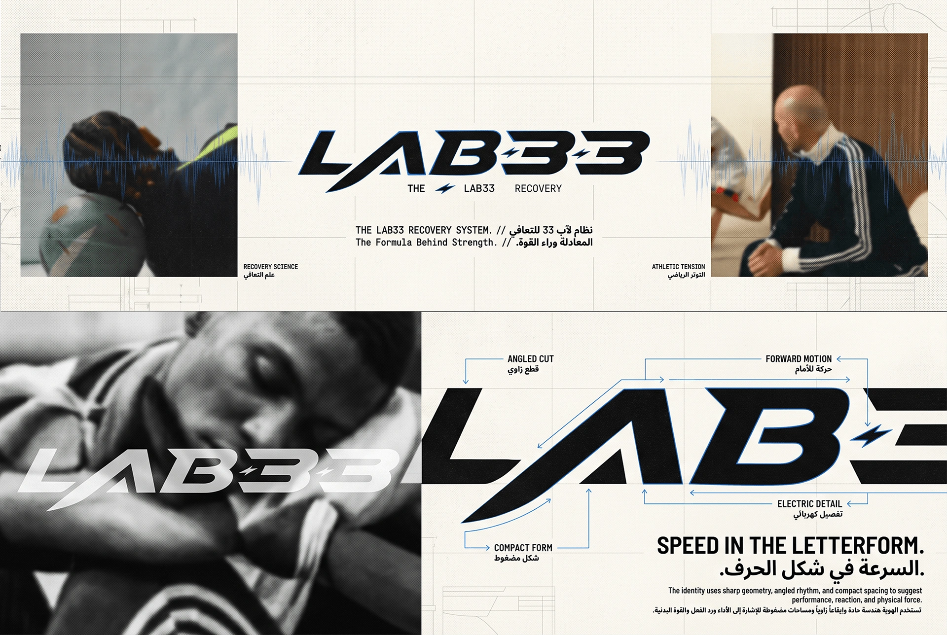
The signature, supporting type and image treatment share one technical grid.
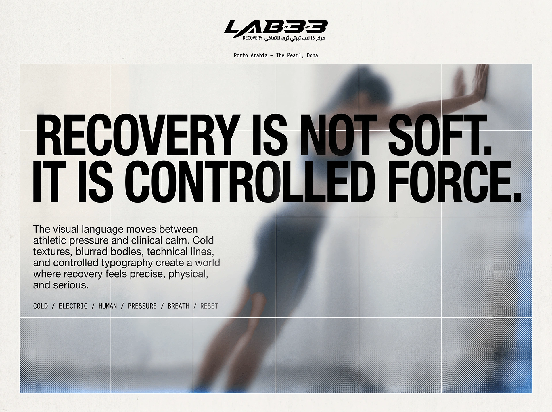
Cold texture, blurred bodies and technical lines create a world of movement under control.
What holds
it together.
A project becomes a system when each choice supports the same position—and still works when the format changes.
01REFRAME
Recovery is engineering
The brand treats repair as a designed return process, removing the softness often attached to recovery services.
02ENERGY
Clinical meets physical
High-contrast behaviour bridges the authority of science with the urgency of performance culture.
03SPACE
The system enters the room
Environmental graphics turn services and movement through the facility into part of the brand experience.
The system
has to travel.
Identity is tested where people actually meet it: on a shelf, in a hand, across an image, inside a presentation or through a space.
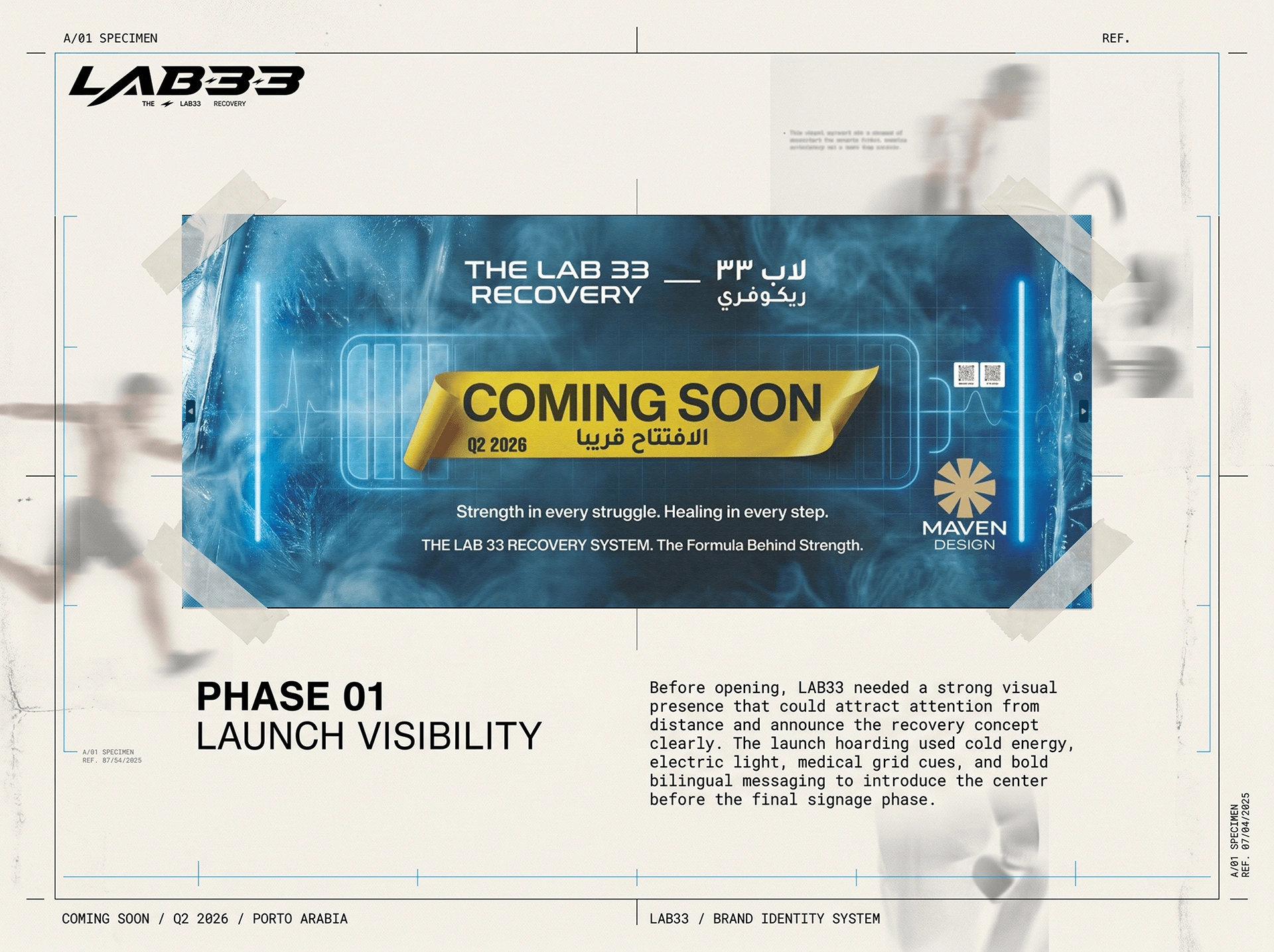
The identity scales to a bilingual launch hoarding with clear distance reading.
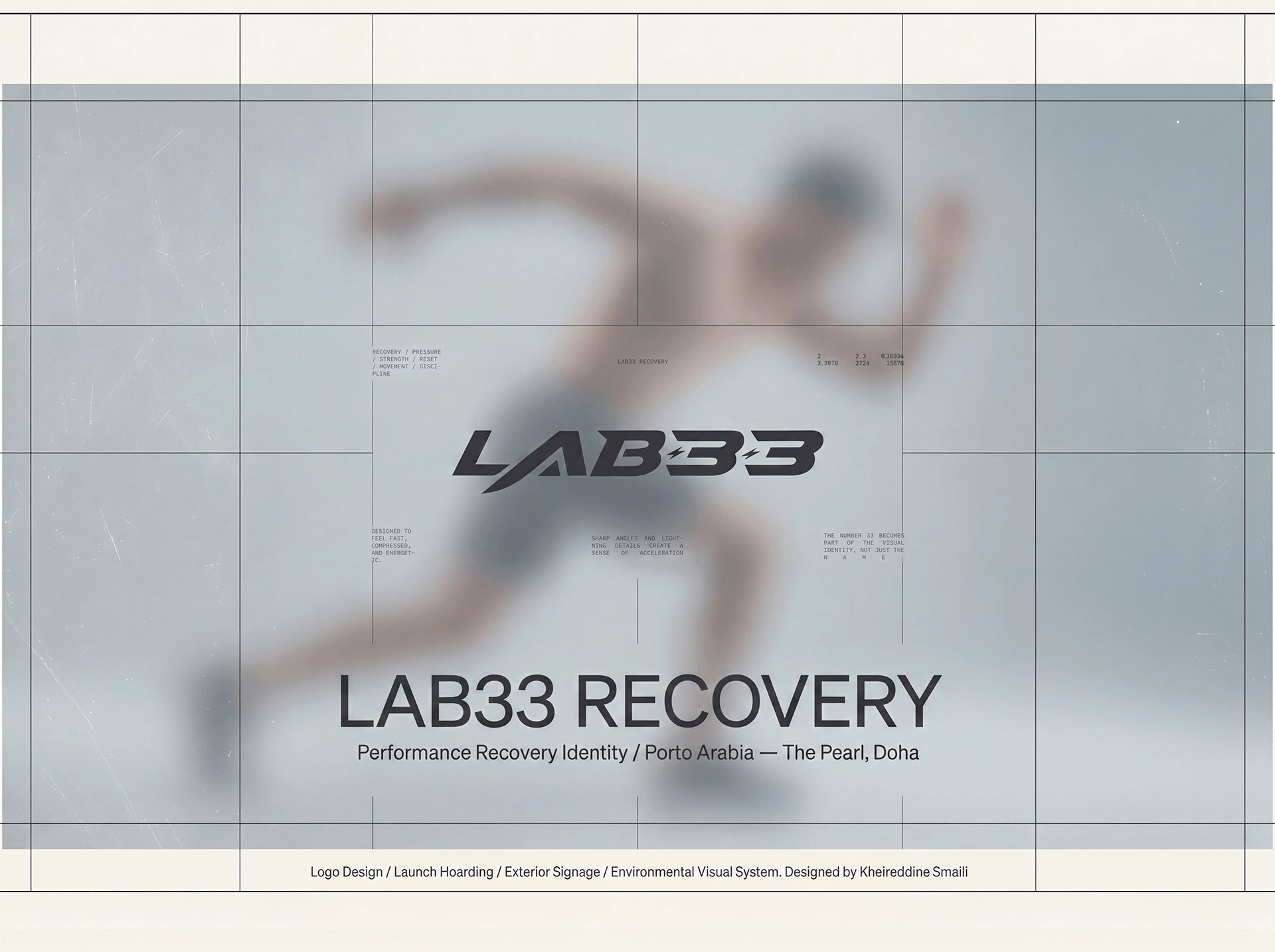
A blurred athlete and calm field balance physical exertion with recovery.
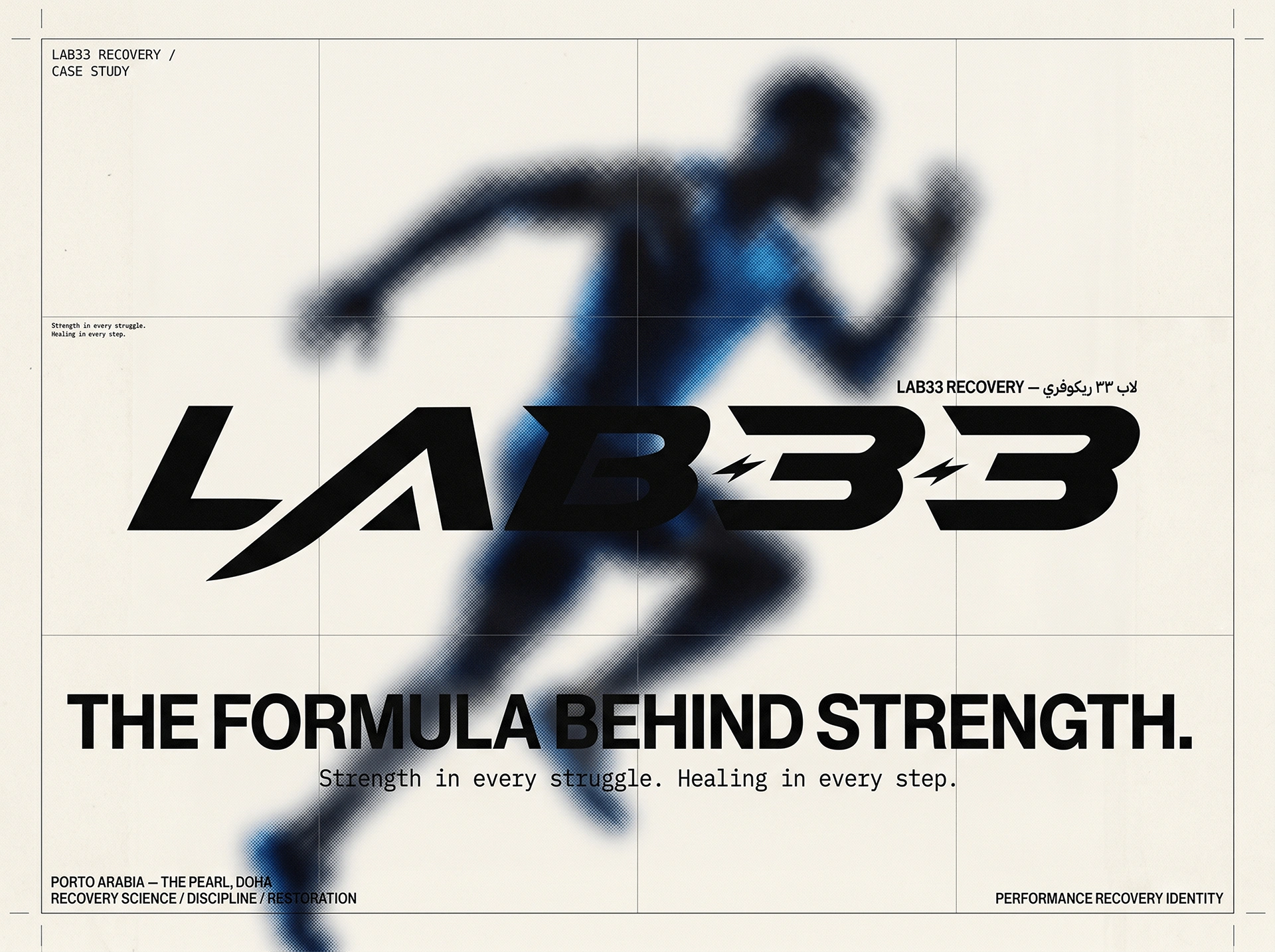
The large signature anchors the moving figure and the campaign statement.
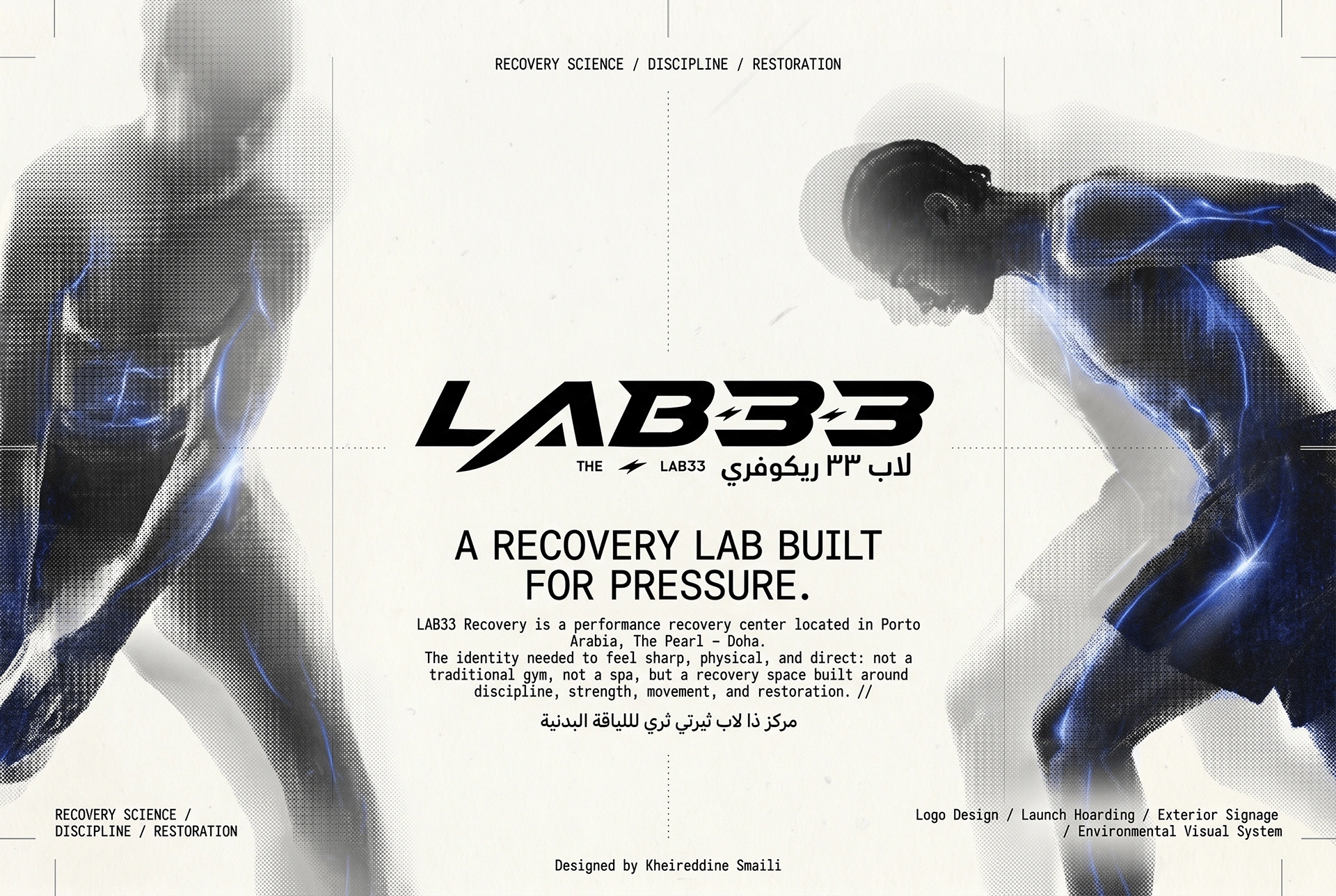
Human movement and an ordered layout hold the performance-and-recovery tension together.
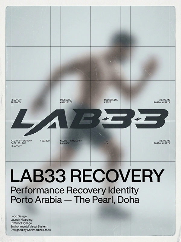
A portrait poster combines the signature, body in motion and essential location information.
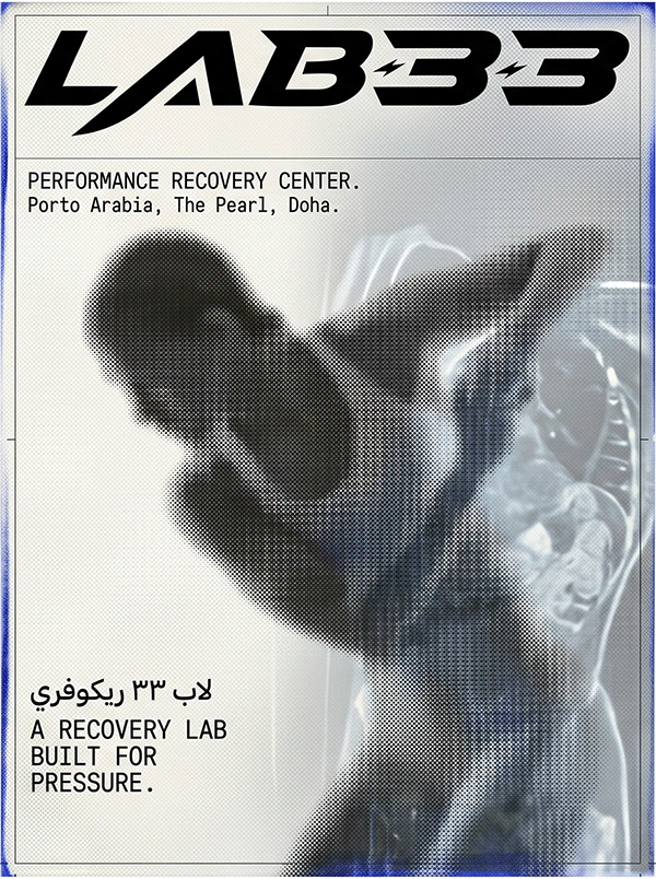
The performance poster gives the headline and athlete separate reading distances.
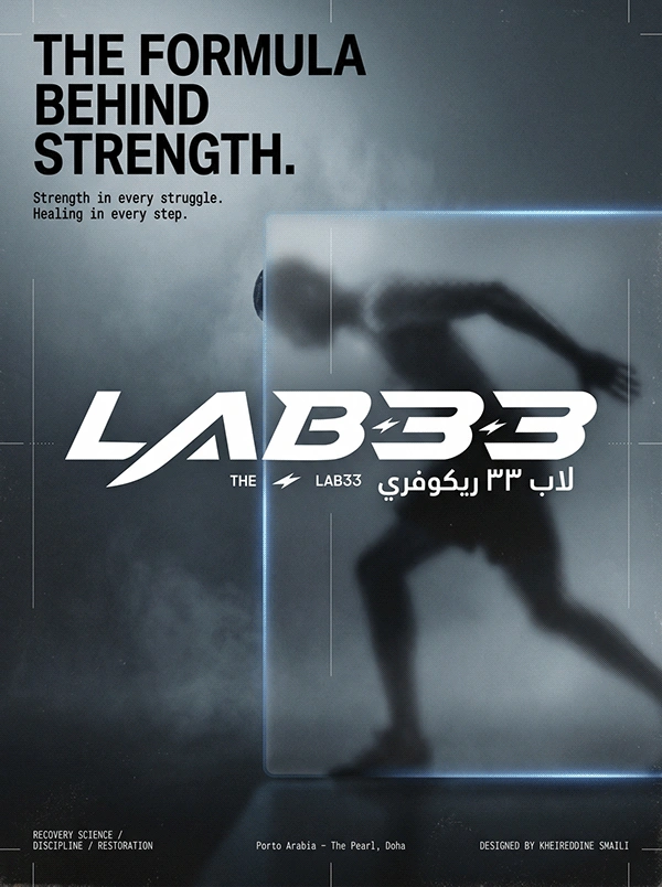
The final poster presents recovery through a focused statement and restrained image field.
01Identity02Campaign system03Service communication04Environmental graphics05Social direction06Presentation
04 / POSITION AFTER THE WORK
A recovery language with enough clinical precision to build trust and enough physical energy to belong in performance culture.
AUDIENCE
Athletes / performance clients / recovery community
GEOGRAPHY
Doha, Qatar
STATUS
Identity development / Maven Studio client work
AUTHORSHIP
Created for a client under Maven Studio
Rest becomes motivating when it is understood as preparation for return, not evidence of weakness.
The human lens informs the creative choices; it is not presented as a claim that design can control behaviour.
06 / ROLE
Identity · Campaign · Environment
PROJECT TYPE
Client work / Maven Studio
PROJECT CREDIT
View the extended visual case on Behance↗Maven Studio client work
Kheireddine Smaili / Brand & visual design