Rayeh is an independently authored roadside coffee and goods world born between Algiers and Doha. Its name means going or on the way in Algerian Darja, giving a café, clothing and travel-object label one cultural reason to exist.
CASE 13Identity / Lifestyle & hospitalityIndependent brand world
Rayeh
Roadside Coffee & Goods
A fictional roadside coffee and goods label born between Algiers and Doha—coffee, clothing and collected travel objects for people still going.
- Year
- 2026
- Origin
- Independent world / shaped through the KAI methodology
- Role
- Research · Naming · Identity · Packaging · Art direction
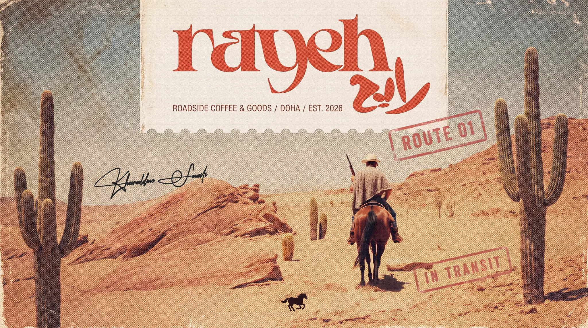
The reason
for the work.
“You do not need to arrive to belong.”
Build a bilingual lifestyle identity around movement without collapsing into generic travel graphics, western costume or decorative nostalgia.
A custom Latin wordmark, expressive Arabic mark, route code, coordinates, horse signal and tactile material palette turn transit into a complete system that can be printed, worn, held and photographed.
A sequence of decisions, shown through the actual work.
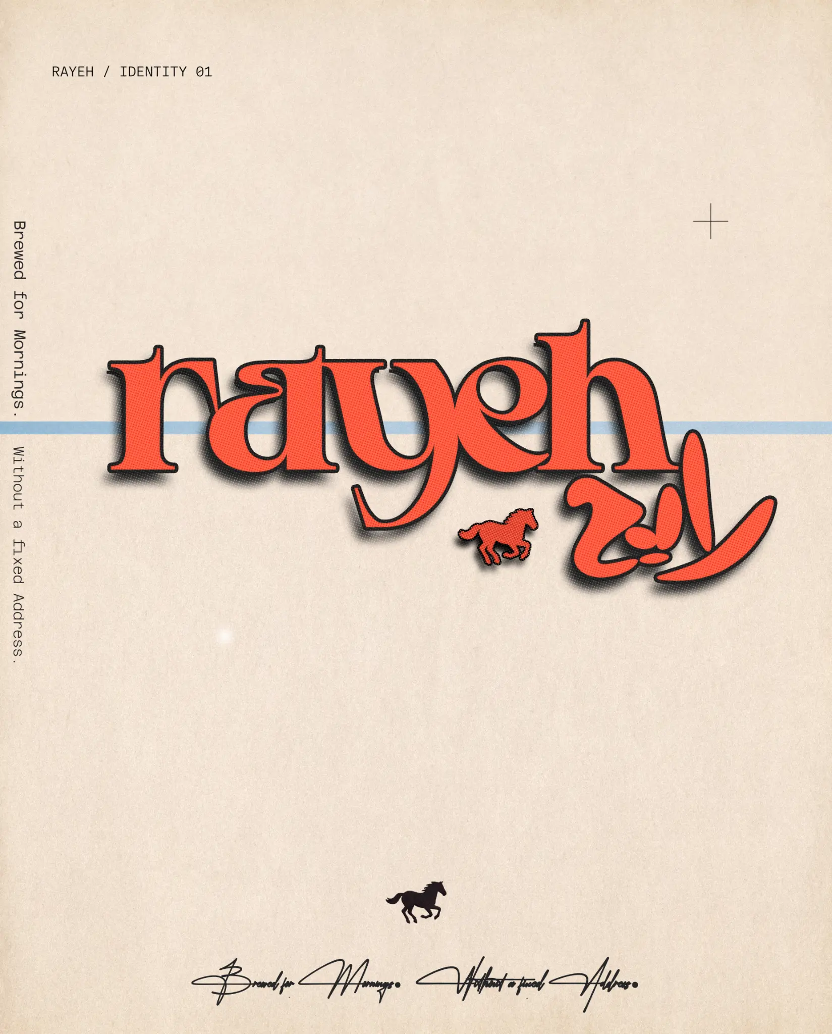
The primary Rayeh identity page holds Arabic expression, editorial typography and the route code in one clear signal.
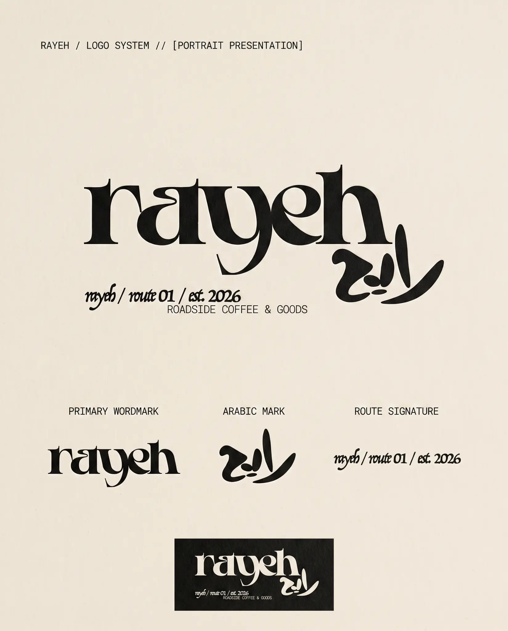
The master wordmark, Arabic mark and route signature establish one flexible bilingual hierarchy.
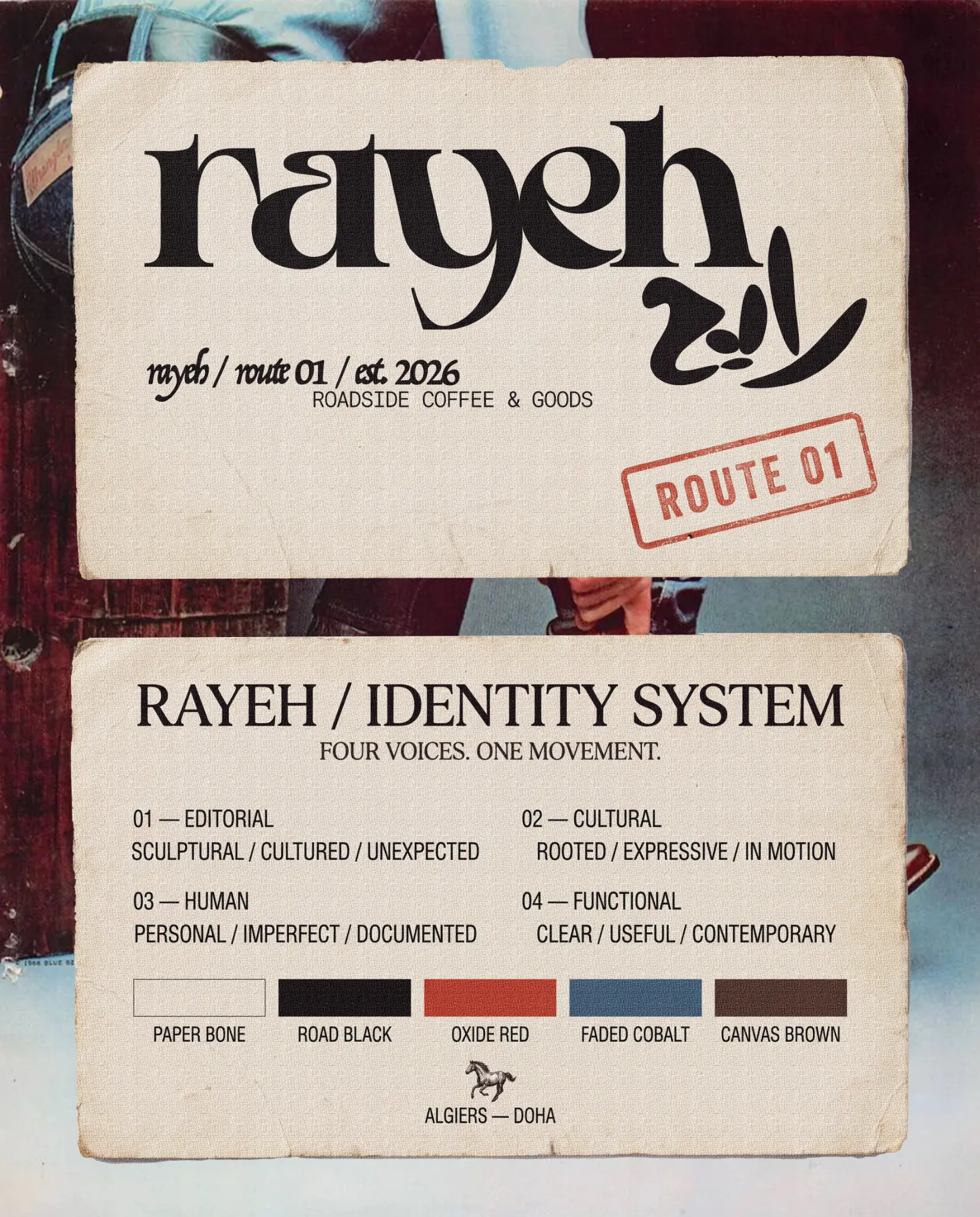
Four voices—editorial, cultural, human and functional—are grounded in paper bone, road black, oxide red, faded cobalt and canvas brown.
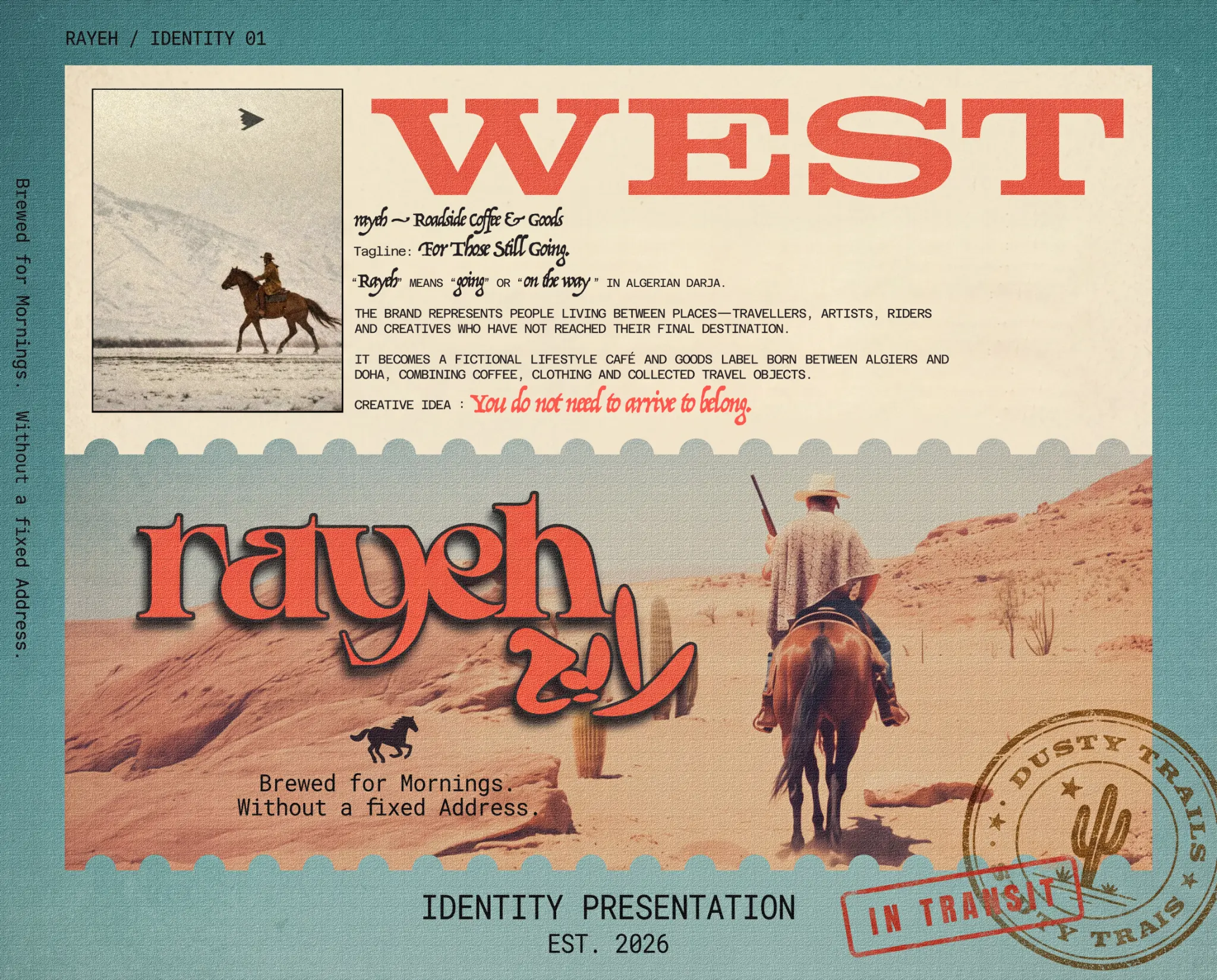
Rayeh means going or on the way in Algerian Darja; the world belongs to people living between places.
What holds
it together.
A project becomes a system when each choice supports the same position—and still works when the format changes.
01LANGUAGE
The name begins in motion
Rayeh carries action, intention and ambiguity in Algerian Darja, so the verbal identity already contains the emotional position.
02ROUTE
Two cities become one address
Coordinates, Route 01 and the horse signal connect Algiers and Doha as a repeatable navigation system rather than a decorative travel theme.
03MATERIAL
The system has to be handled
Paper grain, canvas, embroidery, bottle labels, caps and cards make the world credible through physical use—not only through campaign imagery.
The system
has to travel.
Identity is tested where people actually meet it: on a shelf, in a hand, across an image, inside a presentation or through a space.
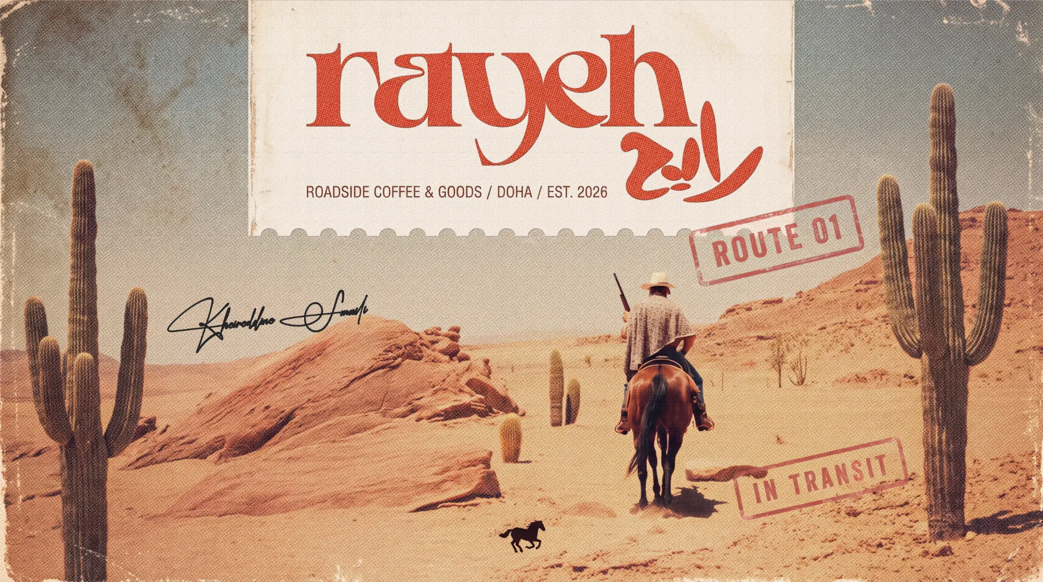
Algiers and Doha meet through route mythology, collected objects and a visual language built for transit.
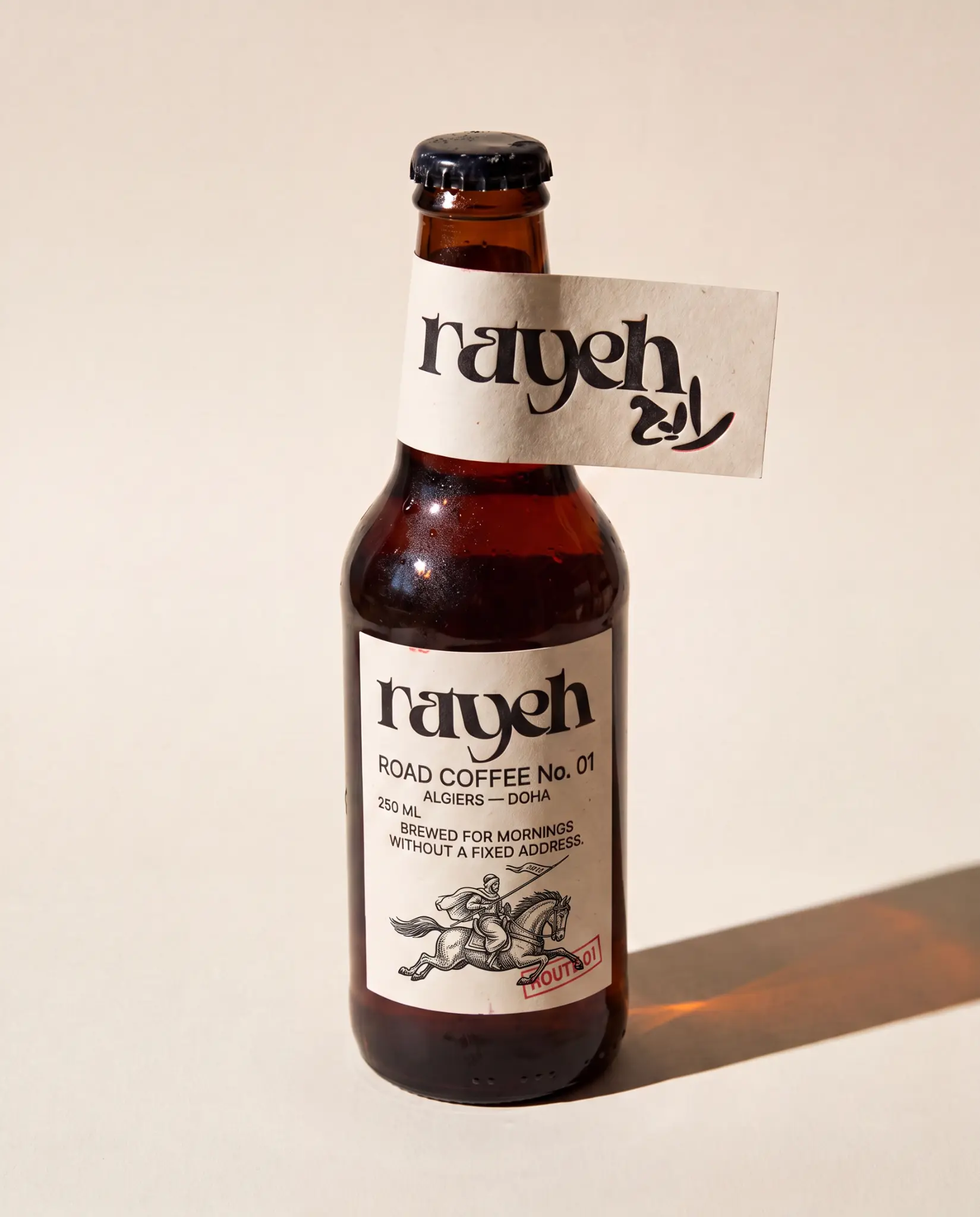
The road coffee bottle turns the identity into a held object for mornings without a fixed address.
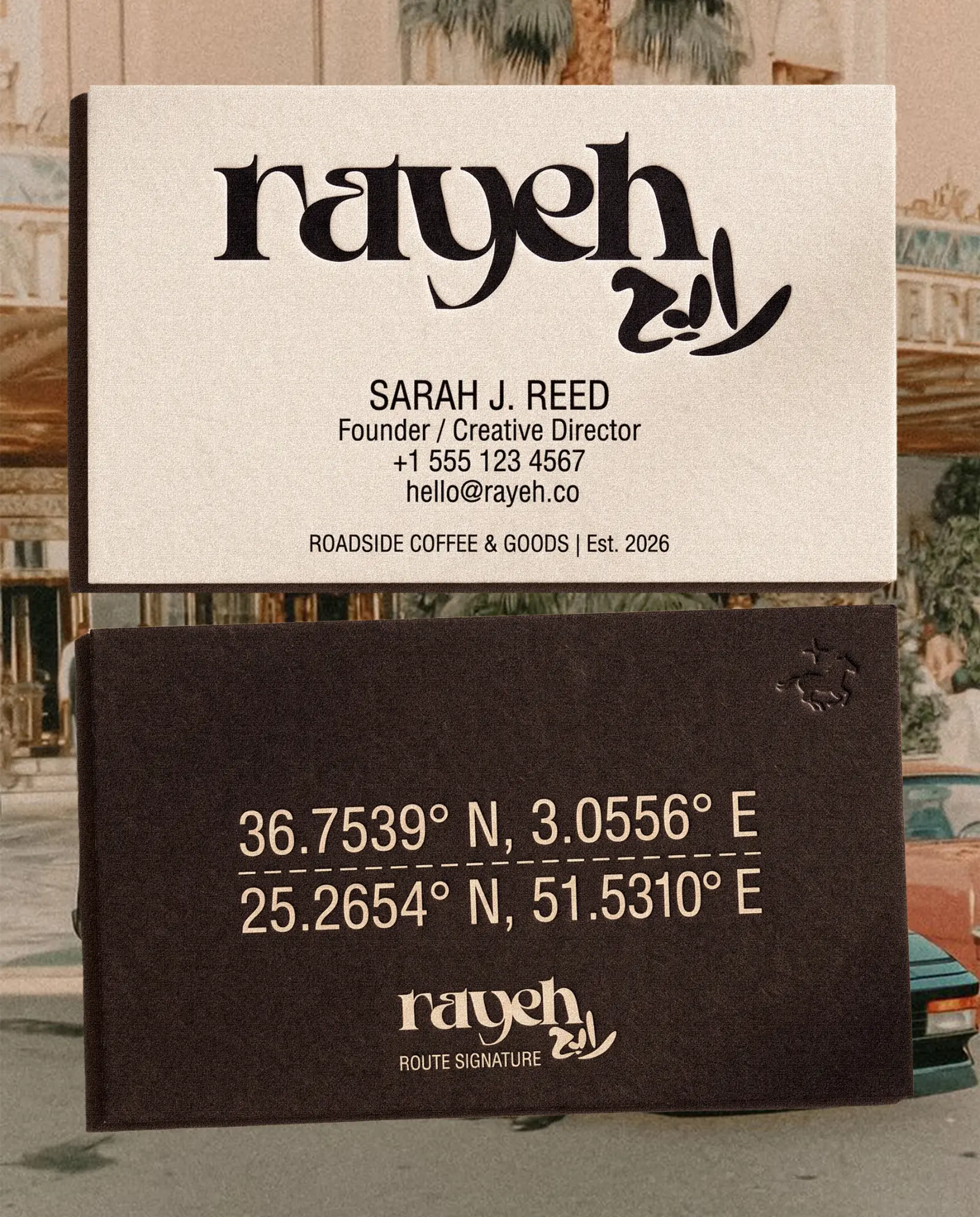
Coordinates connect Algiers and Doha, making movement part of the practical identity system.
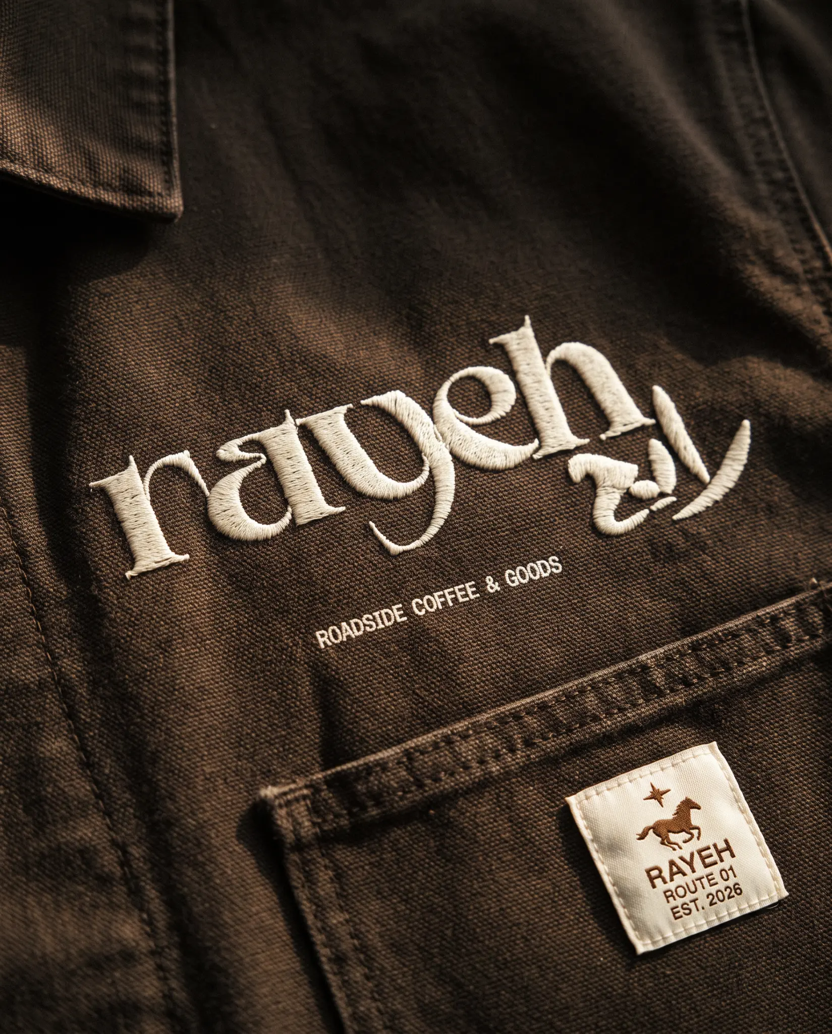
The mark becomes physical through dense embroidery, washed canvas and utilitarian garment construction.
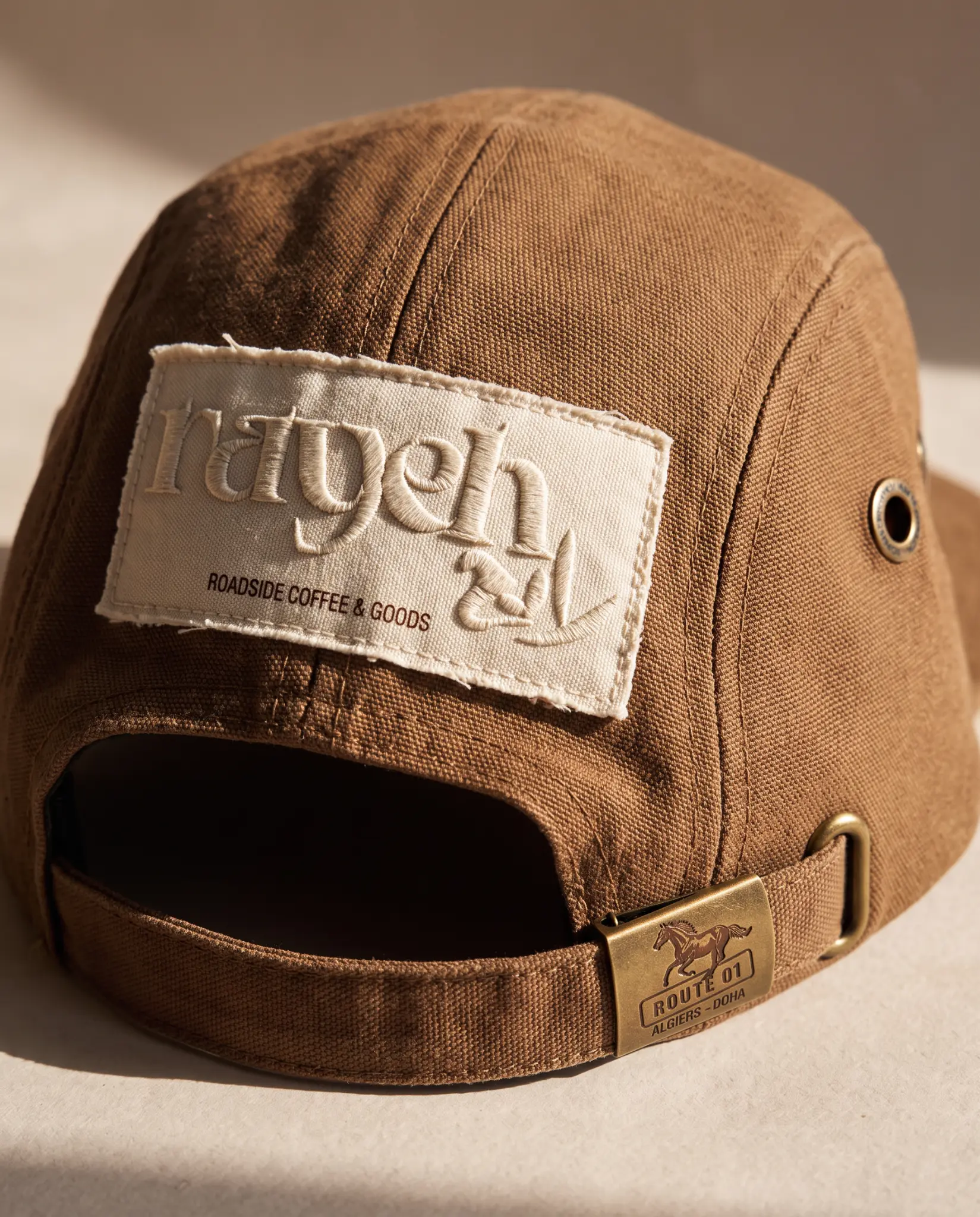
Route patches and hardware make the travel code feel manufactured rather than merely styled.
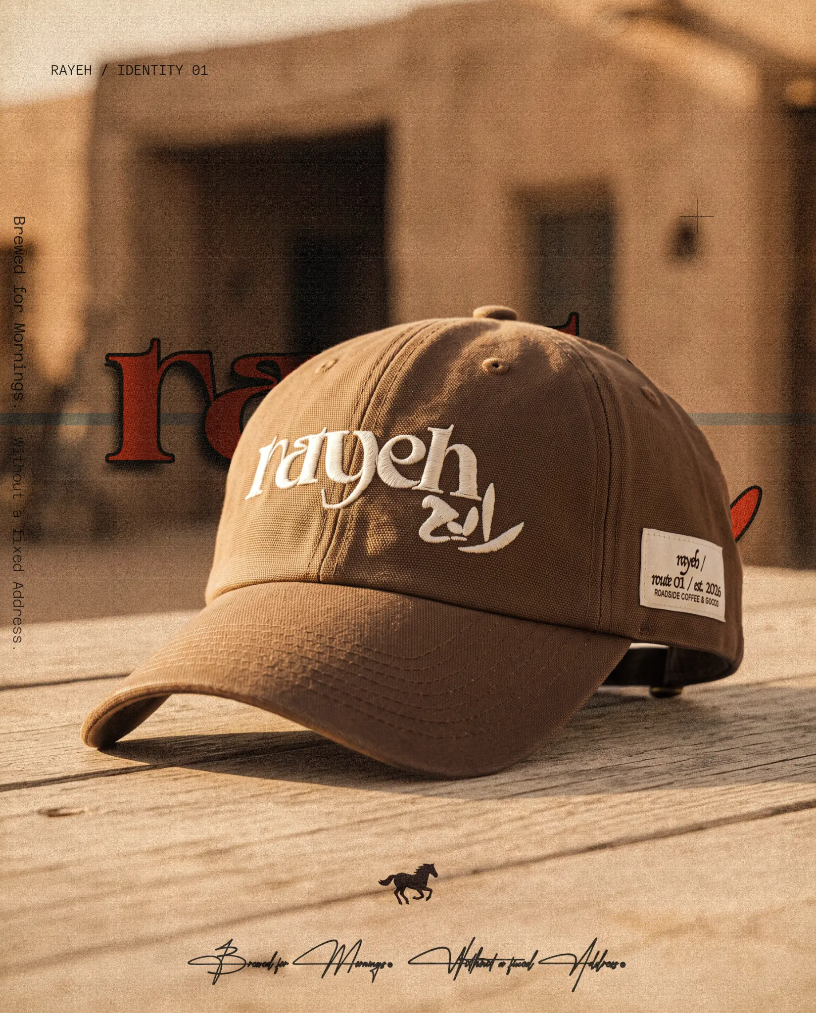
Product detail, atmosphere and the travelling voice meet inside one application frame.
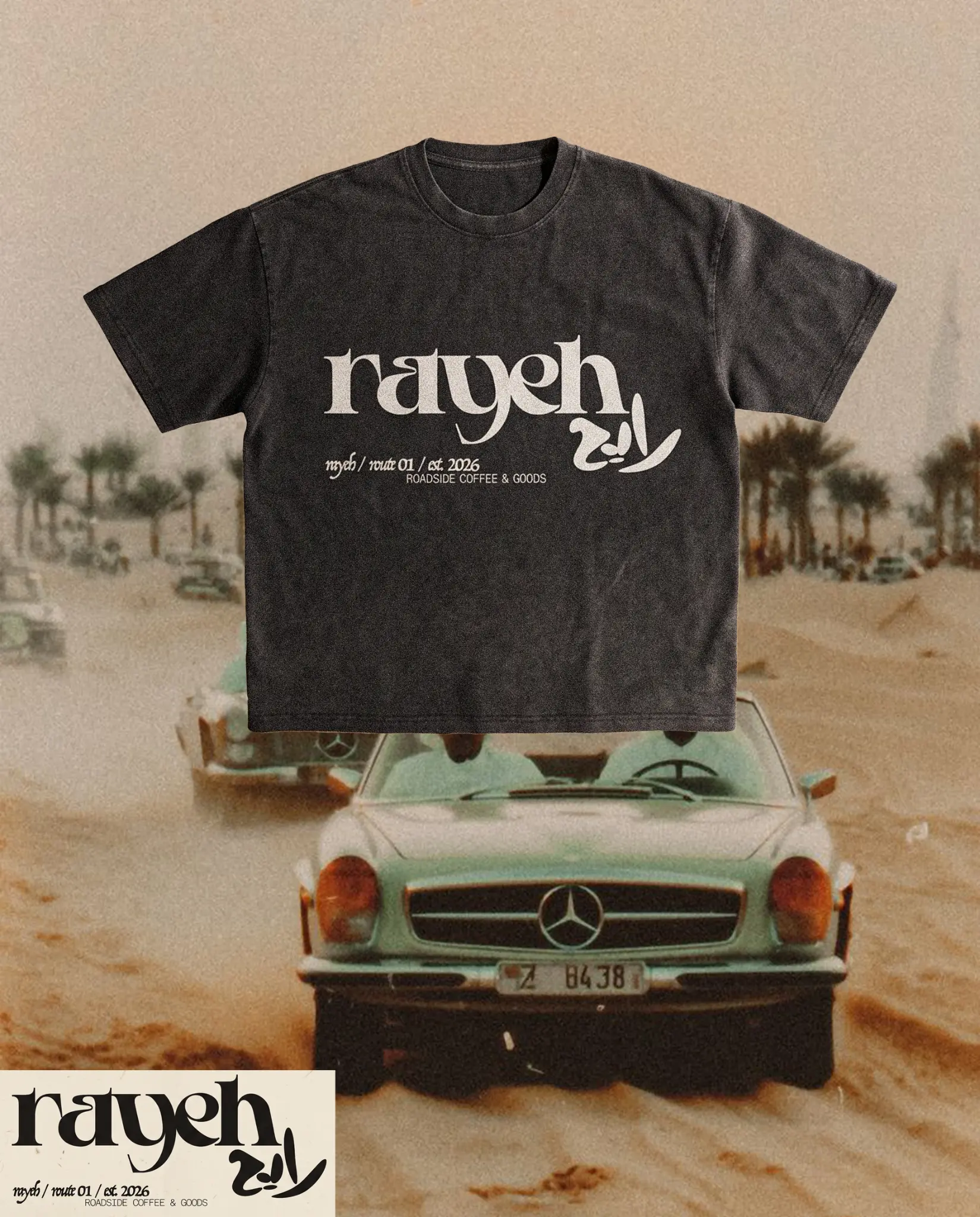
The bilingual lockup moves onto a worn garment without losing hierarchy or character.
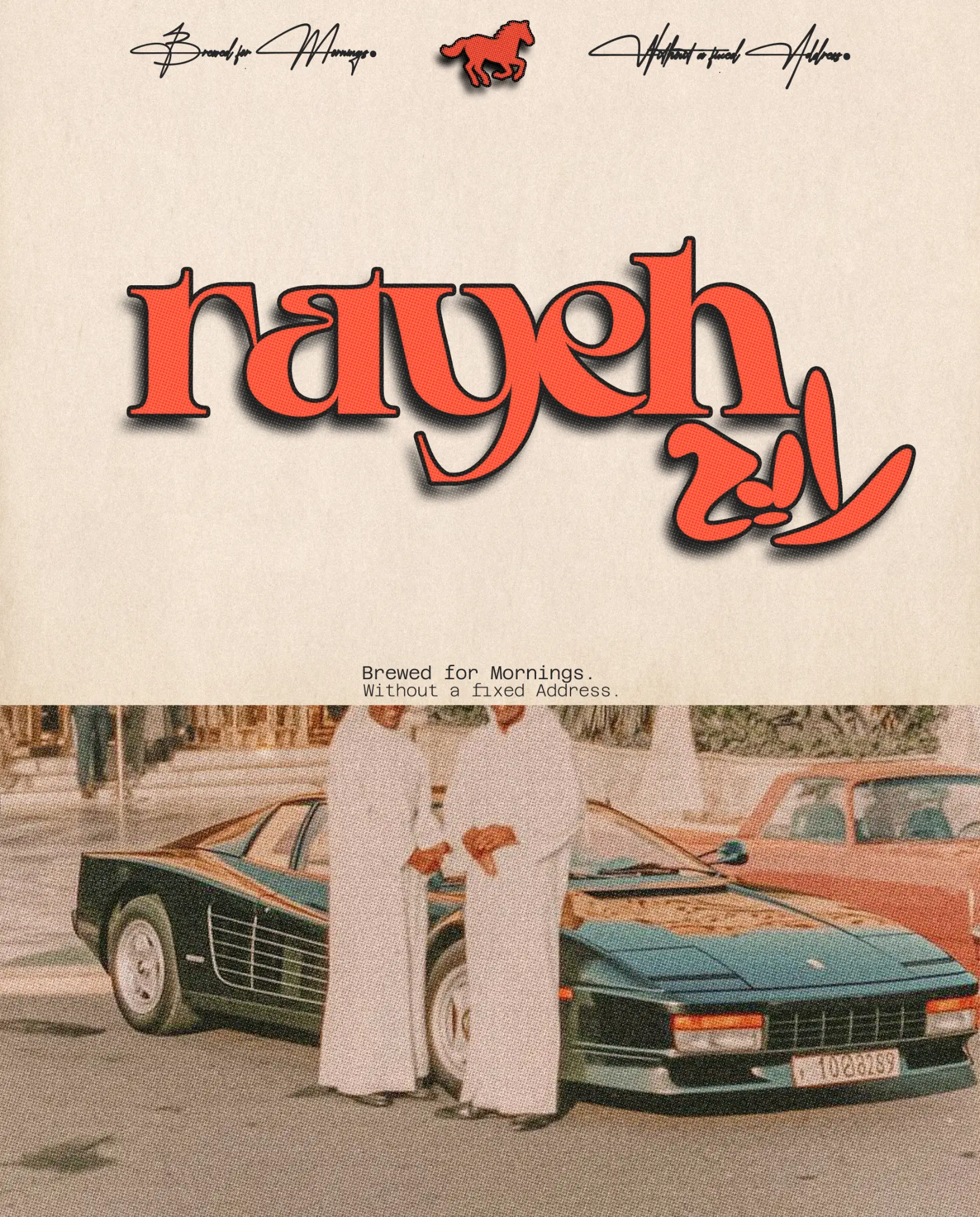
Cars, street texture and oxide red extend the identity into a lived roadside culture.
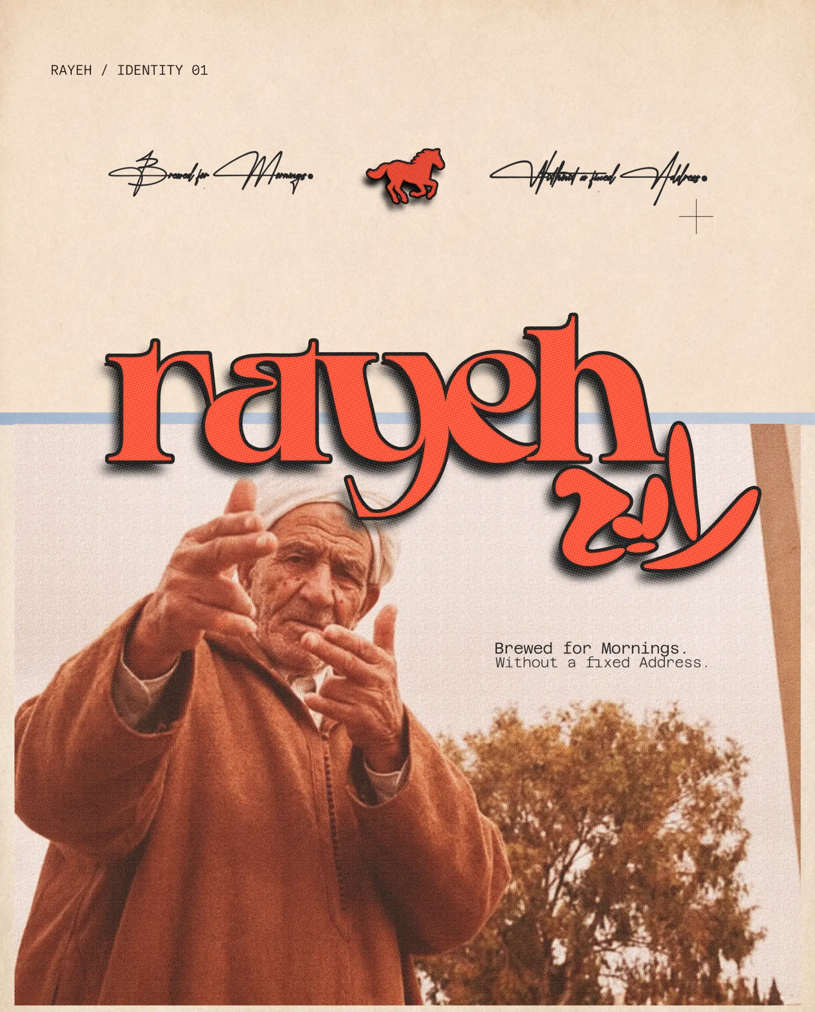
A human figure brings the world back to imperfect, expressive movement.
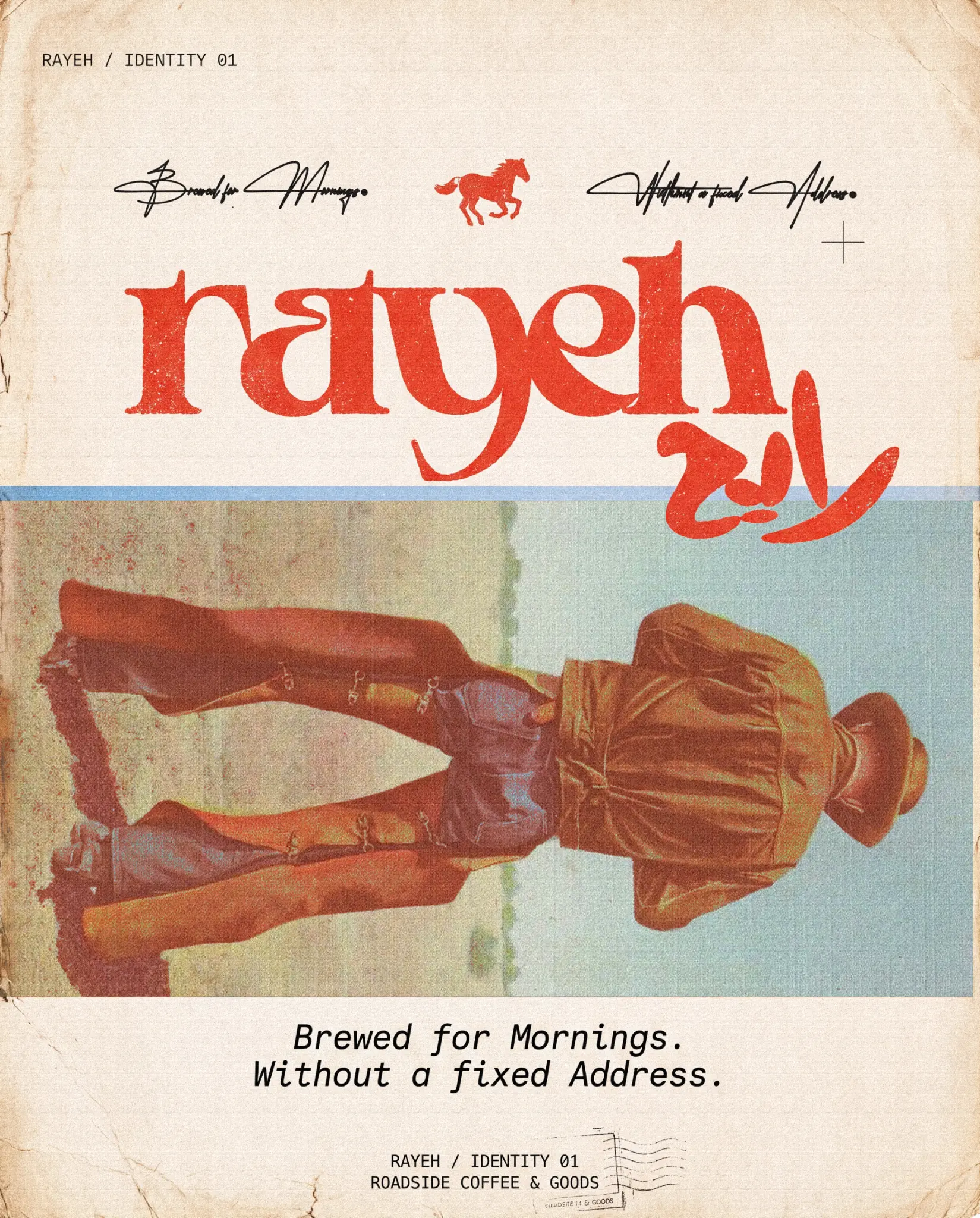
Editorial collage turns the campaign into a document of people still going.
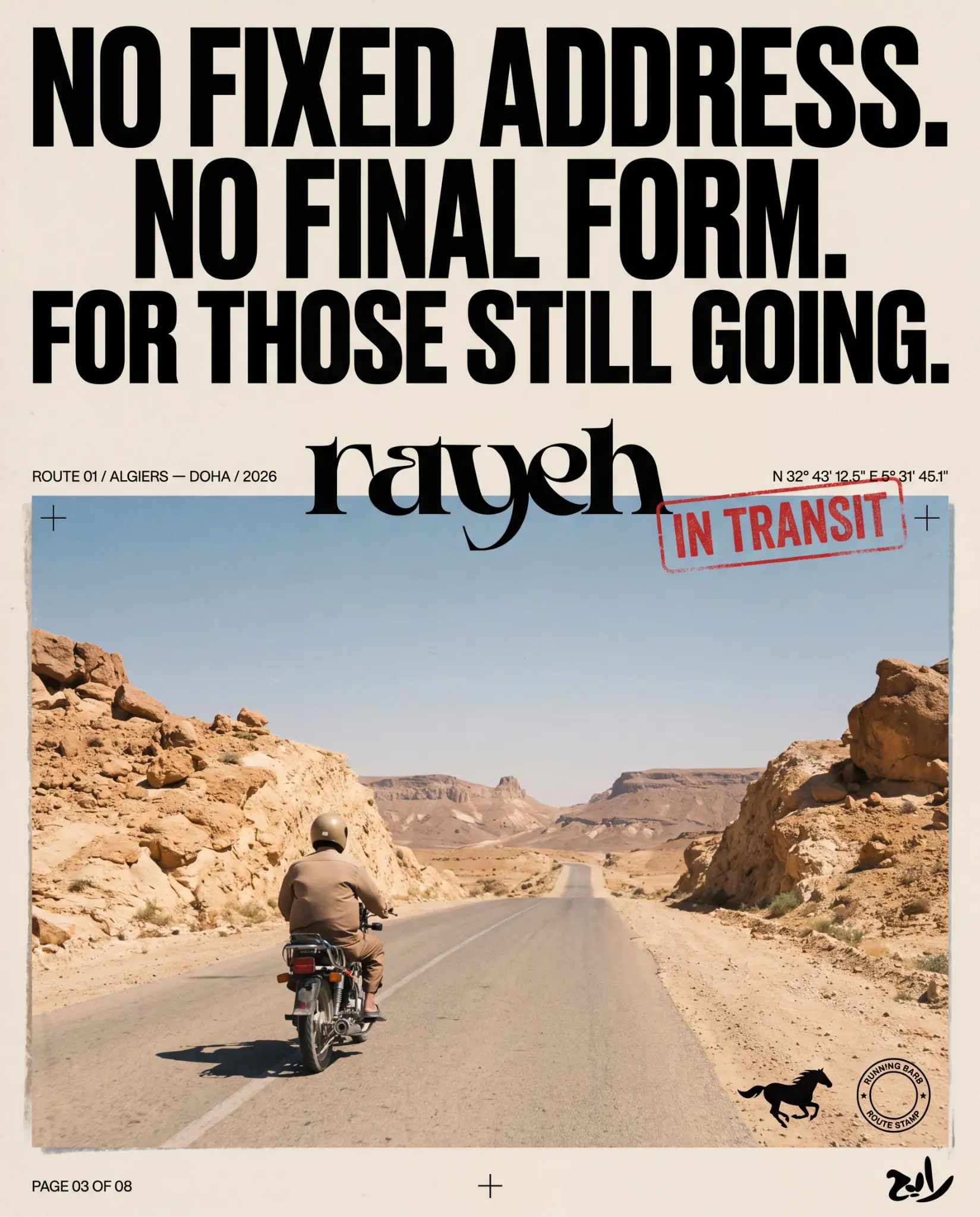
No fixed address. No final form. For those still going.
01Research02Naming03Bilingual identity04Packaging05Garment applications06Editorial system07Campaign direction
04 / POSITION AFTER THE WORK
A transportable lifestyle world with enough structure to operate as café, goods label, garment system and editorial campaign without losing its reason.
AUDIENCE
Travellers, artists, riders and culturally curious coffee and lifestyle audiences
GEOGRAPHY
Algiers—Doha / Route 01
STATUS
Independent brand world / identity and launch direction
AUTHORSHIP
Independent world / shaped through the KAI methodology
Belonging does not always begin with arrival. Sometimes it forms through the things we carry, drink and wear while moving.
The human lens informs the creative choices; it is not presented as a claim that design can control behaviour.
06 / ROLE
Research · Naming · Identity · Packaging · Art direction
PROJECT TYPE
Independent brand world
PROJECT CREDIT
View the extended visual case on Behance↗Kheireddine Smaili
Independent concept / KAI methodology