A Maven Studio beauty-salon rebrand connecting visual identity, service communication and spatial presence.
CASE 08Identity / BeautyClient work / Maven Studio
Belleza Club
Rebranding Beauty Ritual
A salon rebrand creating a clearer emotional and commercial language across identity, space and communication.
- Year
- 2025
- Origin
- Created for a client under Maven Studio
- Role
- Identity · Applications · Direction
The reason
for the work.
“Beauty systems work when aspiration still feels inhabitable.”
Create a premium beauty language that feels desirable but still close enough for customers to inhabit repeatedly.
Warm colour, controlled typography and ritual-focused applications replace generic glamour with a more coherent emotional system.
A sequence of decisions, shown through the actual work.
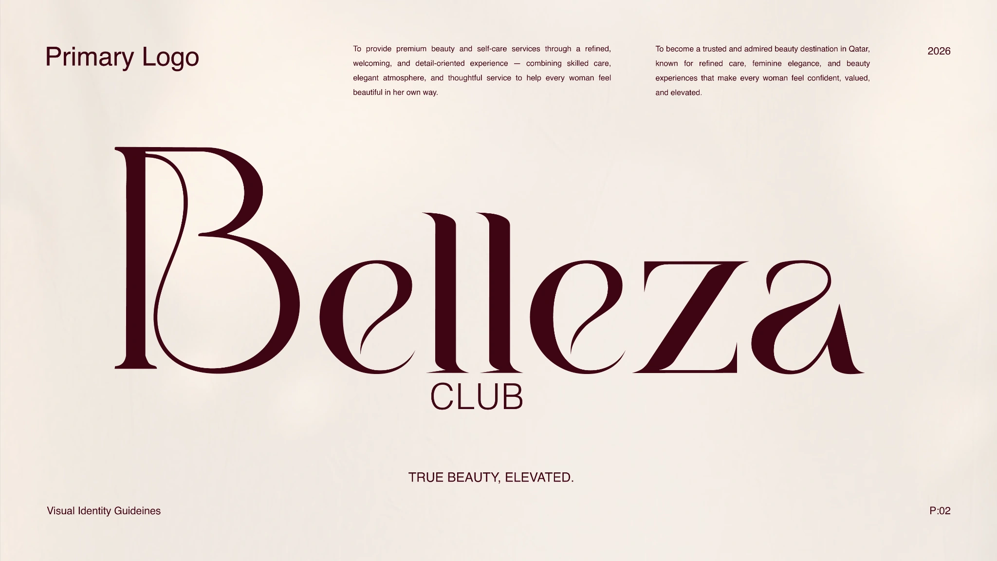
A slender custom wordmark gives the salon a distinct and composed voice.
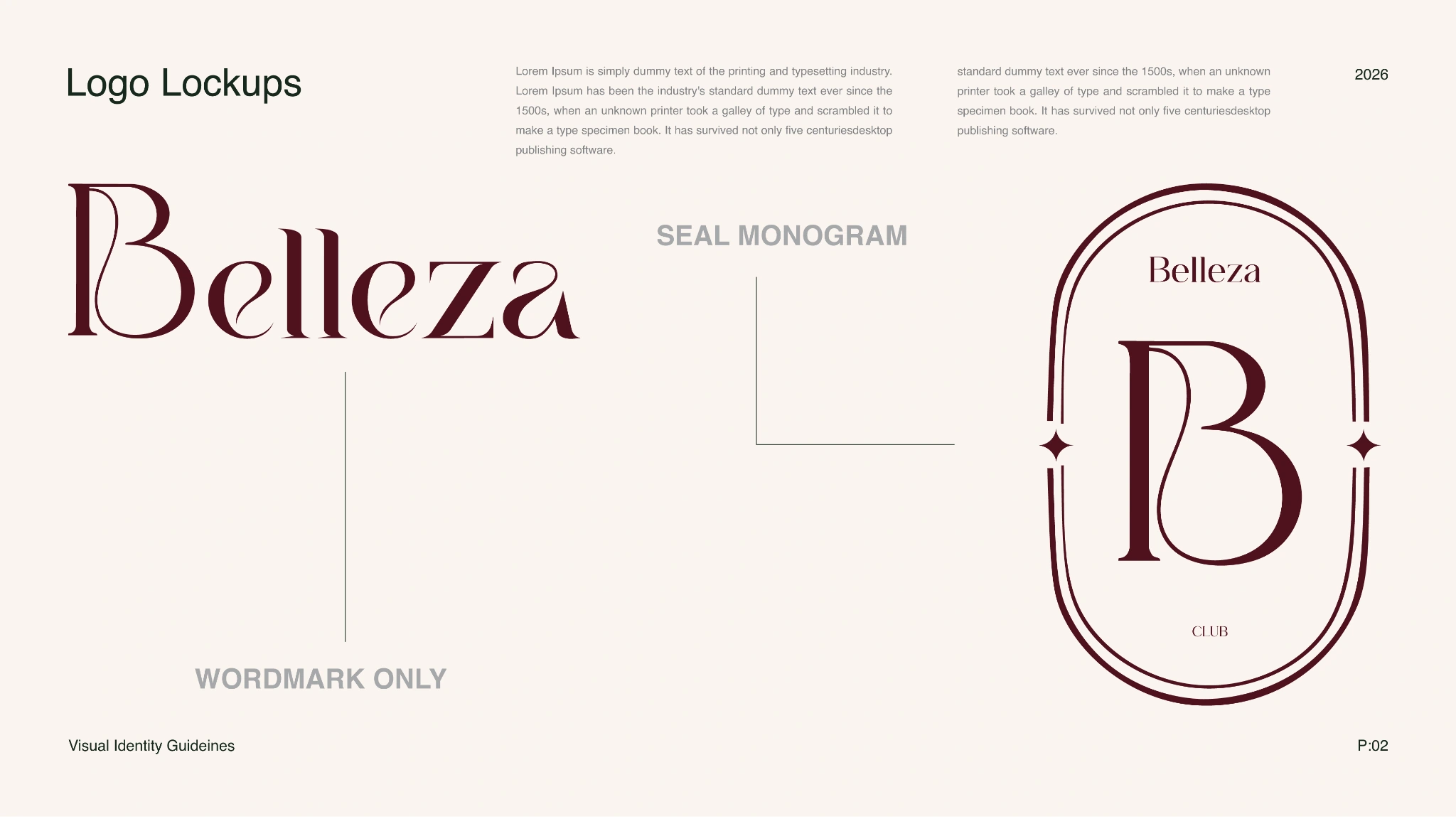
Wordmark, monogram and seal create a flexible family for different scales and surfaces.
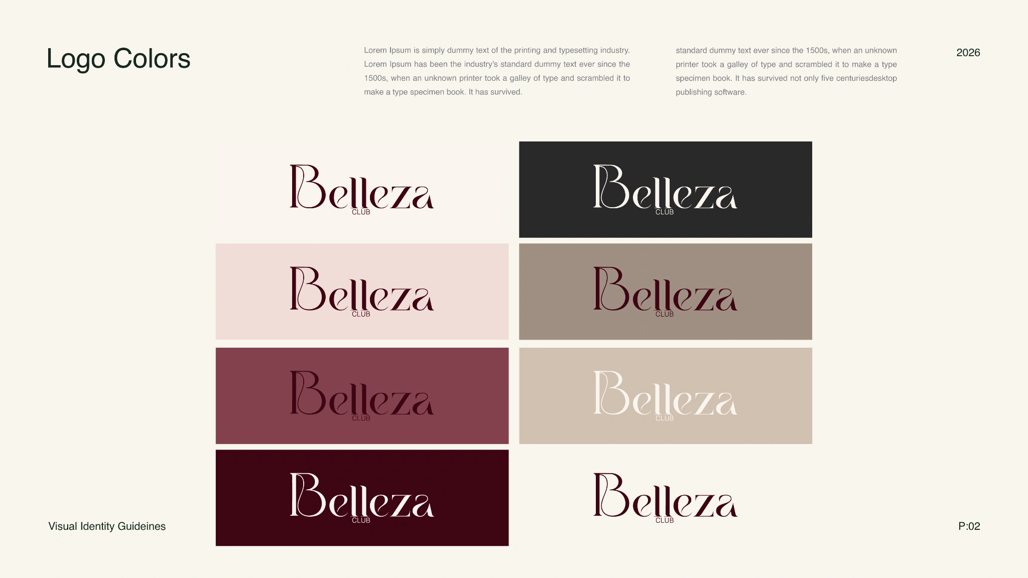
Warm neutrals and deeper accents let the identity move between calm service and premium expression.
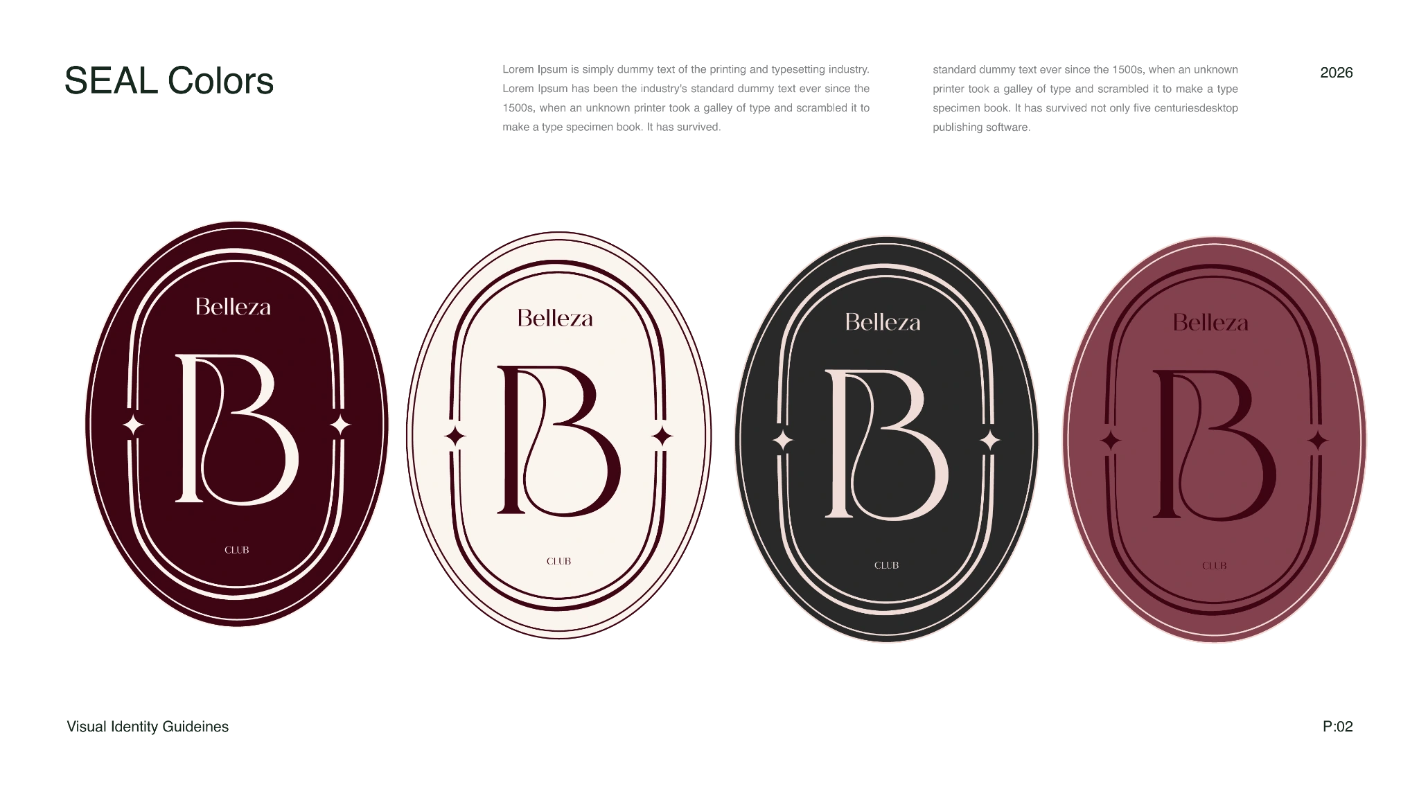
The compact seal preserves recognition when the full wordmark would be too delicate.
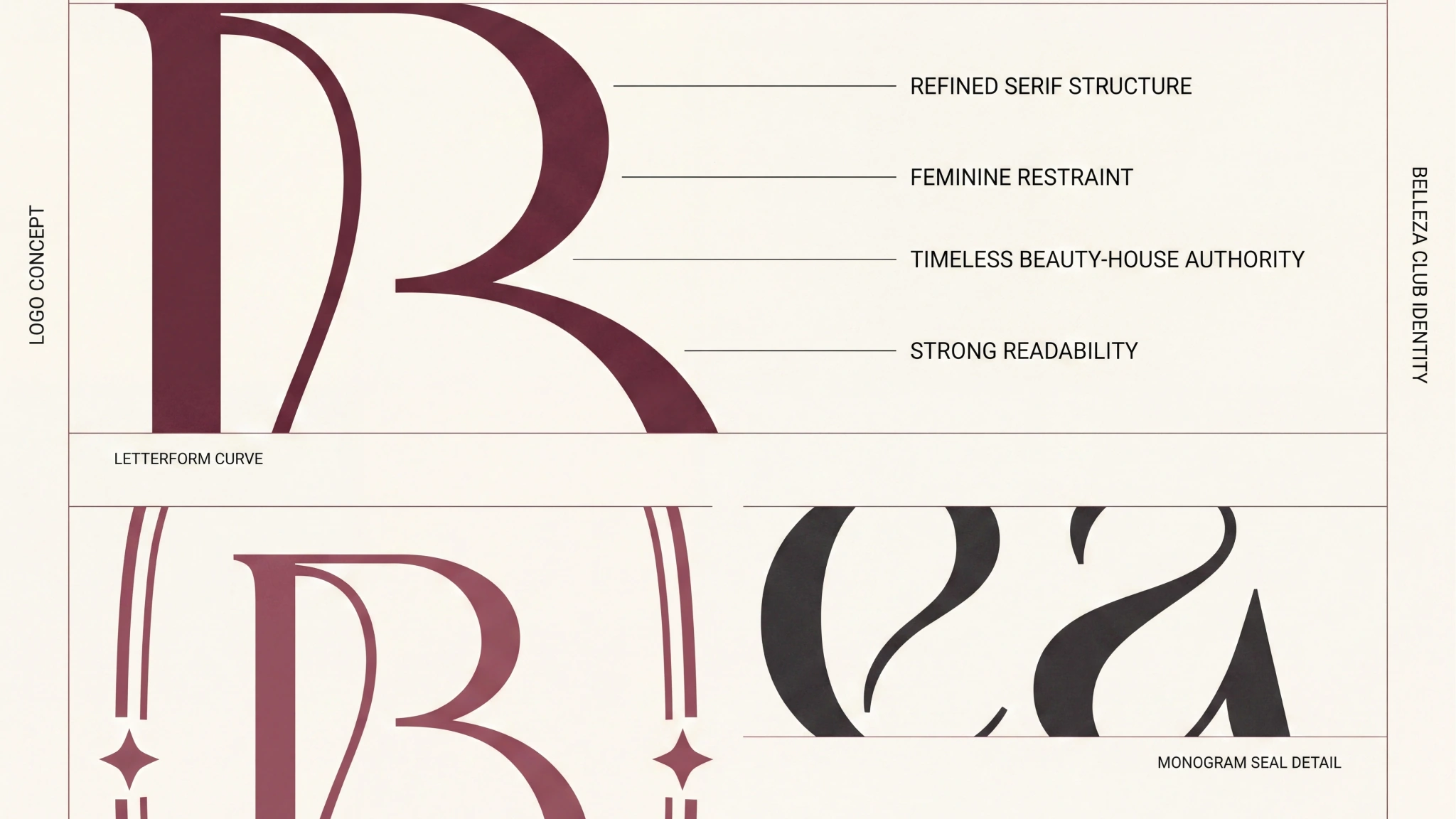
Construction and spacing rules keep the signature consistent across production formats.
What holds
it together.
A project becomes a system when each choice supports the same position—and still works when the format changes.
01POSITION
Confidence over glamour
The direction centres self-possession and routine instead of relying on beauty-industry spectacle.
02TEMPERATURE
Warmth makes luxury usable
A warm material palette gives premium signals a more approachable and inhabitable character.
03RITUAL
Repeat the experience
Applications are organised around recurring service moments so the identity works beyond announcement graphics.
The system
has to travel.
Identity is tested where people actually meet it: on a shelf, in a hand, across an image, inside a presentation or through a space.
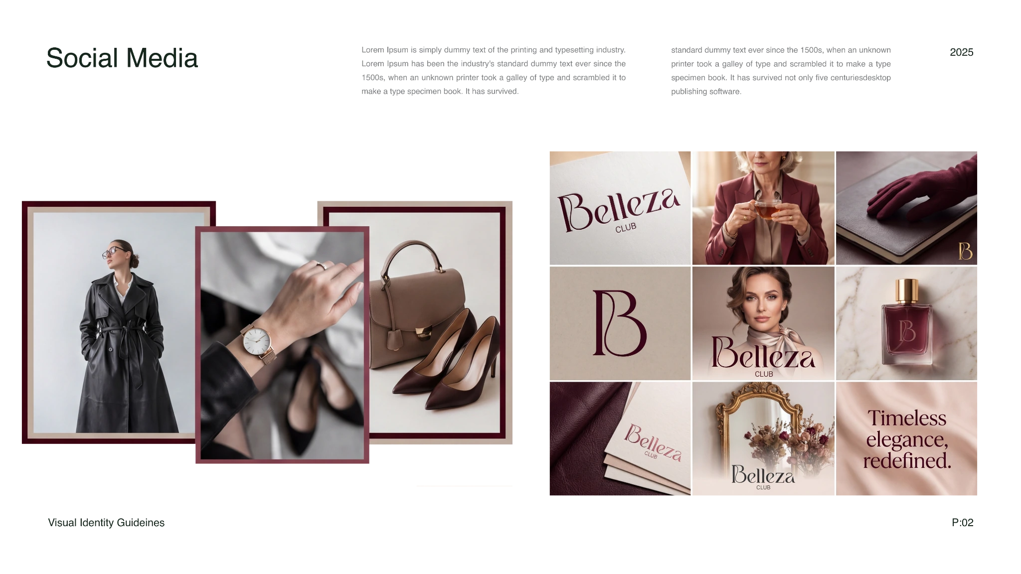
Campaign portraits, service details and typographic posts share one measured social rhythm.
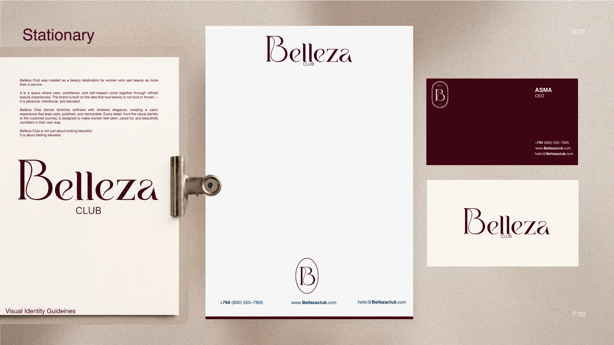
Letterhead, cards and service communication carry the rebrand into daily operations.
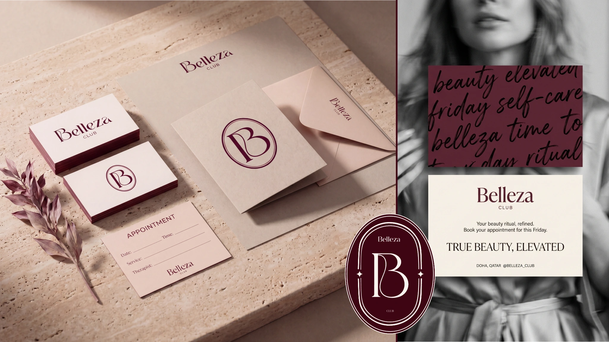
The printed suite uses restrained placement and material contrast to keep the identity tactile.
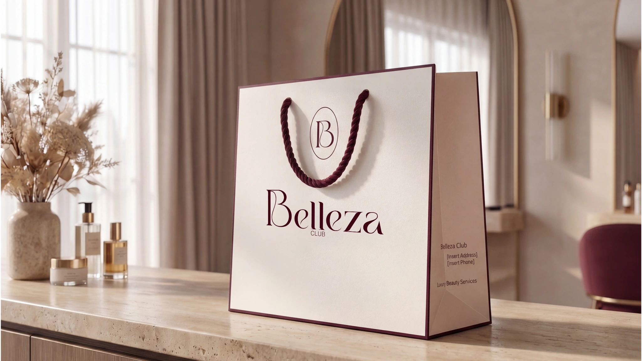
The wordmark remains clear and confident on a simple customer-facing object.
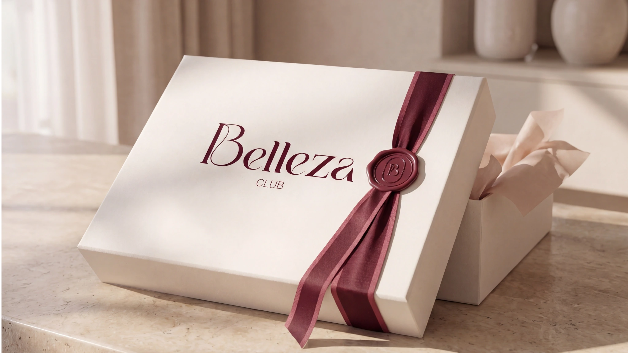
Ribbon and seal turn a small handover moment into part of the salon ritual.
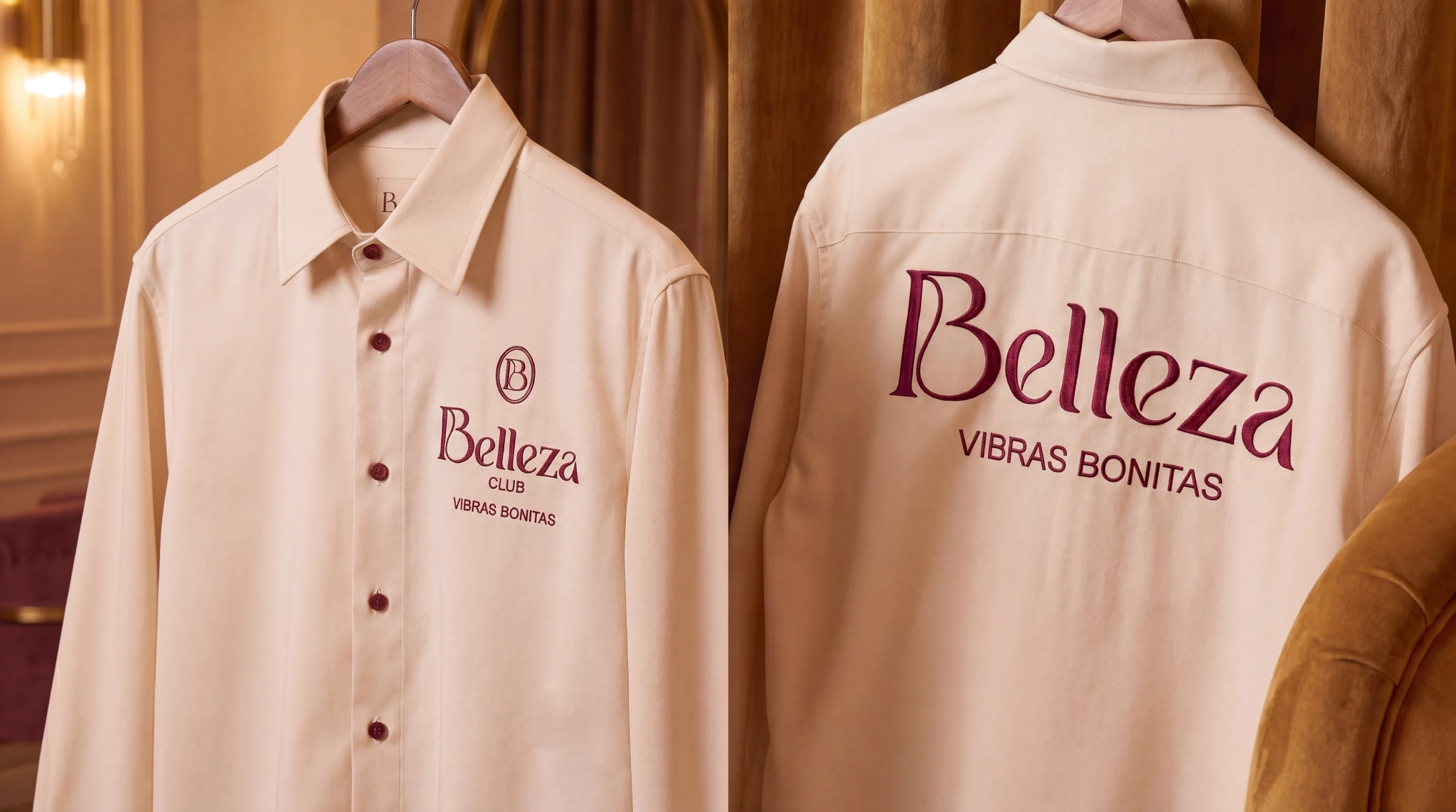
The monogram moves onto staff clothing without losing its light, composed character.
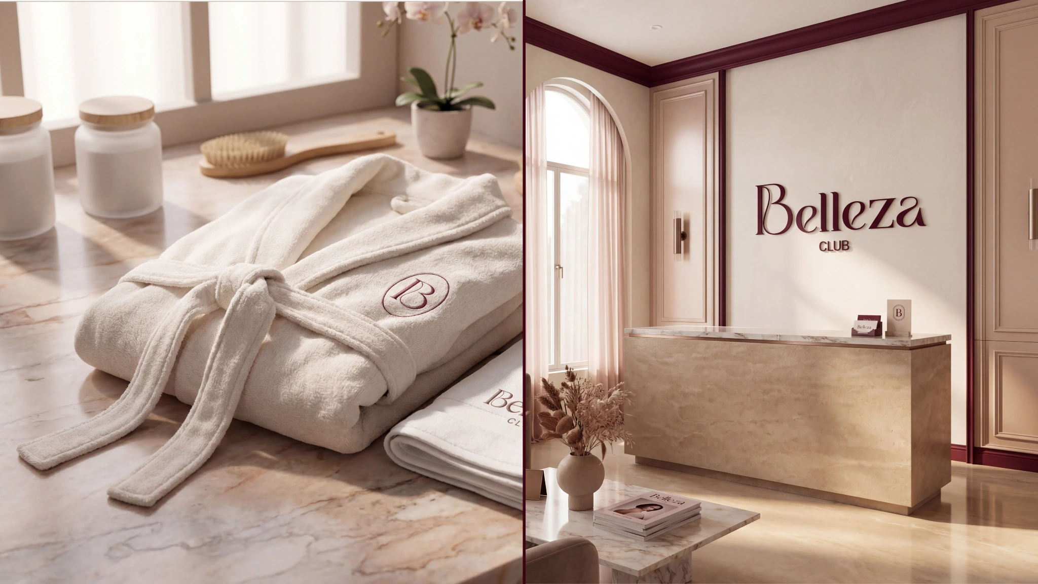
Textiles and interior touchpoints extend the same warm neutral system through the space.
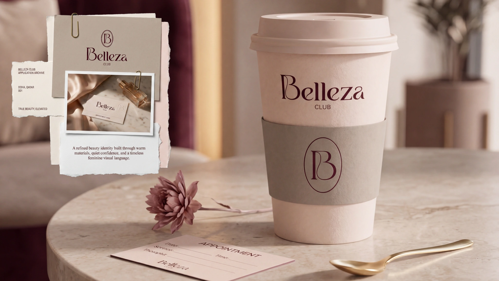
The identity stays legible across cups and smaller hospitality pieces used during service.
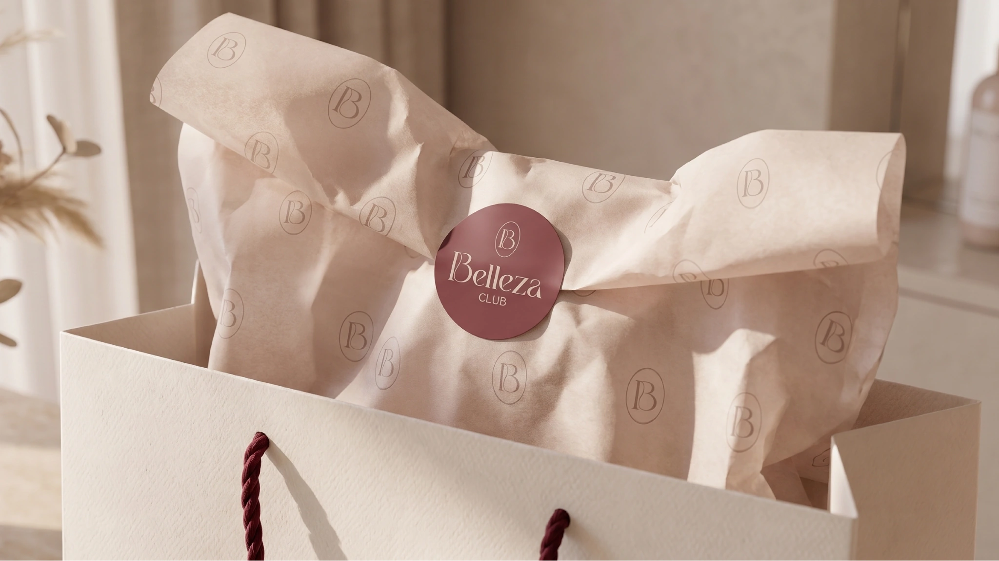
Tissue, seal and bag close the case as one coordinated take-away system.
01Rebrand system02Service communication03Stationery04Social direction05Spatial applications06Presentation
04 / POSITION AFTER THE WORK
A clearer salon identity designed to connect confidence, ritual and commercial consistency across physical and communication touchpoints.
AUDIENCE
Beauty and salon customers / membership community
GEOGRAPHY
Doha, Qatar
STATUS
Rebrand development / Maven Studio client work
AUTHORSHIP
Created for a client under Maven Studio
Beauty loyalty grows when aspiration feels like a repeatable personal ritual, not a distant performance.
The human lens informs the creative choices; it is not presented as a claim that design can control behaviour.
06 / ROLE
Identity · Applications · Direction
PROJECT TYPE
Client work / Maven Studio
PROJECT CREDIT
View the extended visual case on Behance↗Maven Studio client work
Kheireddine Smaili / Brand & visual design