An independent functional-liquid concept treating every product as an input that produces a state, then leaves a visible signal.
CASE 10Identity / Functional goodsSelf-initiated concept
VSL
Functional Liquid System
A conceptual beverage system built around one sequence: every input creates a state, and every state leaves a signal. Packaging, campaign, digital and environmental applications follow that same philosophy.
- Year
- 2026
- Origin
- Independent world / creative direction through KAI MULTIVERSE®
- Role
- Concept · Identity · Packaging · Campaign
The reason
for the work.
“Every liquid is coded as a state—not sold as a flavour.”
Make product function immediately legible while keeping several states inside a single recognisable identity.
Functional states, compressed typography, technical mono information and grainy colour transitions form a modular system across product categories.
A sequence of decisions, shown through the actual work.
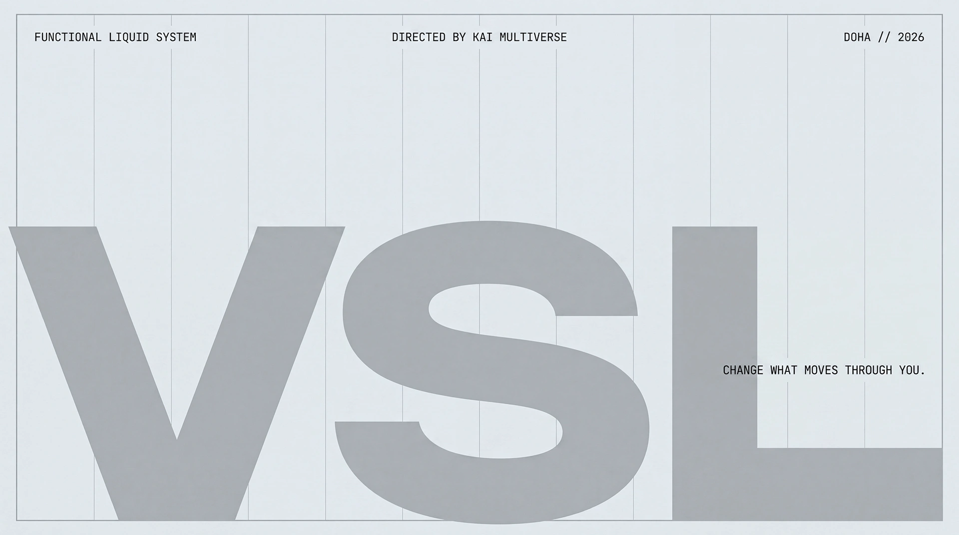
The identity opens with the VSL wordmark and a controlled technical grid.
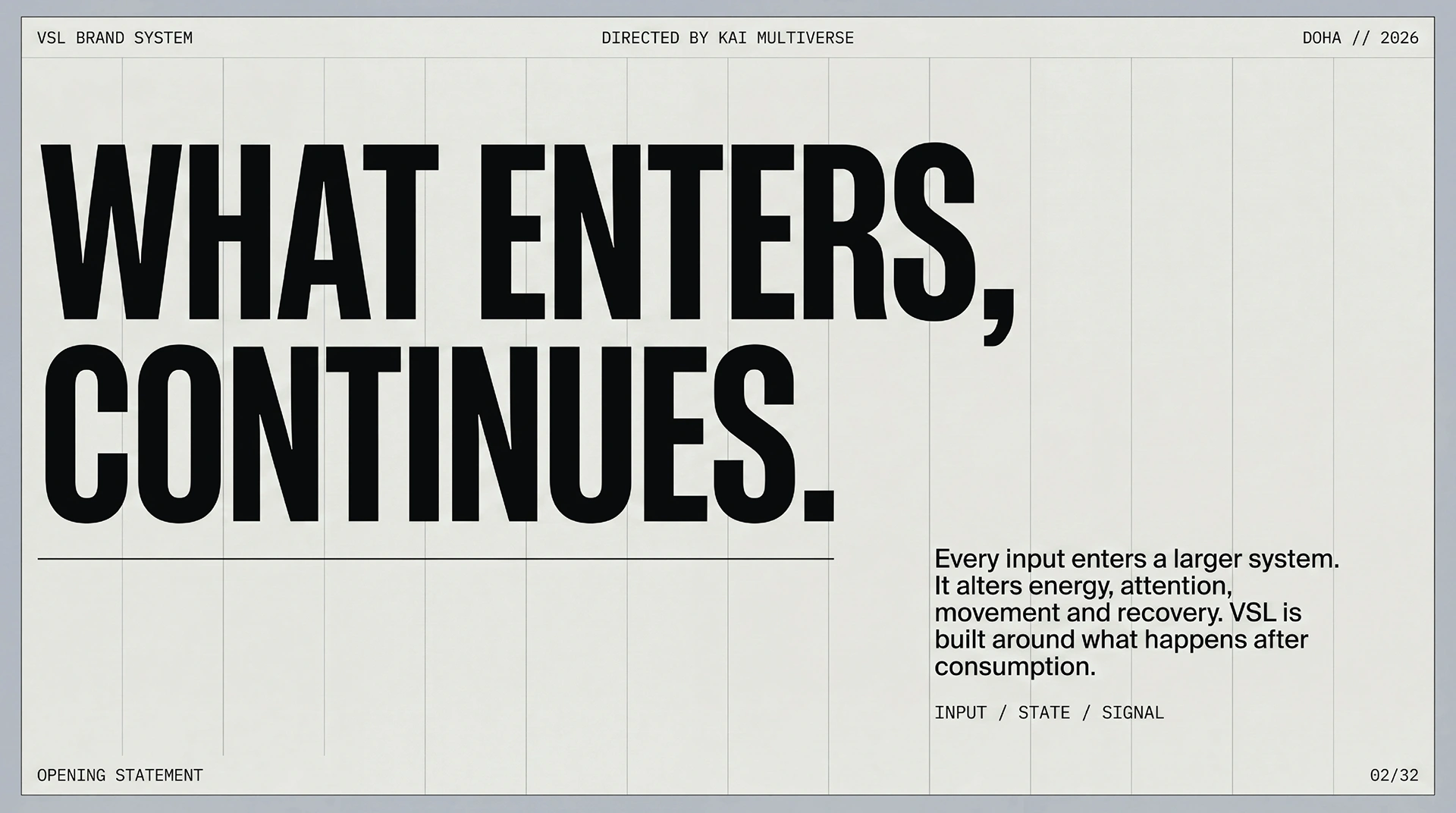
What enters, continues: the concept connects consumption with the state that follows.
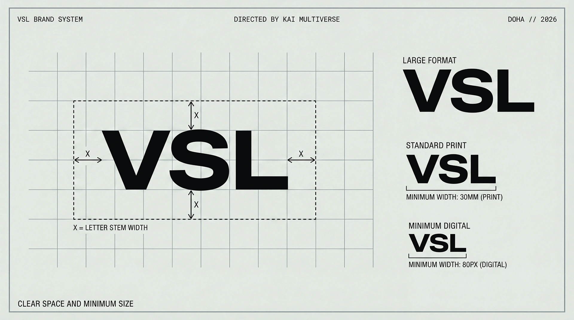
A measured wordmark system defines large, standard and minimum-scale applications.
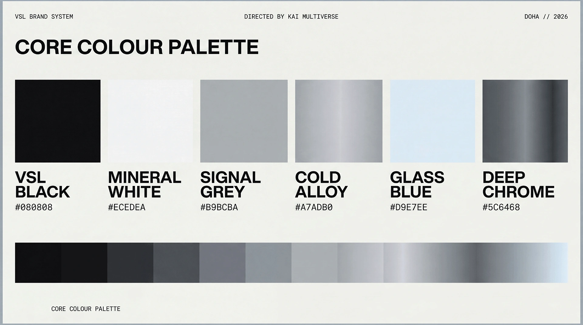
Mineral white, signal grey, black and cold metallic tones create the structural base.
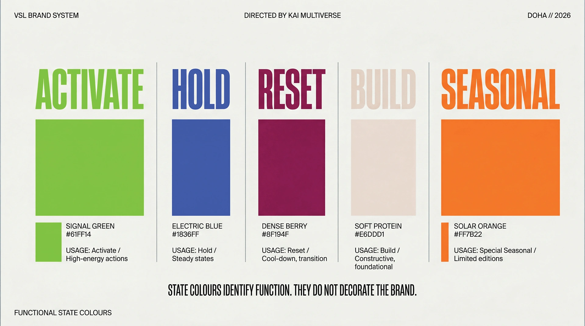
Activate, Hold, Reset, Build and Seasonal use colour to identify function.
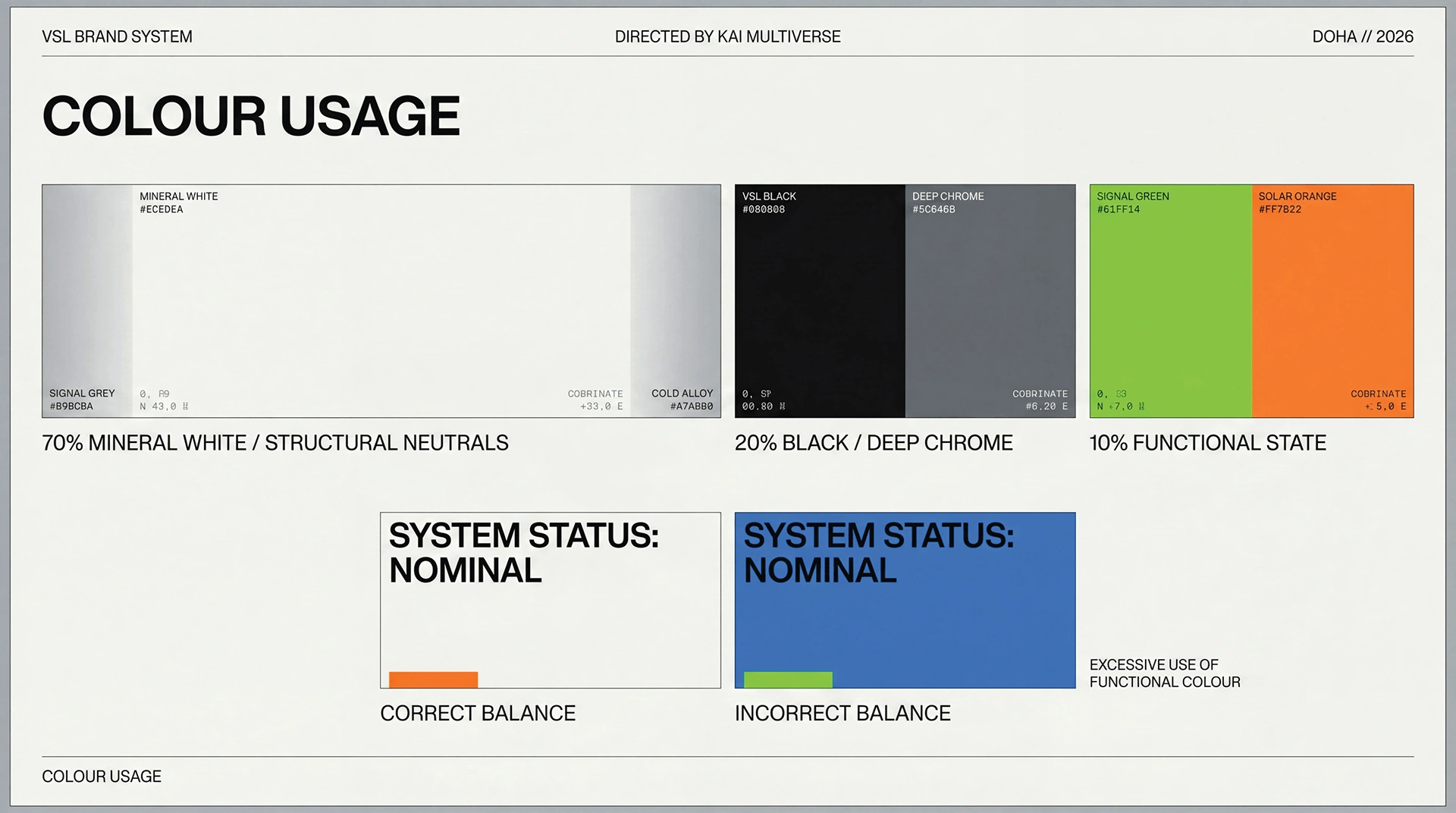
Neutral structure remains dominant so the functional colour can operate as a clear signal.
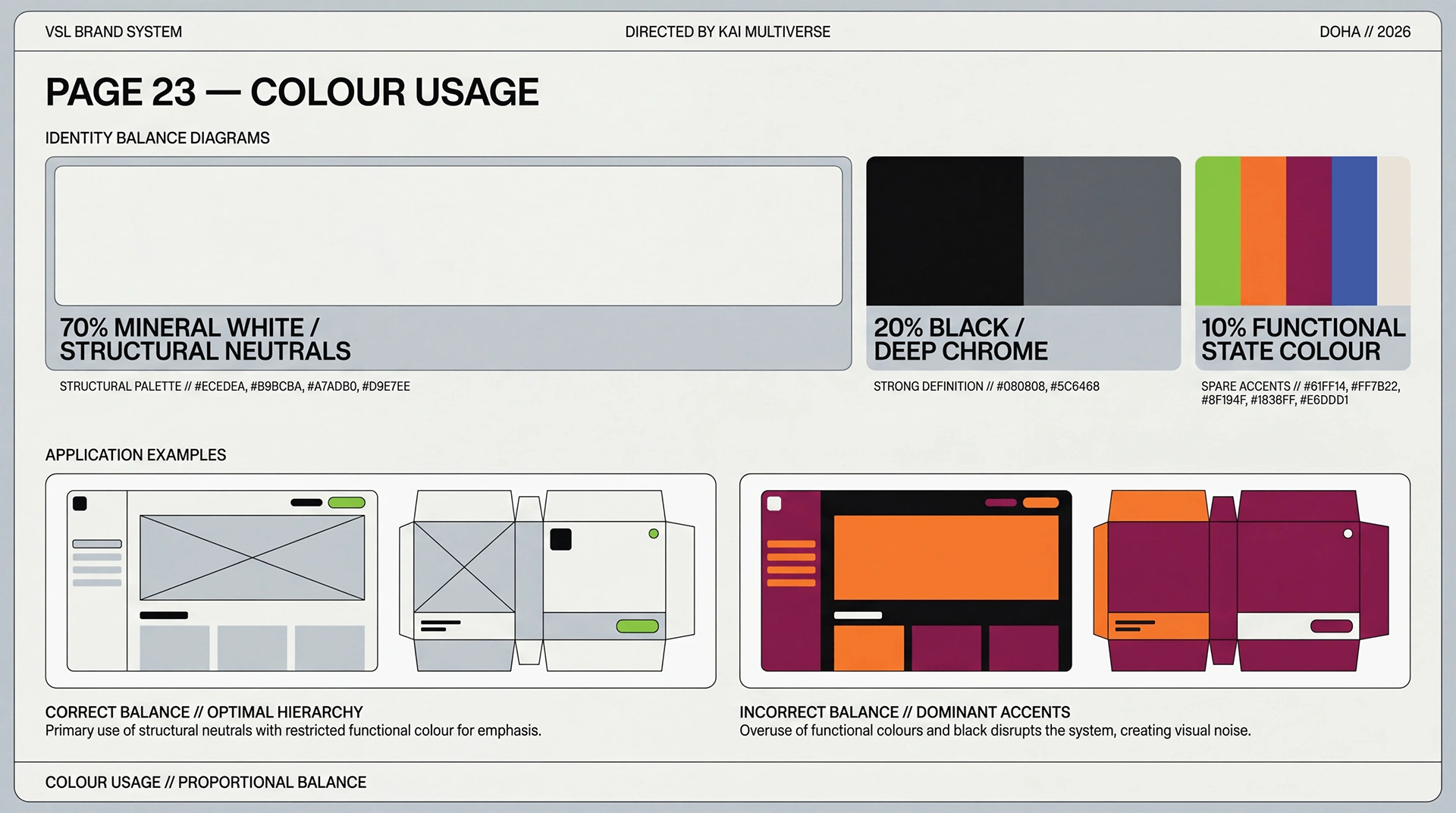
The colour rules are tested across packaging and graphic surfaces.
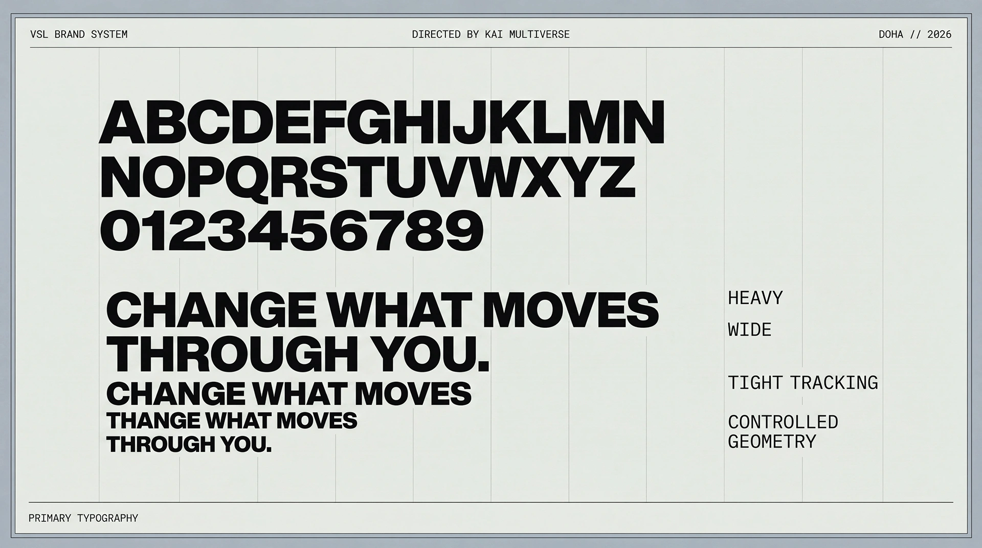
Heavy, closely set display type gives the language compact force.
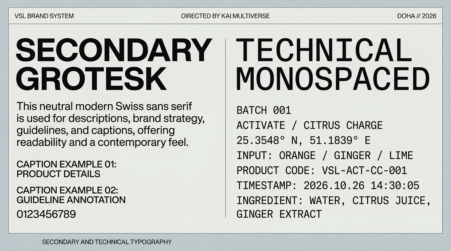
Grotesk text carries explanations; monospaced type separates batch and technical information.
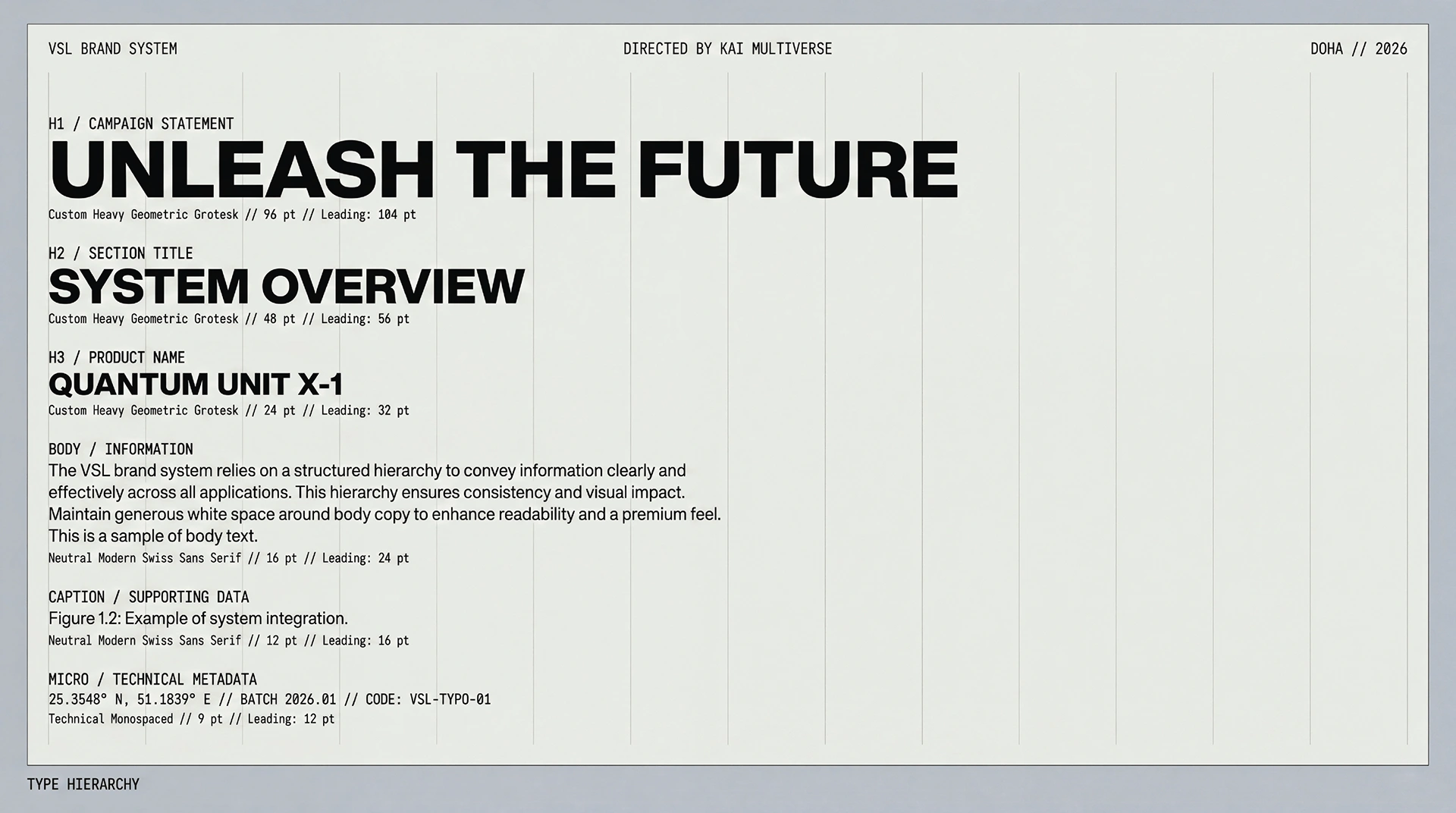
Scale, weight and spacing separate the main statement from supporting metadata.
What holds
it together.
A project becomes a system when each choice supports the same position—and still works when the format changes.
01ARCHITECTURE
State before flavour
Activate, Hold, Reset, Build and Seasonal give each state a name and a colour. These are the identity's organising concepts, not evidence of health benefits.
02TYPE
Signal and specification
A compressed display voice creates immediate recognition while mono typography carries technical information and batch logic.
03COLOUR
Conversion made visible
Grainy gradients behave like states in transition, allowing different products to vary without breaking the master identity.
The system
has to travel.
Identity is tested where people actually meet it: on a shelf, in a hand, across an image, inside a presentation or through a space.
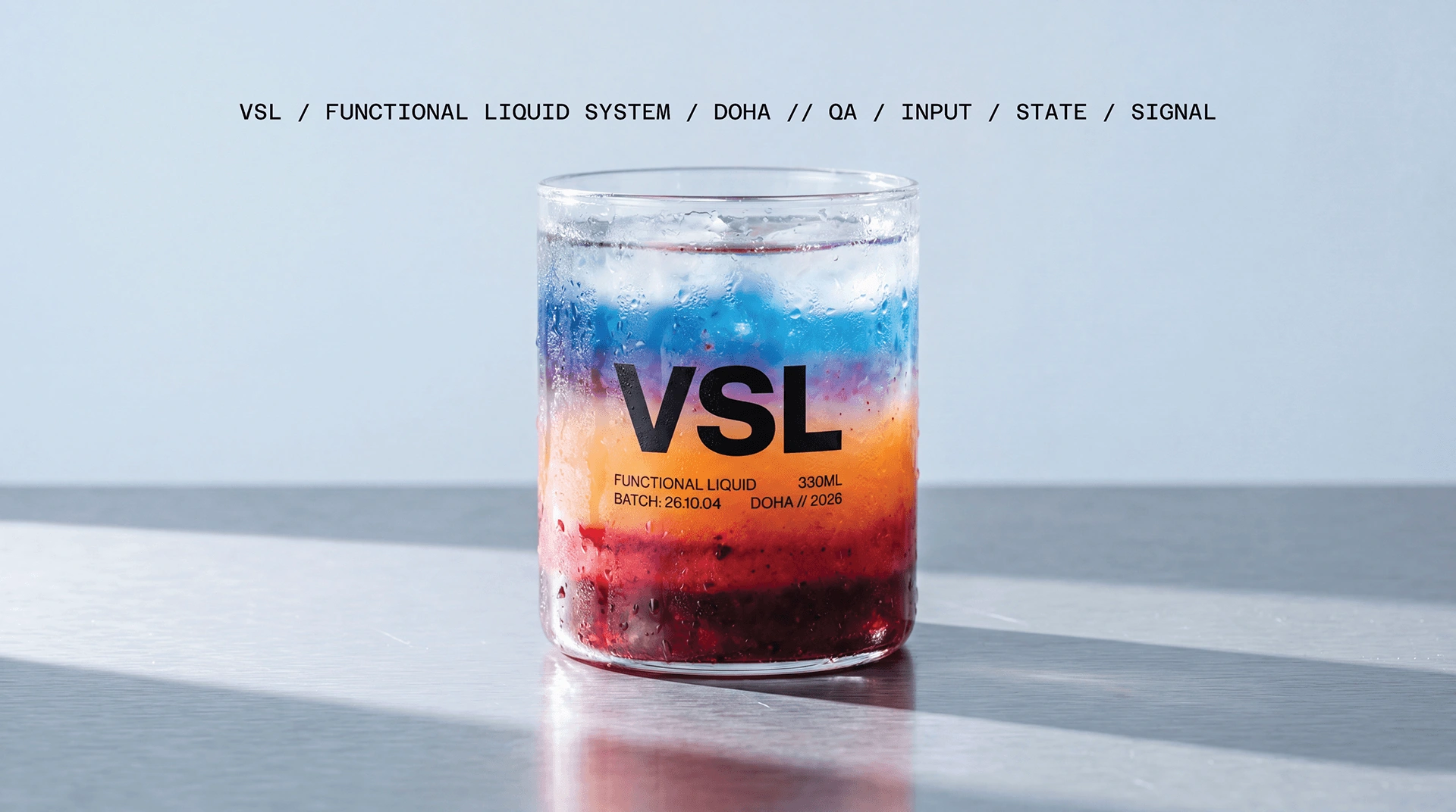
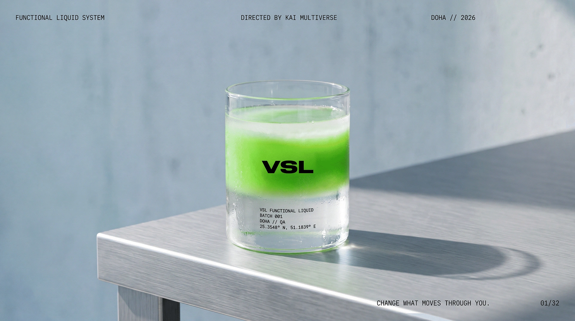
Layered colour and a transparent vessel turn the state concept into a product image.
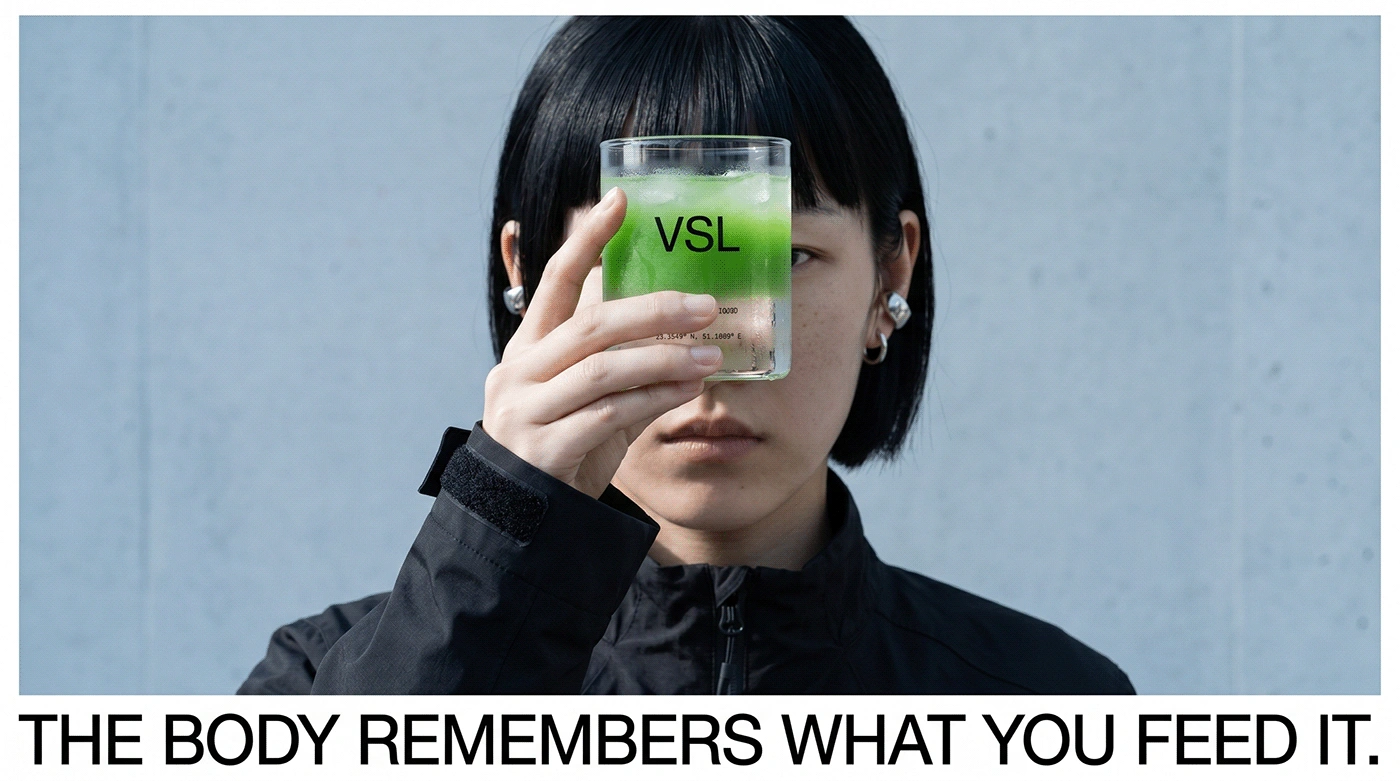
A direct portrait and held product connect the campaign statement to a human presence.
01Brand philosophy02Identity03Functional-state architecture04Colour system05Typography06Product imagery07Campaign
04 / POSITION AFTER THE WORK
A scalable visual and verbal grammar where product purpose, colour state and campaign behaviour all follow the same conversion logic.
AUDIENCE
Performance / wellness / design-conscious everyday consumers
GEOGRAPHY
Independent / global concept
STATUS
Self-initiated concept / case published
AUTHORSHIP
Independent world / creative direction through KAI MULTIVERSE®
People rarely consume only for flavour or utility; they choose the version of themselves they want to enter next.
The human lens informs the creative choices; it is not presented as a claim that design can control behaviour.
06 / ROLE
Concept · Identity · Packaging · Campaign
PROJECT TYPE
Self-initiated concept
PROJECT CREDIT
View the extended visual case on Behance↗Kheireddine Smaili
Independent concept / KAI methodology