A direct identity project for a Doha specialty-coffee brand positioned as an intimate daily luxury: culturally aware, materially rich and contemporary rather than ceremonial or generic.
CASE 02Identity / Specialty coffeeDirect client identity
ABREEZ
Velvet Nocturne
A cultivated specialty-coffee identity built in Doha through ritual, tactile material and character—moving beyond conventional luxury codes into blackberry plum, warm ivory, petrol blue and brushed silver.
- My role
- Strategy · Creative direction · Identity · Packaging · Brand world
- Project credit
- Direct client identity / independently directed through KAI MULTIVERSE®
- Year
- 2026
Tap or click any artwork to enlarge and browse the full sequence.
The reason
for the work.
“Refinement without repetition.”
Translate the name's association with pure gold into value and character without falling into predictable black-and-gold luxury, café clichés or a single repetitive premium code.
Velvet Nocturne connects an Arabic and Latin logo system, plum and petrol-blue colour, tactile coffeeware and patterned takeaway cups with a cinematic world of reading, records and daily coffee rituals.
A sequence of decisions, shown through the actual work.
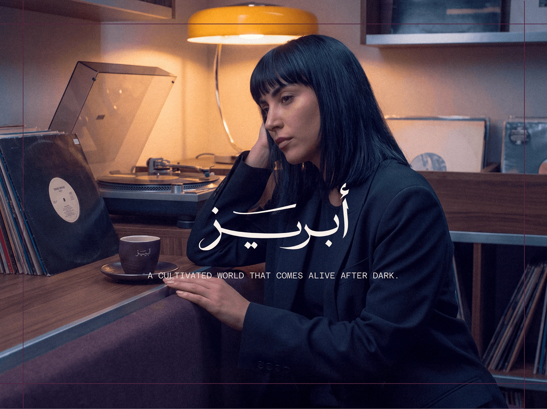
The official ABREEZ campaign introduces coffee, music and a quiet daily ritual.
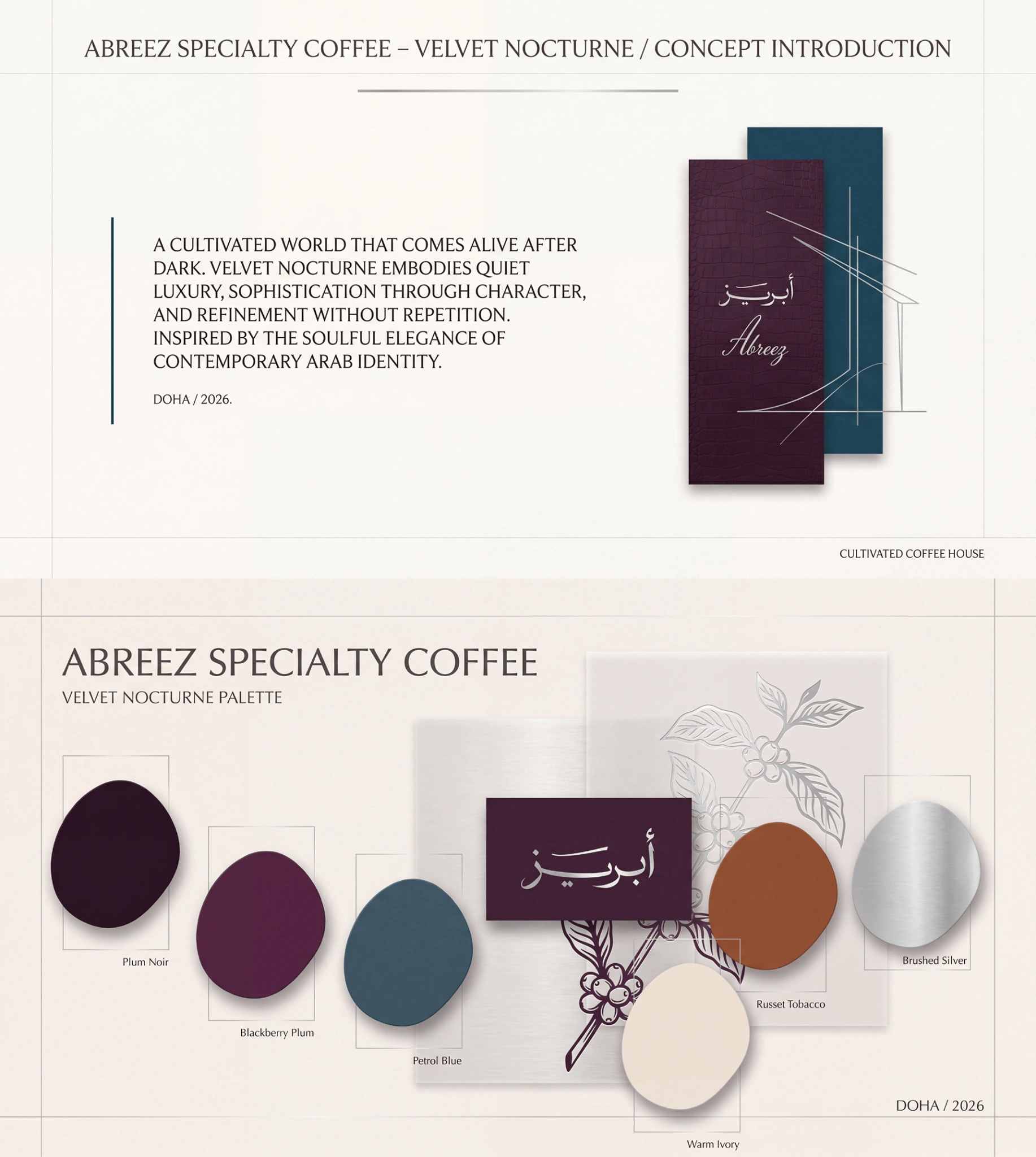
The identity palette and material references establish the Velvet Nocturne direction.
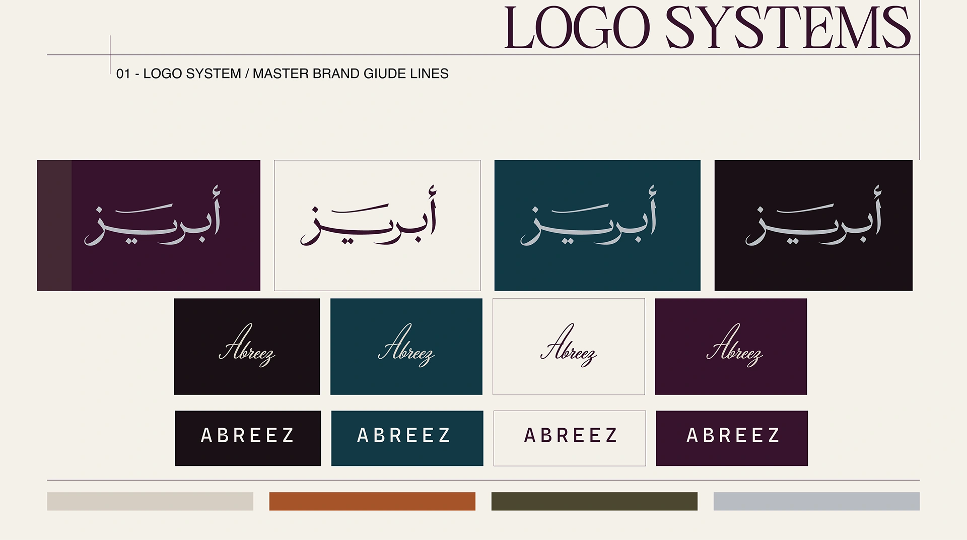
Arabic, script and uppercase wordmarks form the brand’s logo system.
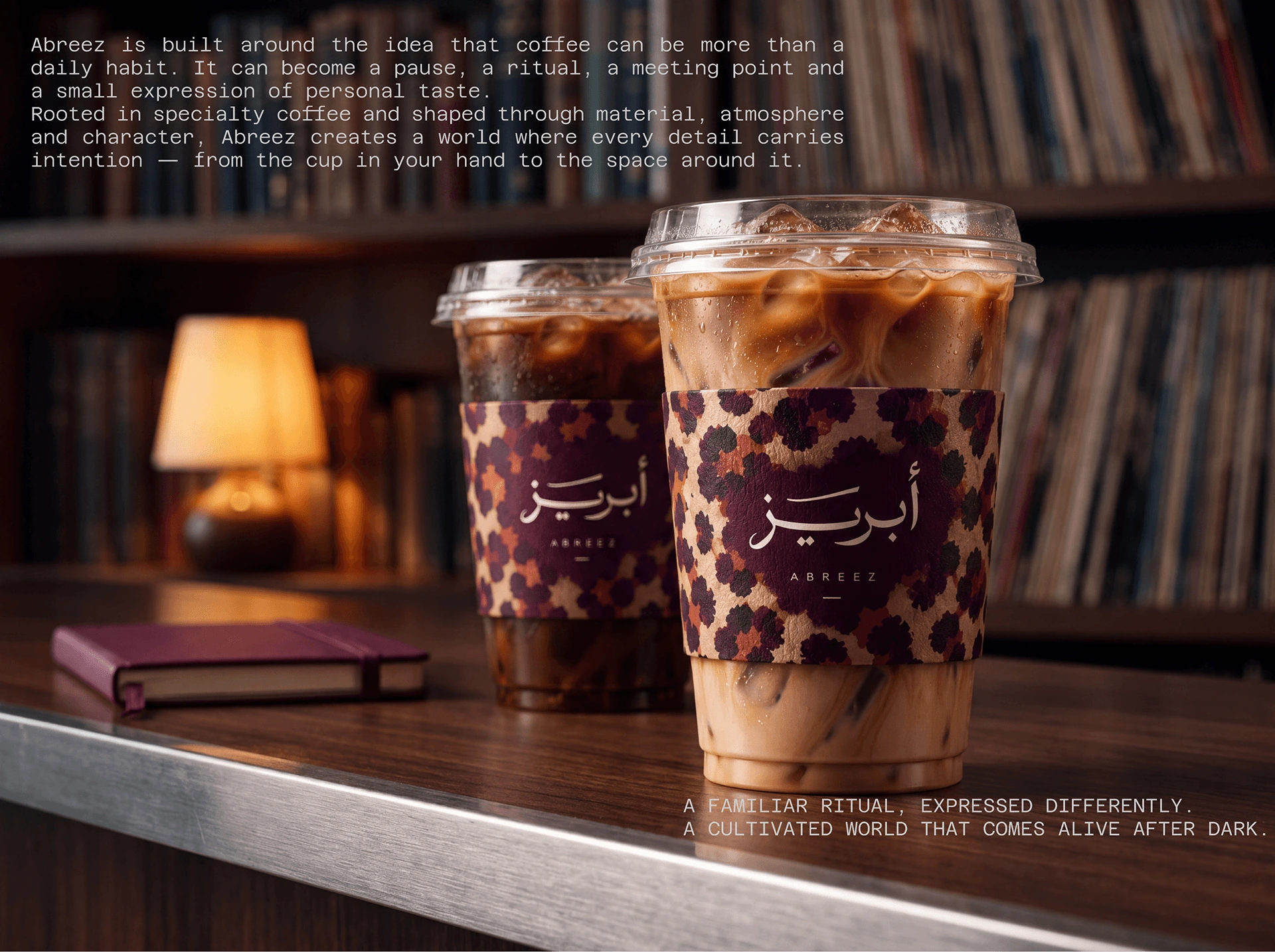
Patterned takeaway cups carry the identity into coffee service.
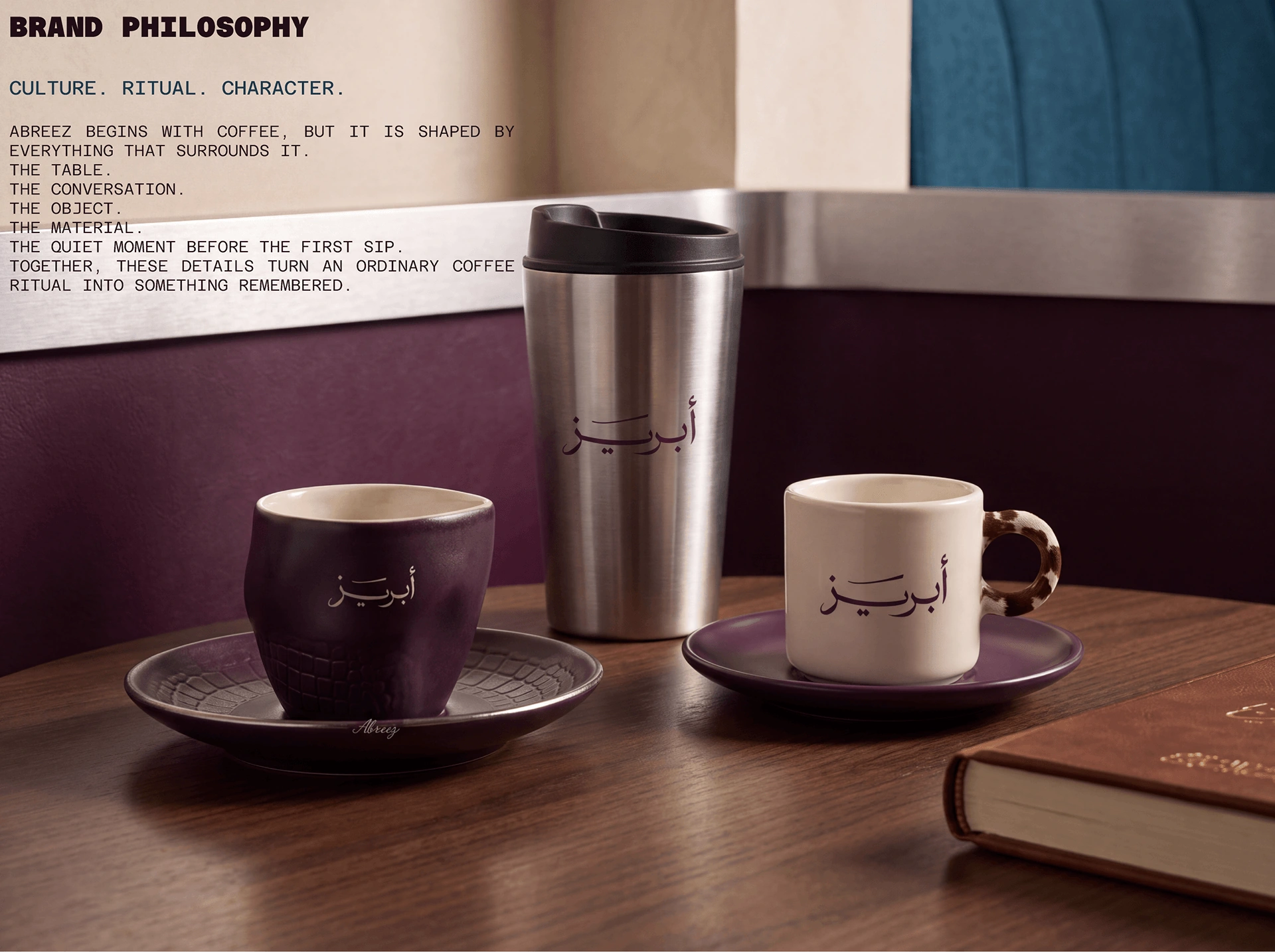
Culture, ritual and character connect the brand philosophy to everyday objects.
What holds
it together.
A project becomes a system when each choice supports the same position—and still works when the format changes.
01POSITION
Cultivated, not conventional
The identity treats luxury as taste, material and confidence—not as an automatic black-and-gold finish.
02SYSTEM
Recognition across forms
Arabic, script and uppercase wordmarks work across plum, petrol and ivory surfaces, connecting the guideline boards to the cups shown in the campaign.
03RITUAL
Coffee inside everyday life
Reading, listening and pausing by a window give the identity a human context. Repeated cups, colours and interior details connect the campaign images.
The system
has to travel.
Identity is tested where people actually meet it: on a shelf, in a hand, across an image, inside a presentation or through a space.
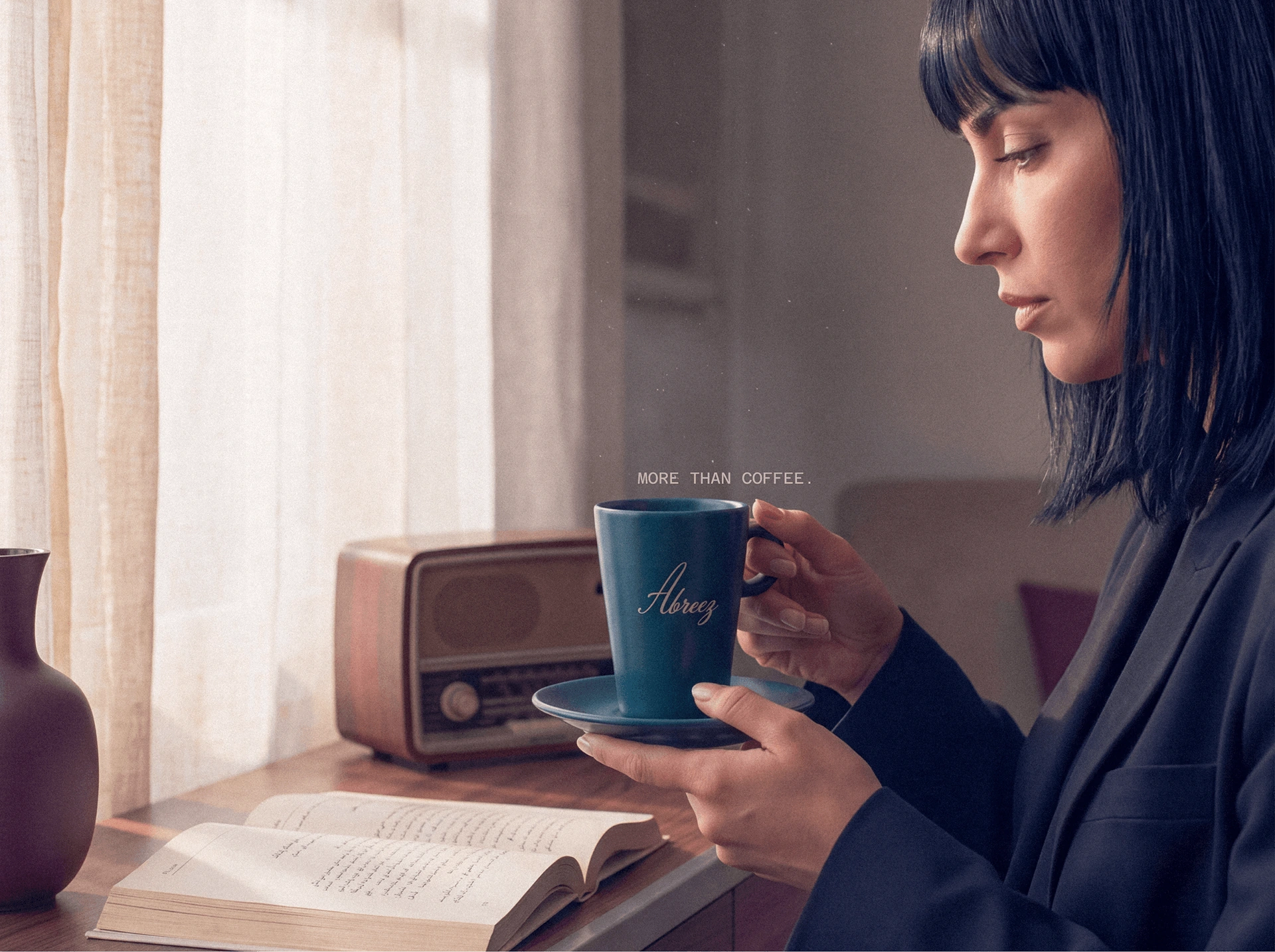
A window-side coffee ritual brings the petrol-blue cup into the campaign world.
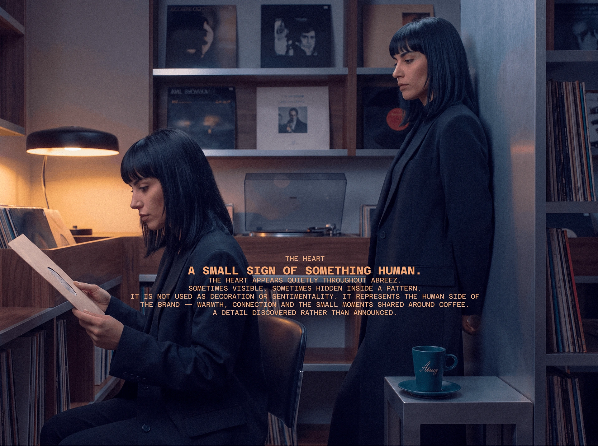
Reading, records and coffee establish the pace of the brand.
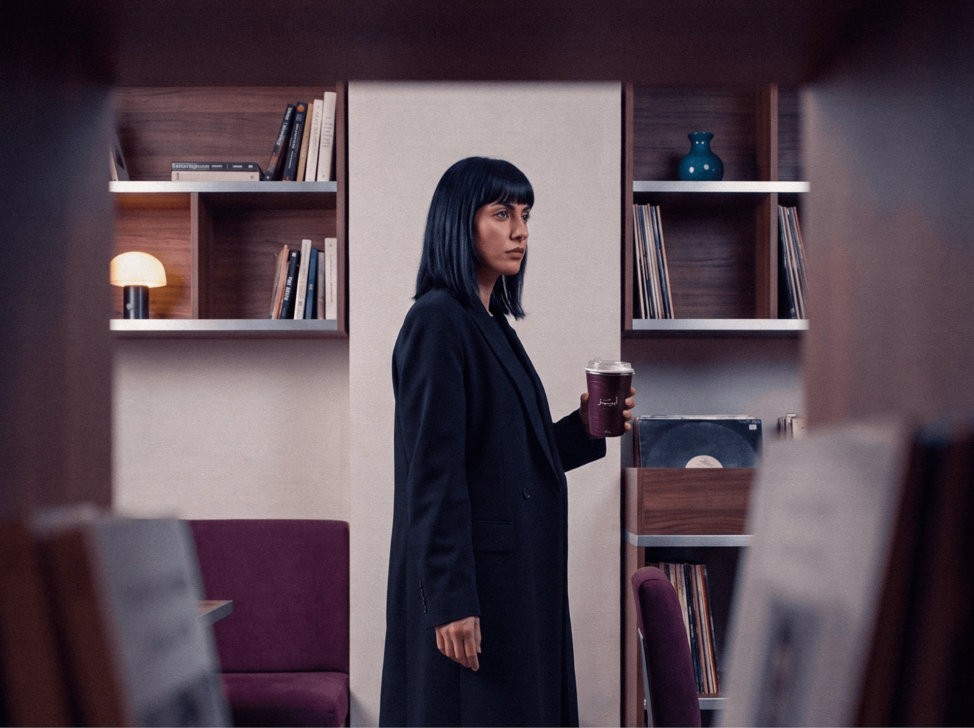
The campaign connects the held cup to the surrounding space.
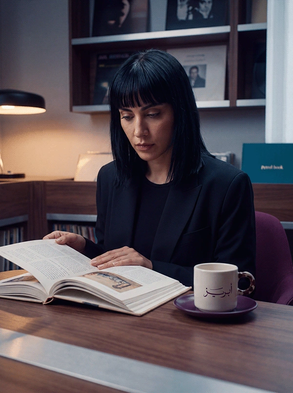
Coffee accompanies a quiet moment with a book.
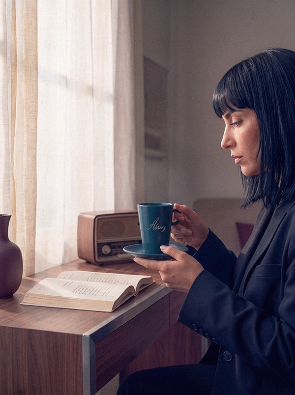
Window light and petrol-blue coffeeware repeat the visual language in portrait format.
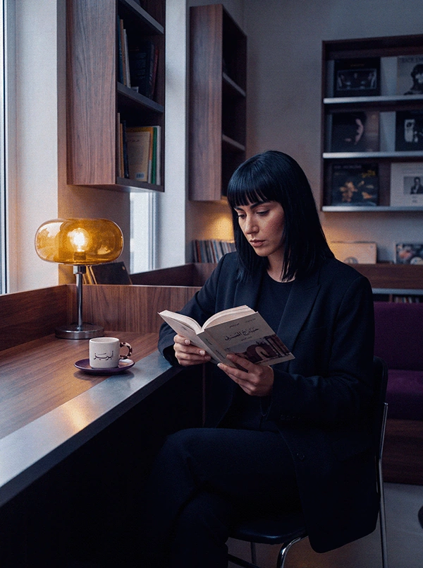
A wider reading moment gives the campaign room to breathe.
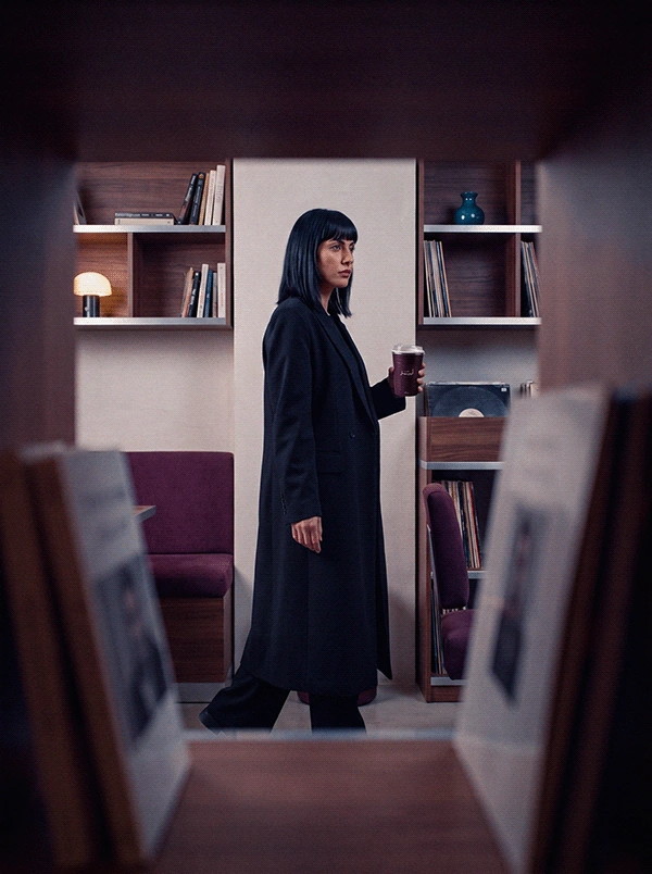
The interior campaign adapts to a vertical composition.
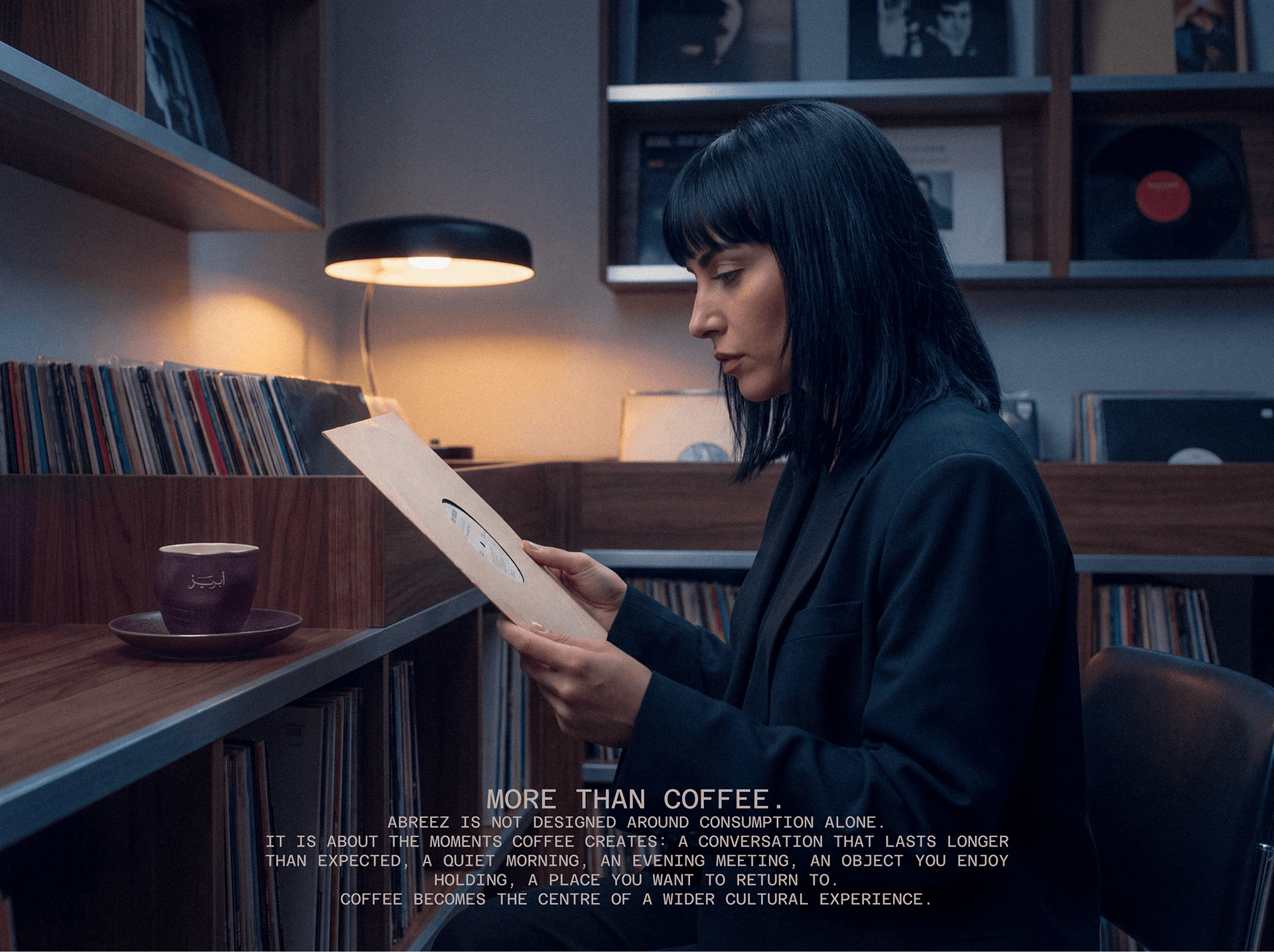
The campaign pairs its brand message with a record-listening ritual.
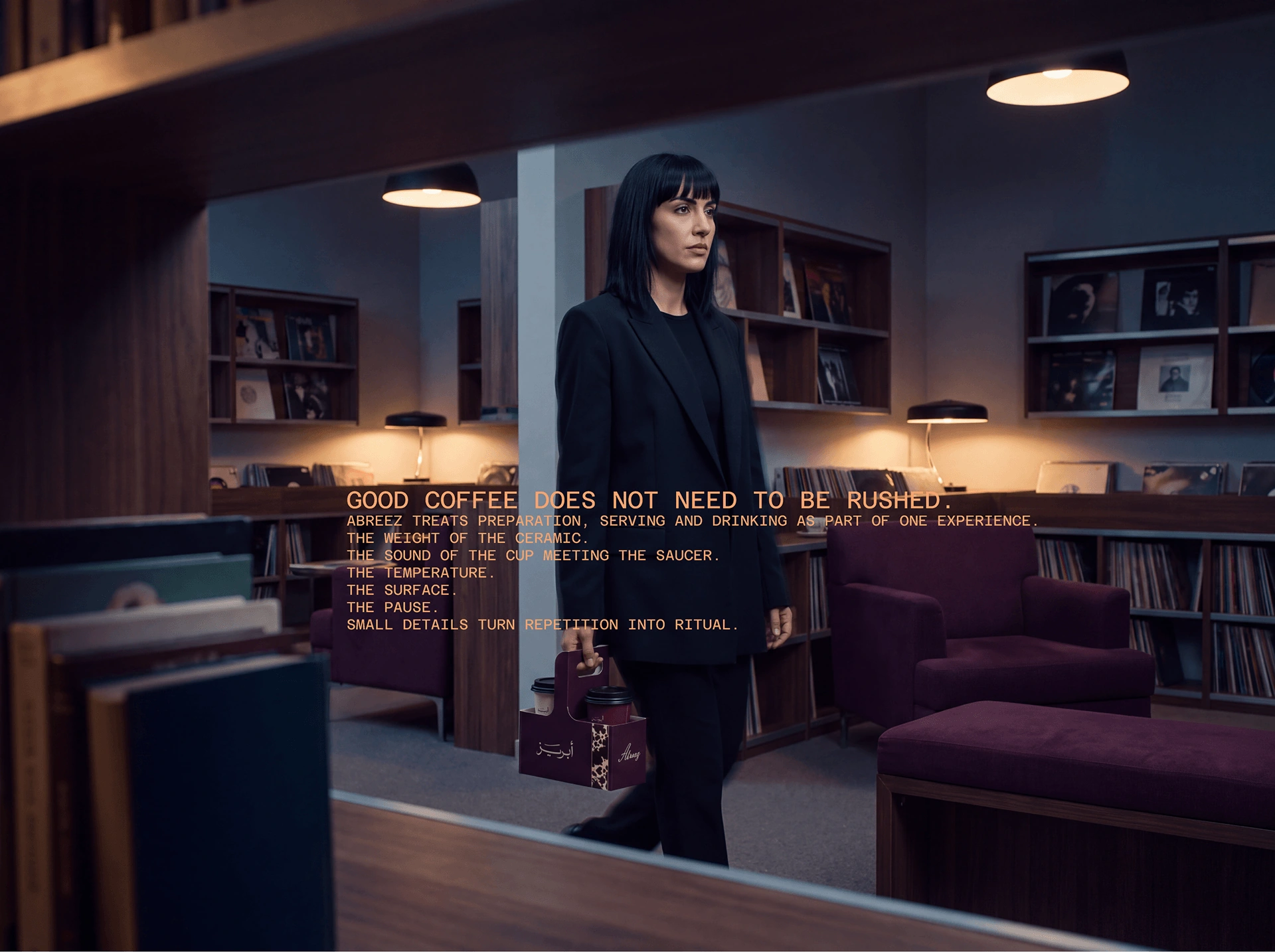
A wider room composition extends the same campaign atmosphere.
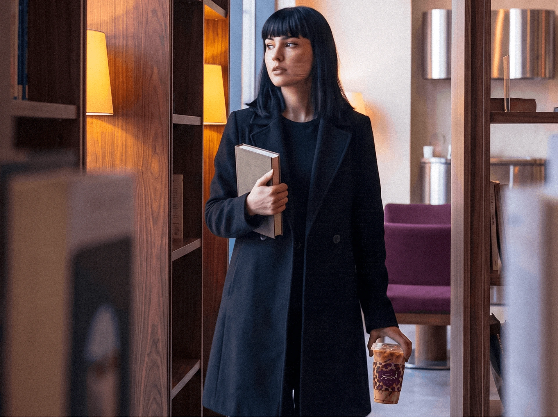
The takeaway cup travels beyond the table into an arrival moment.

Plum tones connect the portrait, seating and coffee ritual.
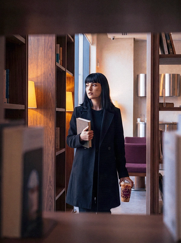
The doorway scene continues in a vertical campaign format.

The campaign closes its human sequence with coffee and reading.
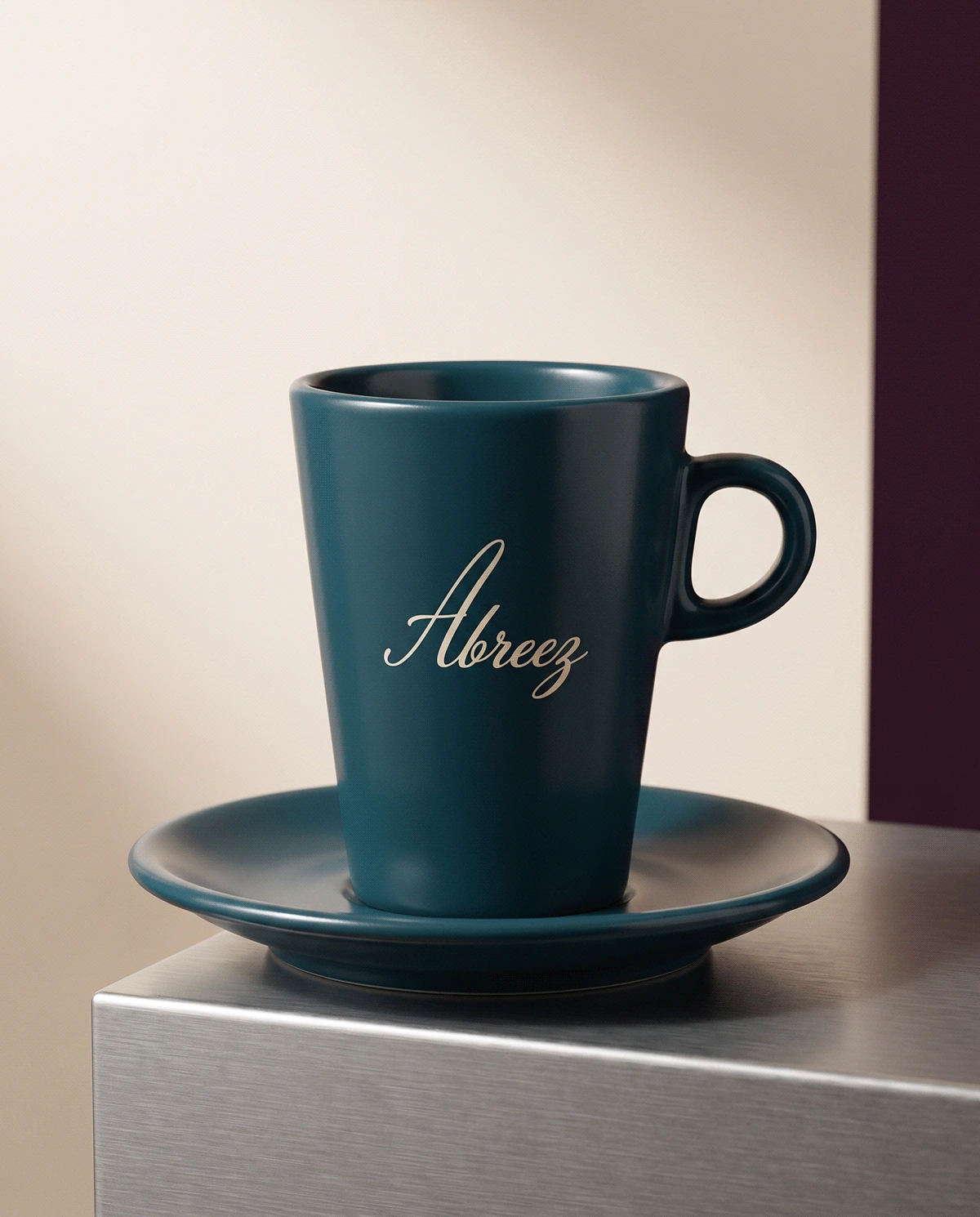
The Latin script mark appears on petrol-blue coffeeware.
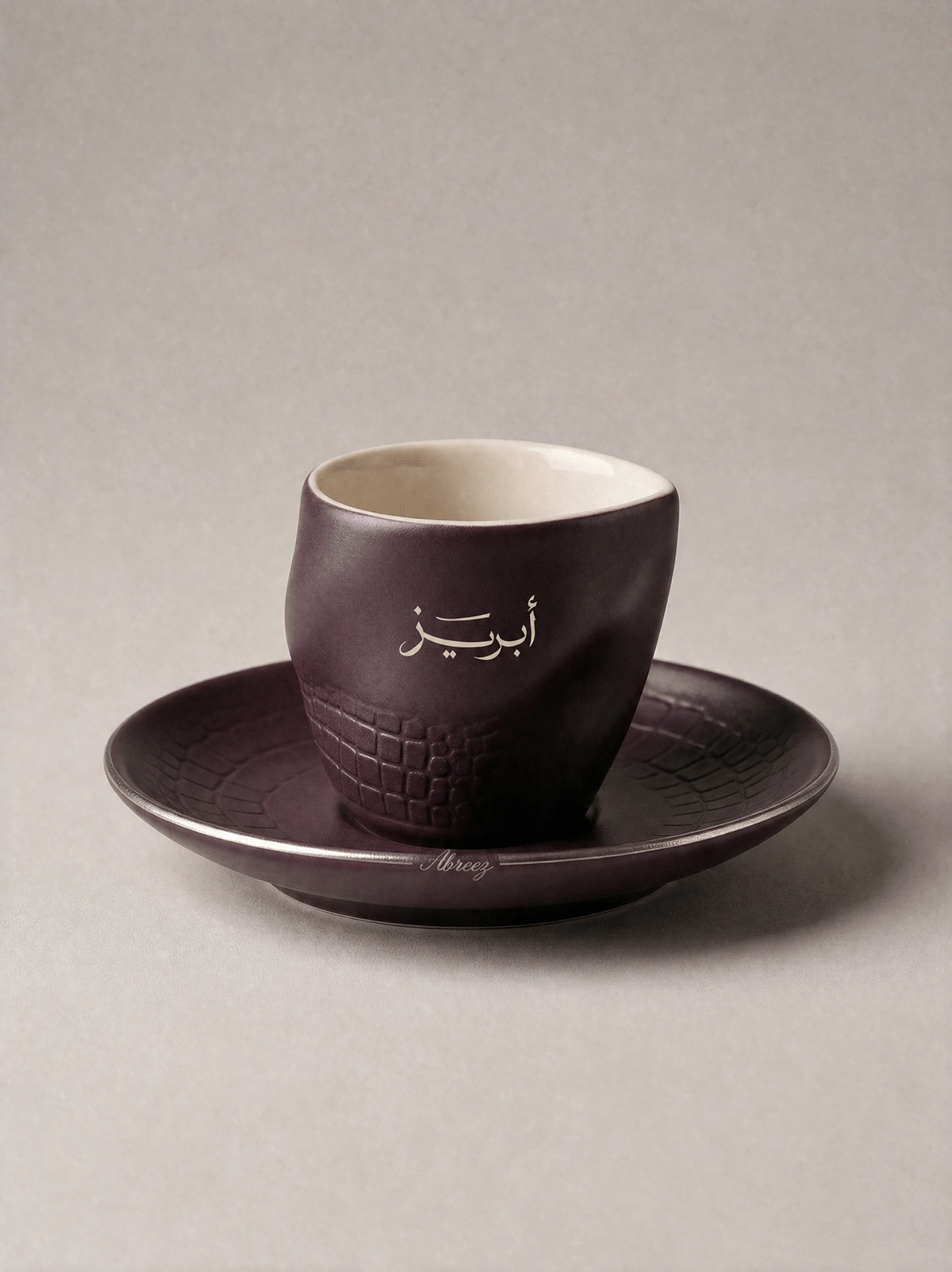
The Arabic mark appears on a plum espresso cup with a warm ivory interior.
01Brand philosophy02Arabic and Latin logo system03Colour and material direction04Takeaway cup design05Coffeeware06Campaign imagery07Opening film
04 / POSITION AFTER THE WORK
A specialty-coffee identity carried consistently through logo variations, colour and material guidelines, takeaway cups, coffeeware, campaign imagery and an opening film.
AUDIENCE
Specialty-coffee customers / design-conscious Doha audience / gifting
GEOGRAPHY
Doha, Qatar
STATUS
Direct client identity / complete visual case
AUTHORSHIP
Direct client identity / independently directed through KAI MULTIVERSE®
The objects people repeat every day gain meaning when tactility, atmosphere and small discoveries turn routine into ritual.
The human lens informs the creative choices; it is not presented as a claim that design can control behaviour.
06 / ROLE
Strategy · Creative direction · Identity · Packaging · Brand world
PROJECT TYPE
Direct client identity
PROJECT CREDIT
View the extended visual case on Behance↗Kheireddine Smaili
Direct client collaboration