A Maven Studio client world spanning restaurant, café, flowers and chocolate, informed by the manners and material confidence of a British house.
CASE 06Brand world / HospitalityClient work / Maven Studio
Monarch
The Art of Gracious Hosting
A British-house-inspired restaurant, café, flower and chocolate world shaped around generosity, ritual and considered hospitality.
- Year
- 2026
- Origin
- Created for a client under Maven Studio
- Role
- Identity · Packaging · Dining applications
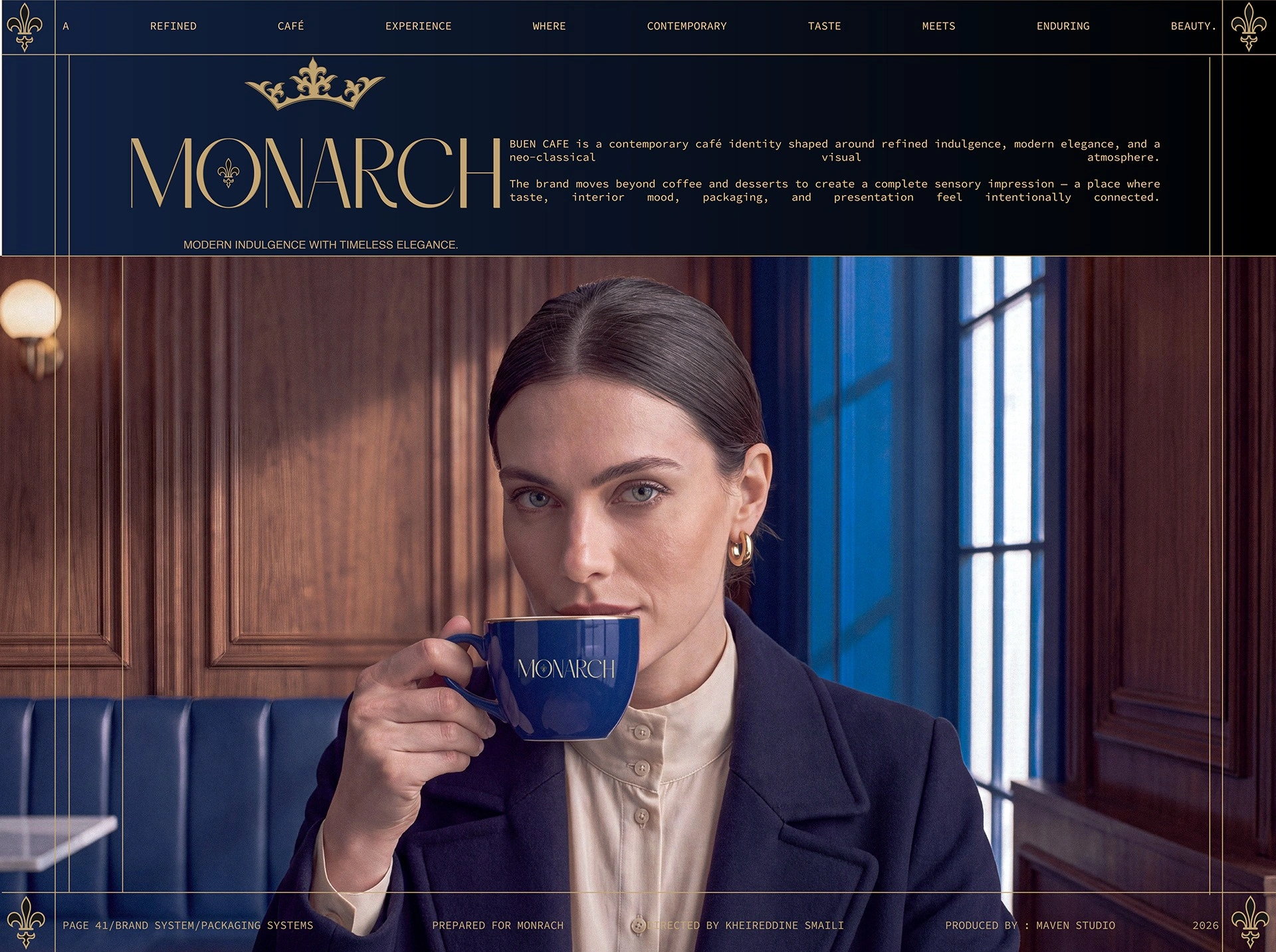
The reason
for the work.
“Luxury becomes human when ceremony stops feeling performed.”
Hold several hospitality offers inside one premium identity without turning the brand into unrelated sub-brands.
Ceremony becomes the shared idea: deep colour, considered packaging and dining applications all express generosity through one house language.
A sequence of decisions, shown through the actual work.
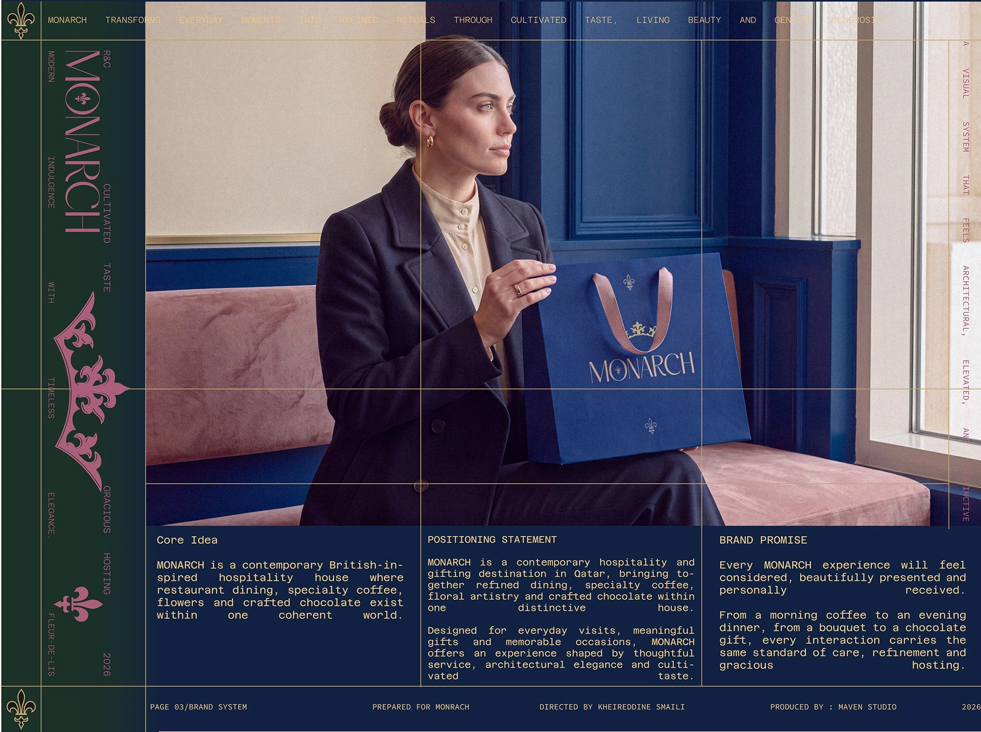
The host is the organising character: attentive, composed and generous.
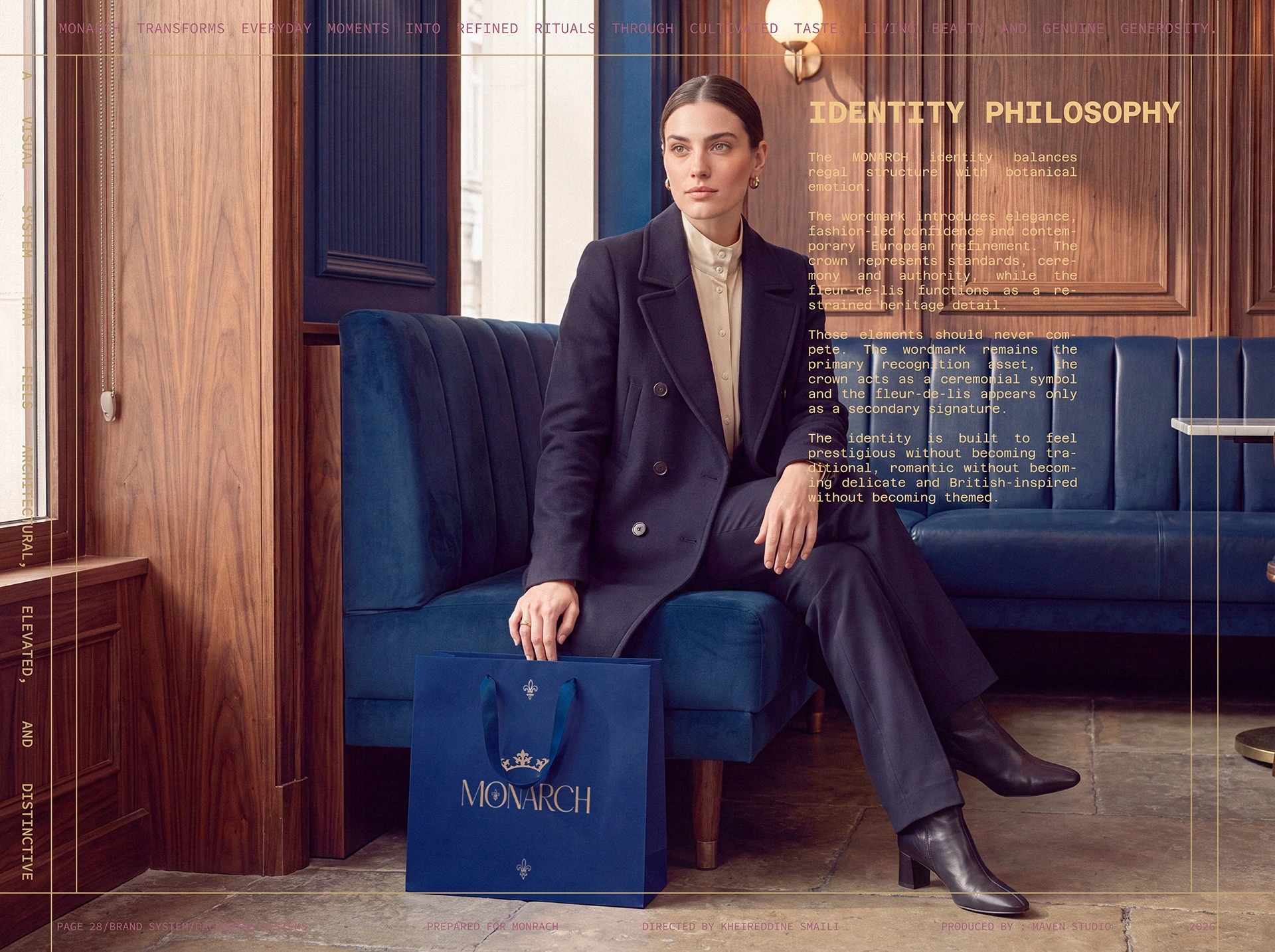
A formal identity gains warmth through human presence, flowers and tactile materials.
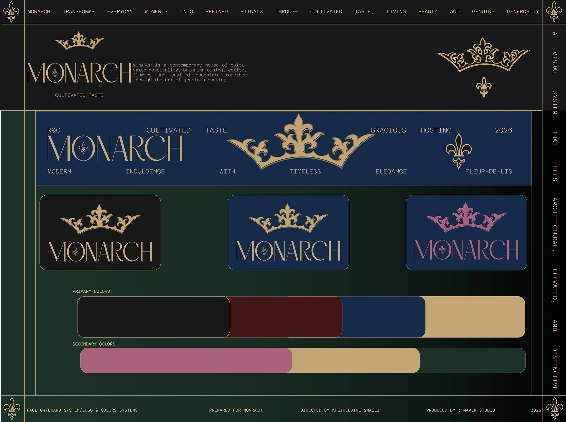
The crown, slender wordmark and fleur-de-lis form a recognisable family of marks.
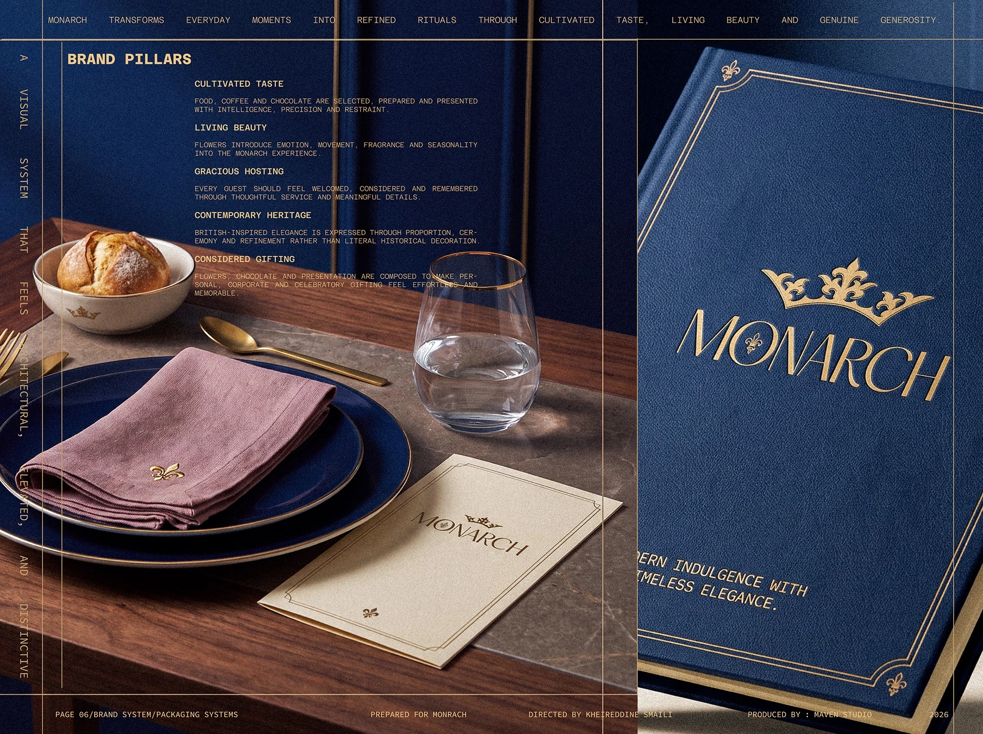
Menu, table setting and material finish connect the brand promise to the service ritual.
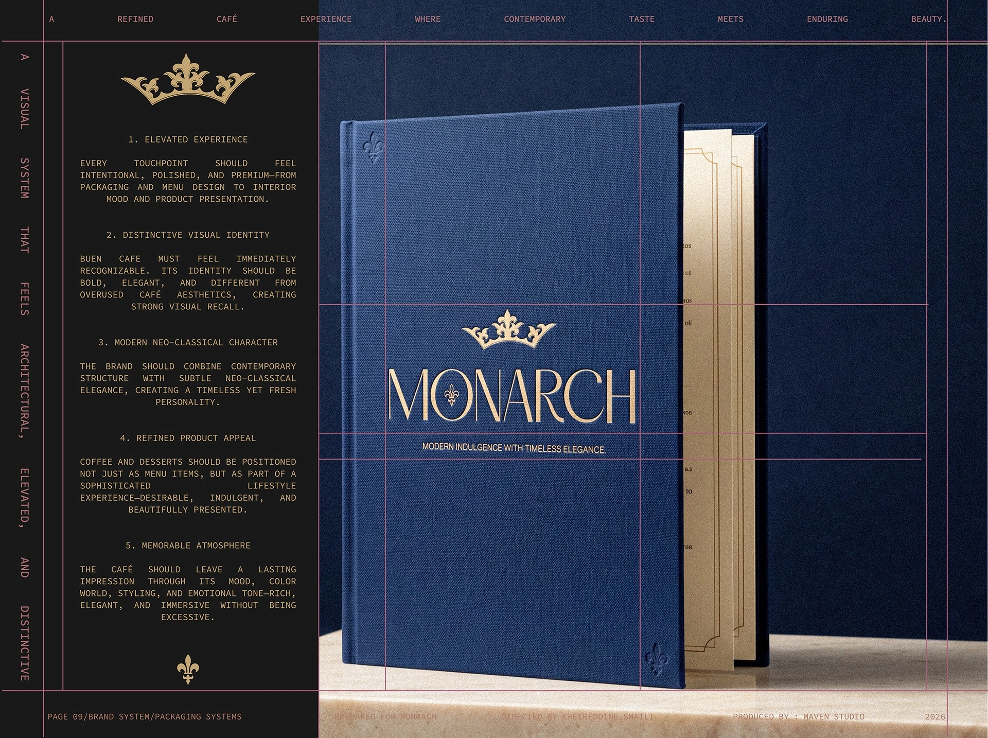
The editorial presentation places the story beside the objects that express it.
What holds
it together.
A project becomes a system when each choice supports the same position—and still works when the format changes.
01HOUSE CODE
Hospitality as ceremony
The identity borrows the composure of a house—not theatrical royalty—to create a more human premium position.
02COLOUR
Depth with warmth
Royal blue provides the formal centre; forest, burgundy, dusty pink and warm metallic accents let dining, flowers and gifting vary within the same family.
03RANGE
One grammar, many rooms
Restaurant, café, flower and chocolate touchpoints shift in emphasis while retaining shared typographic and material rules.
The system
has to travel.
Identity is tested where people actually meet it: on a shelf, in a hand, across an image, inside a presentation or through a space.
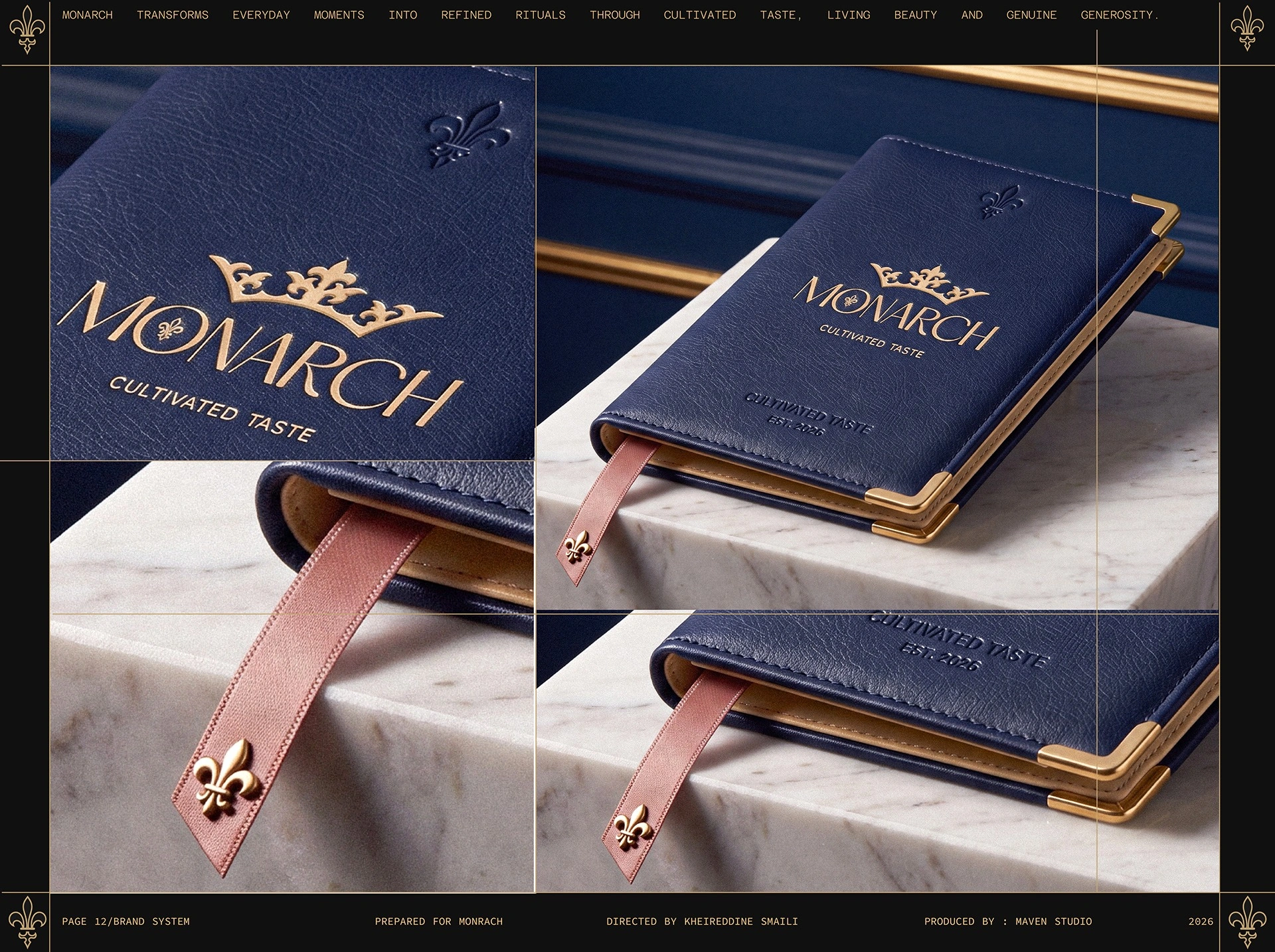
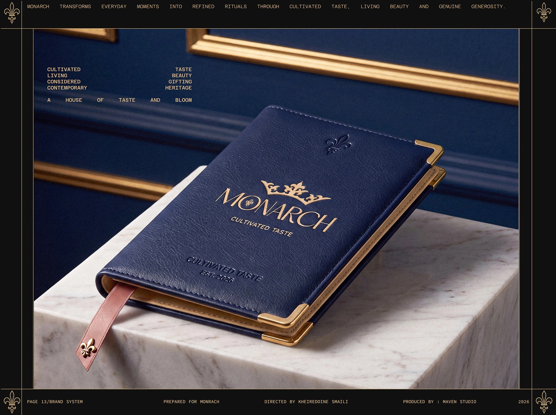
Gold edging, debossing and a ribbon marker give the menu a considered tactile hierarchy.
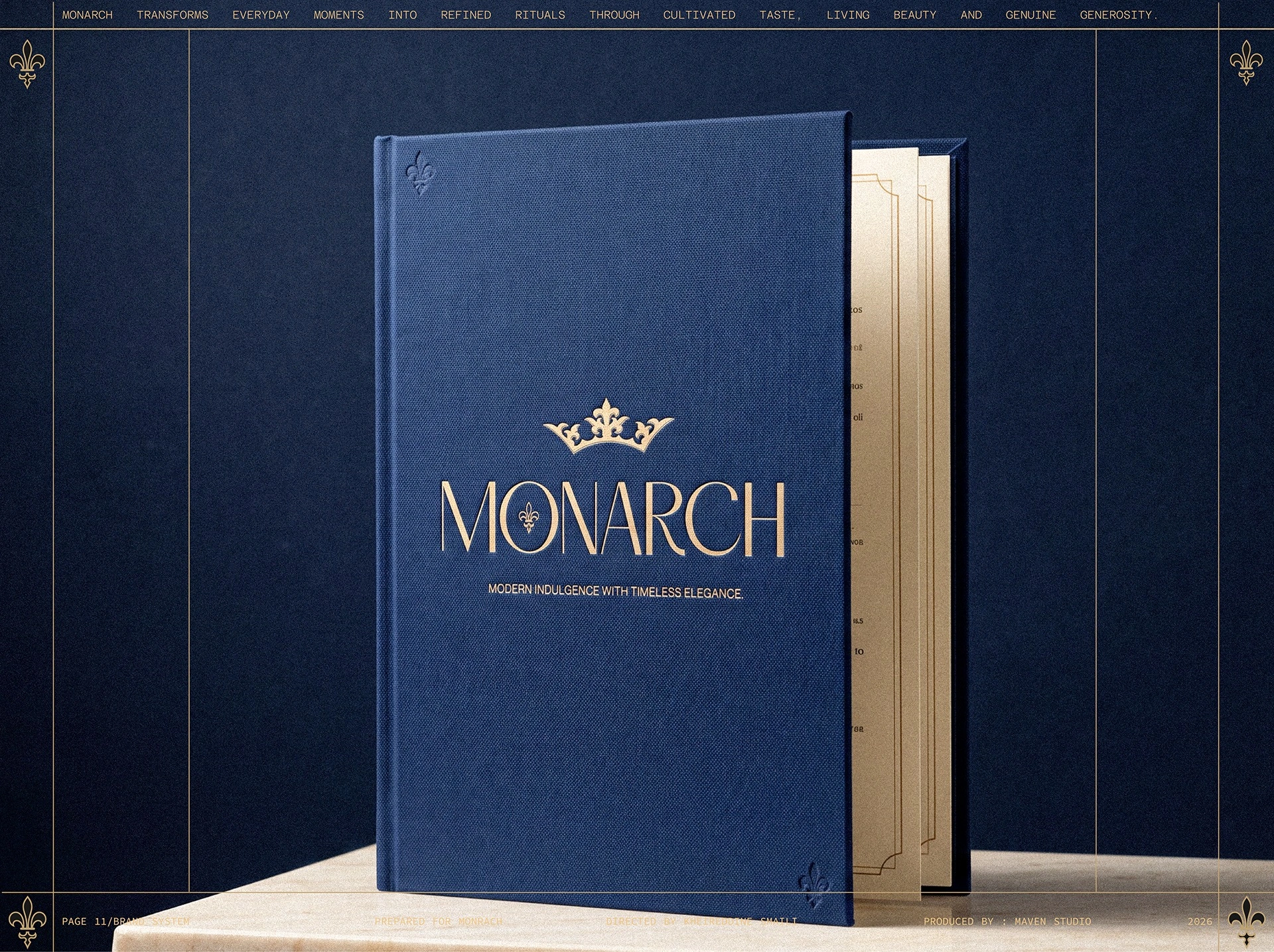
The wordmark is held in generous space on the royal-blue menu cover.
A compact menu retains the same proportions and restrained finishing language.
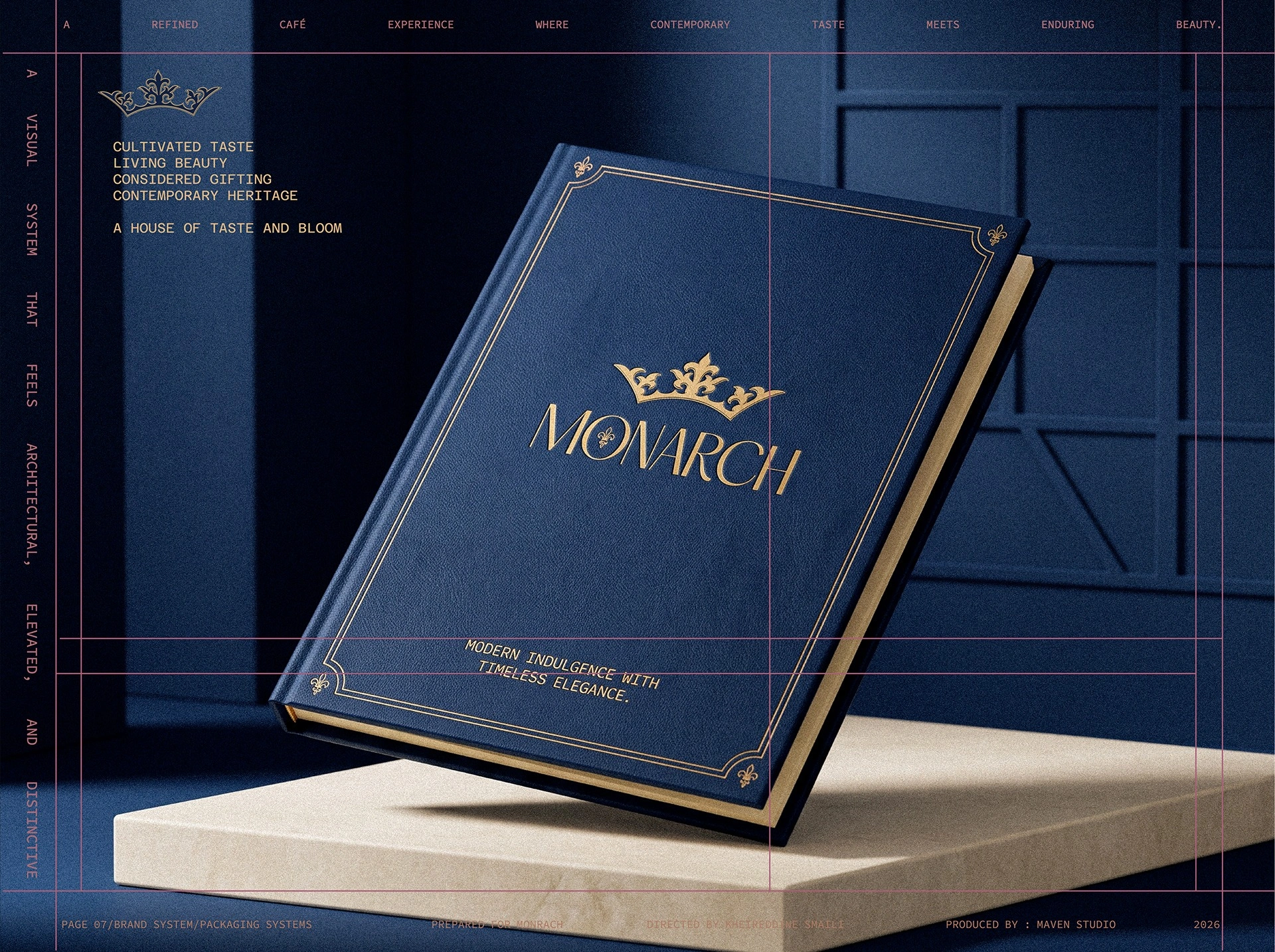
The menu is treated as a guest-facing object, not just a list of products.
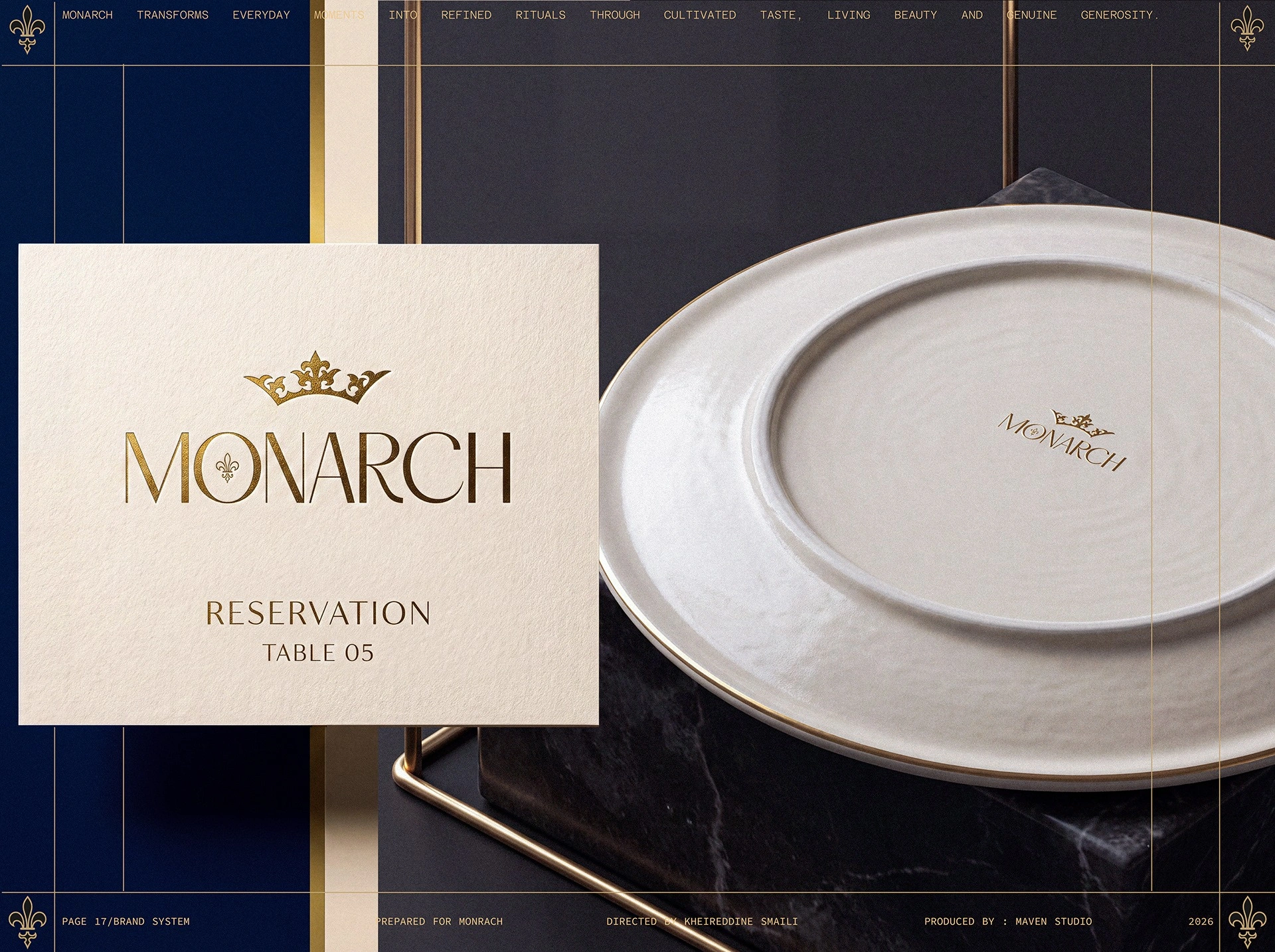
Table cards and ceramics carry the identity into the moment of arrival.
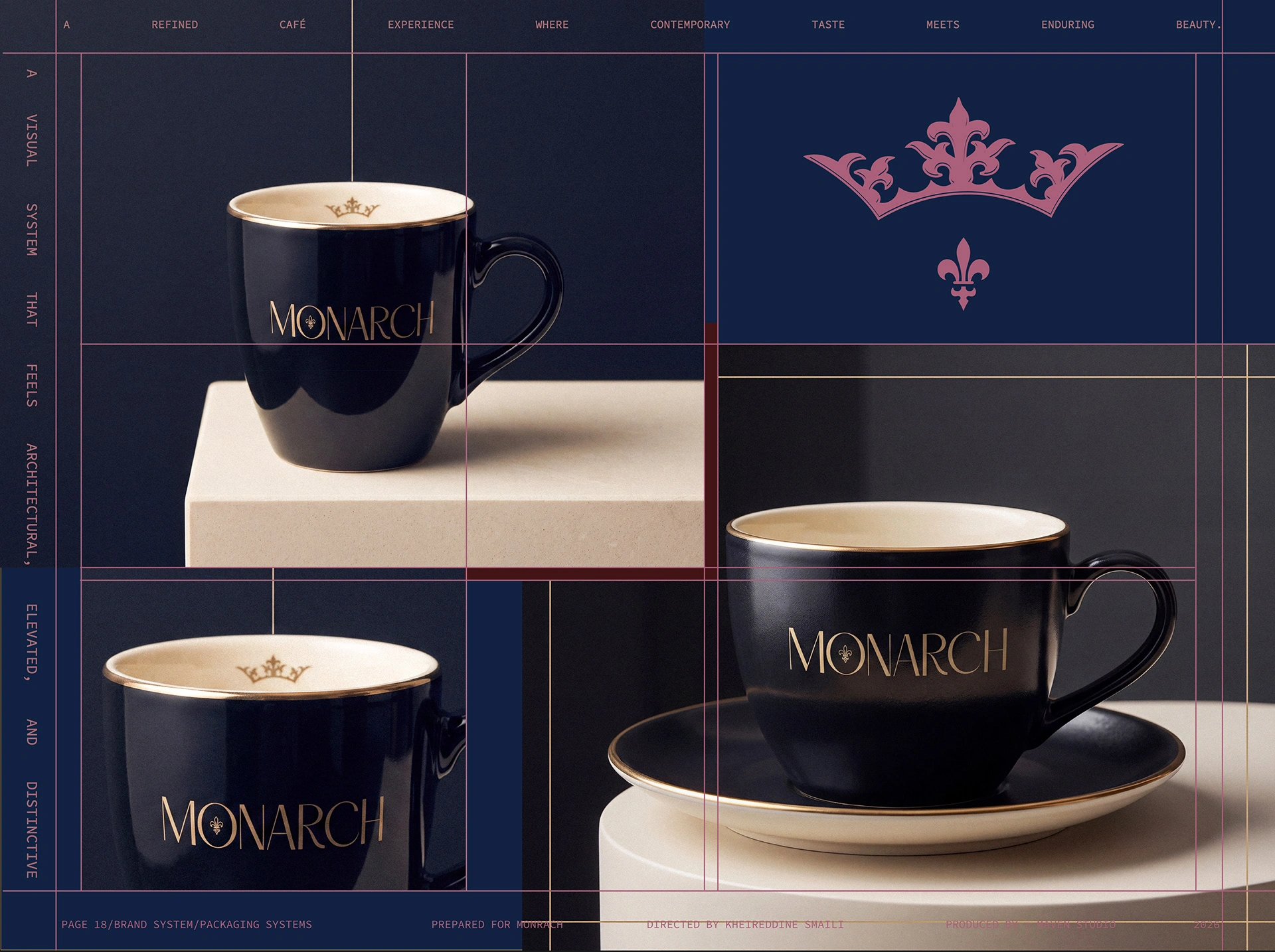
The crown and wordmark adapt to cup and saucer without competing with their shape.
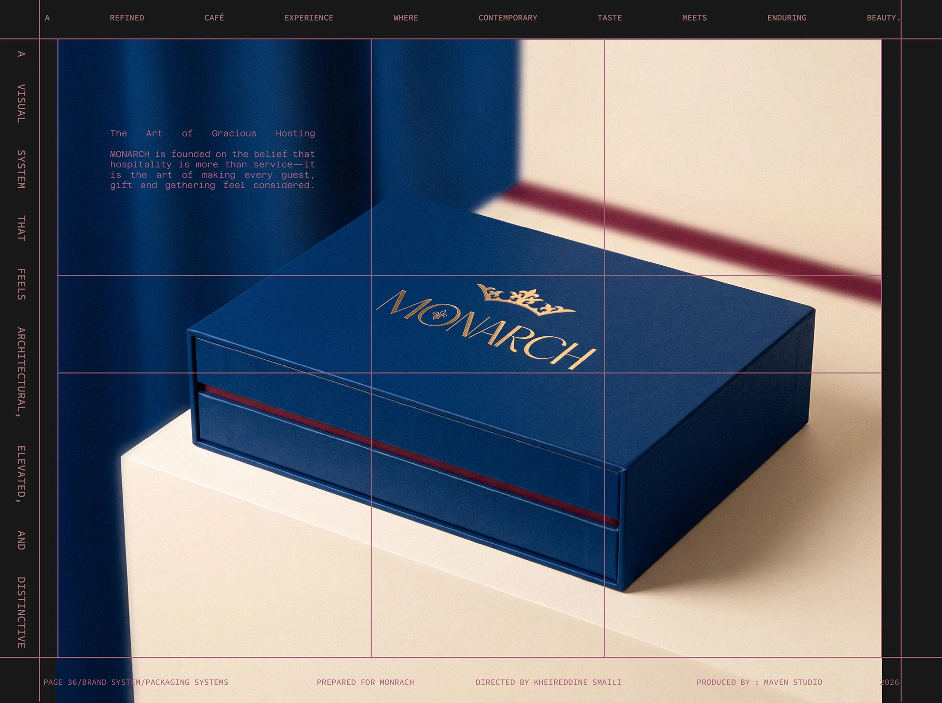
The blue presentation box extends the hosting idea into a gift that leaves the venue.
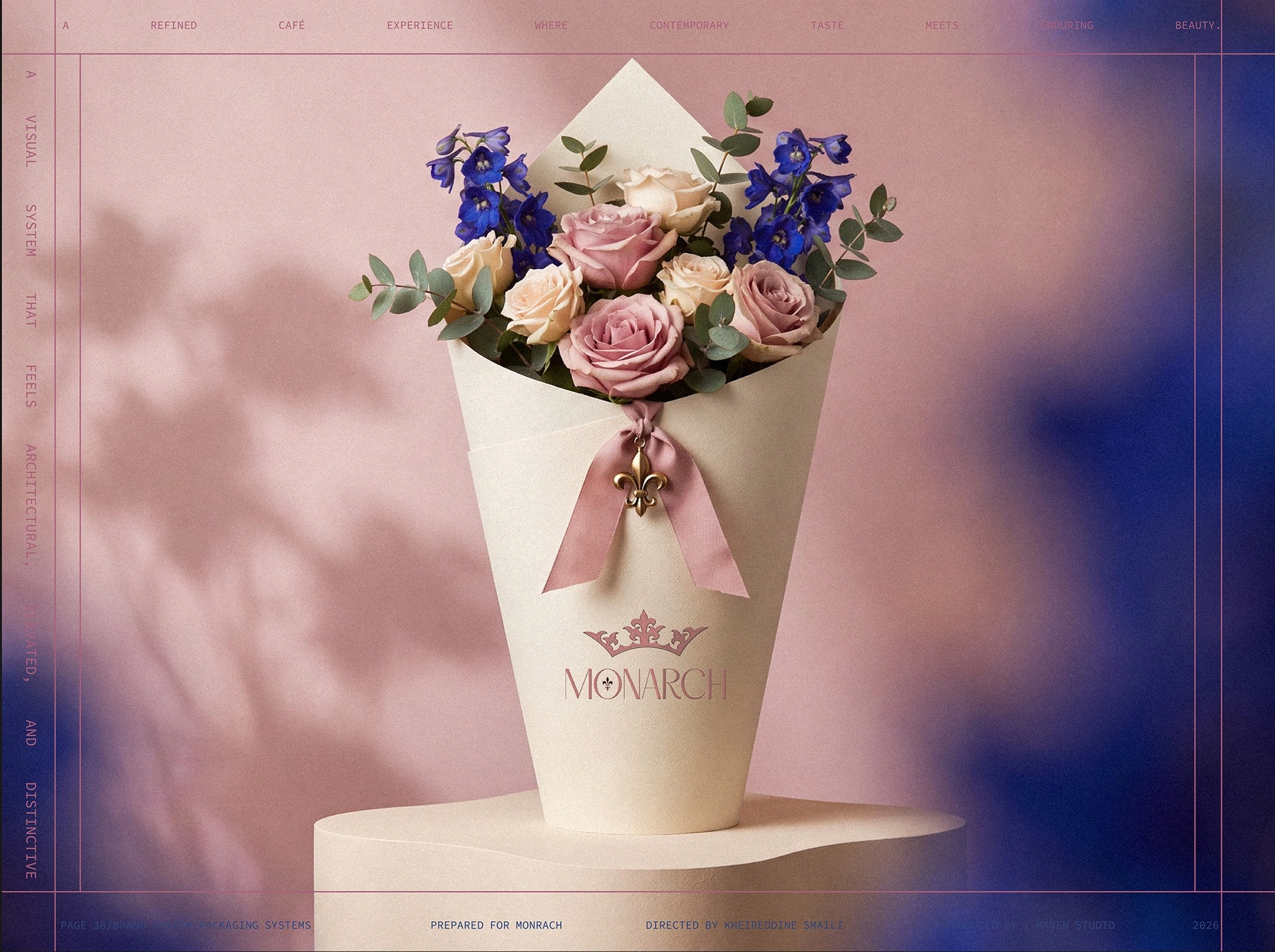
A quiet cream wrap lets the bouquet lead while keeping the signature visible.
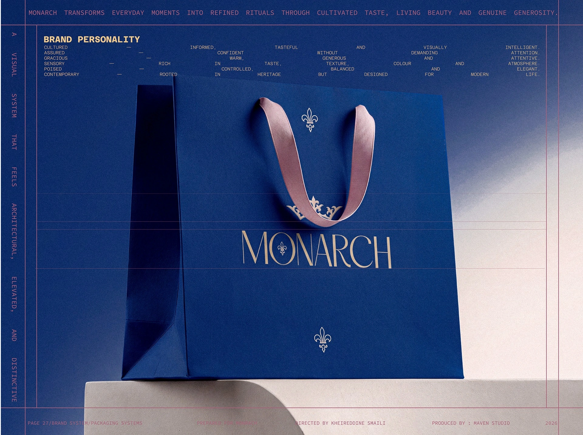
A royal-blue bag and softened pink handles connect the formal and expressive parts of the palette.
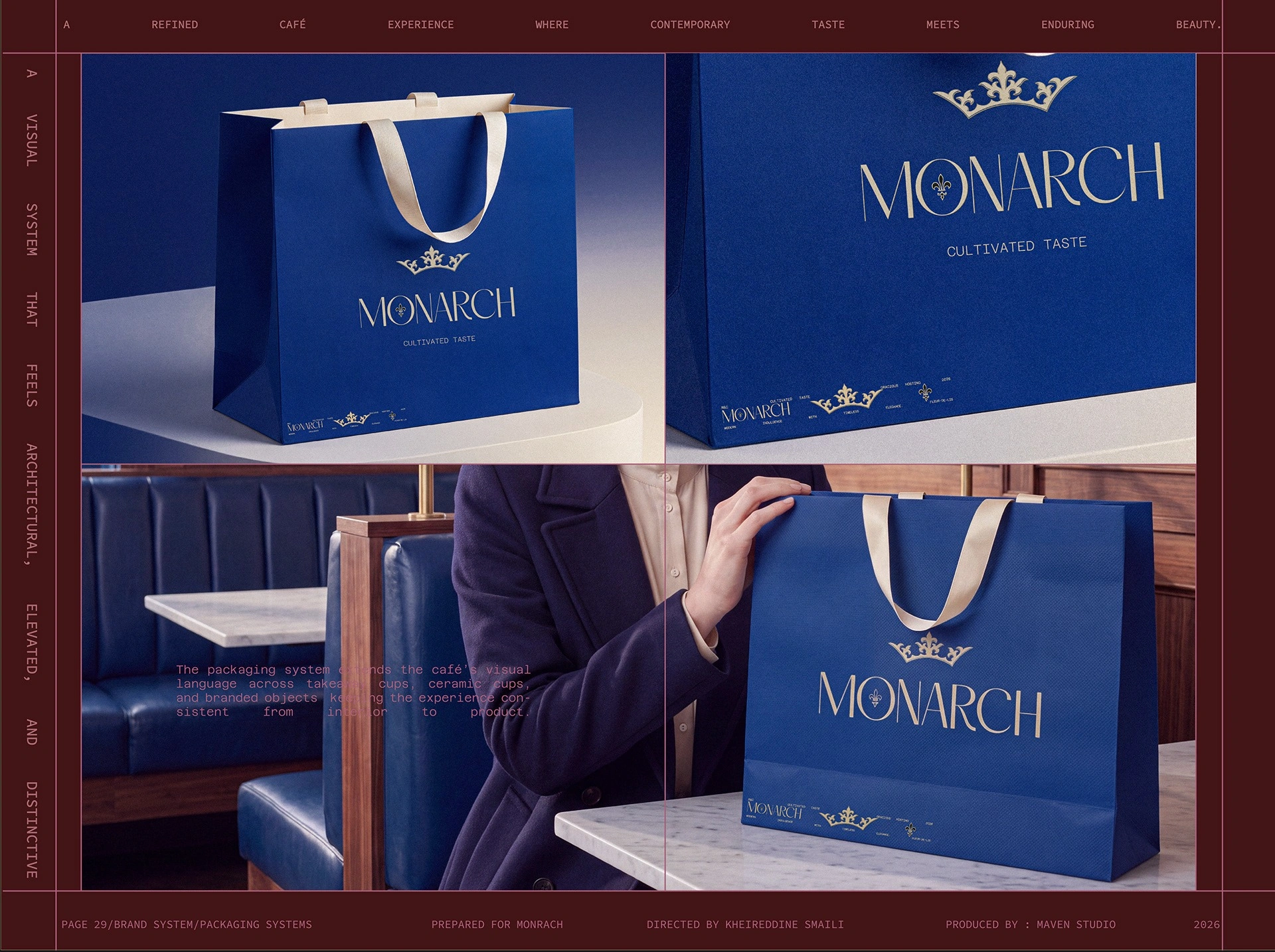
The bag, small box and campaign image show the same codes at different scales.
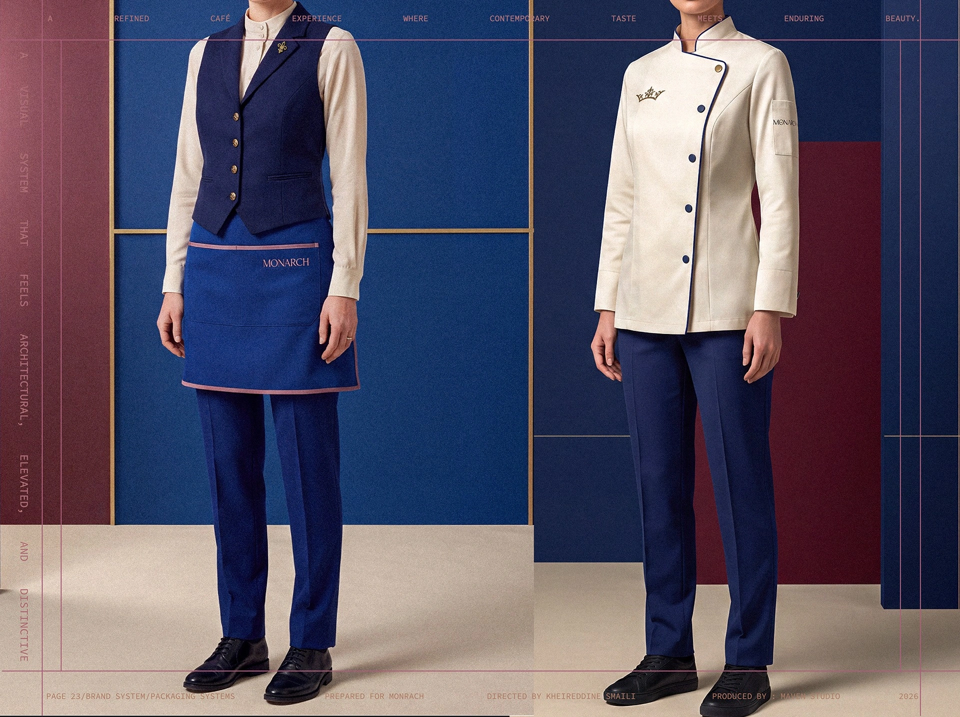
Apron and jacket studies translate the identity into the service team's appearance.
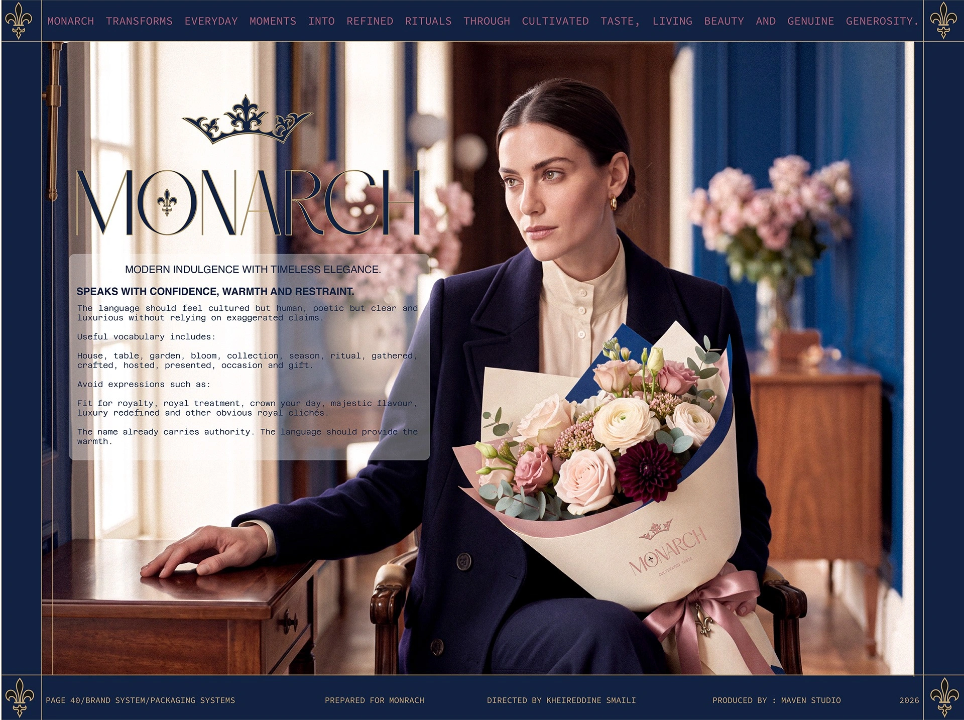
The floral campaign brings the host, bouquet and interior into a single scene.
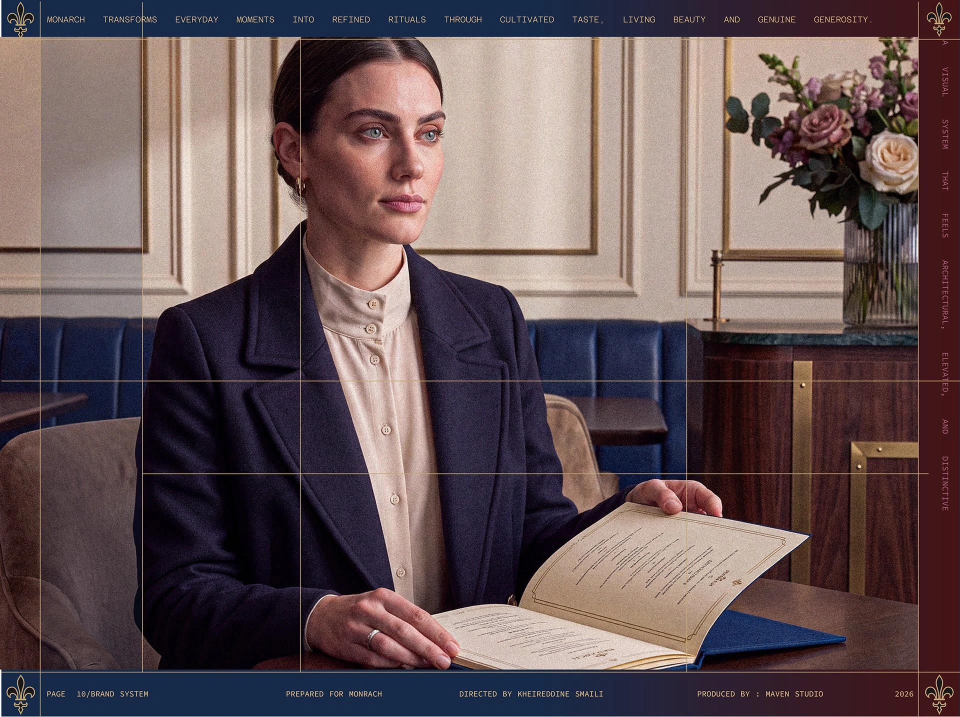
The guest-facing menu becomes part of a composed hospitality portrait.
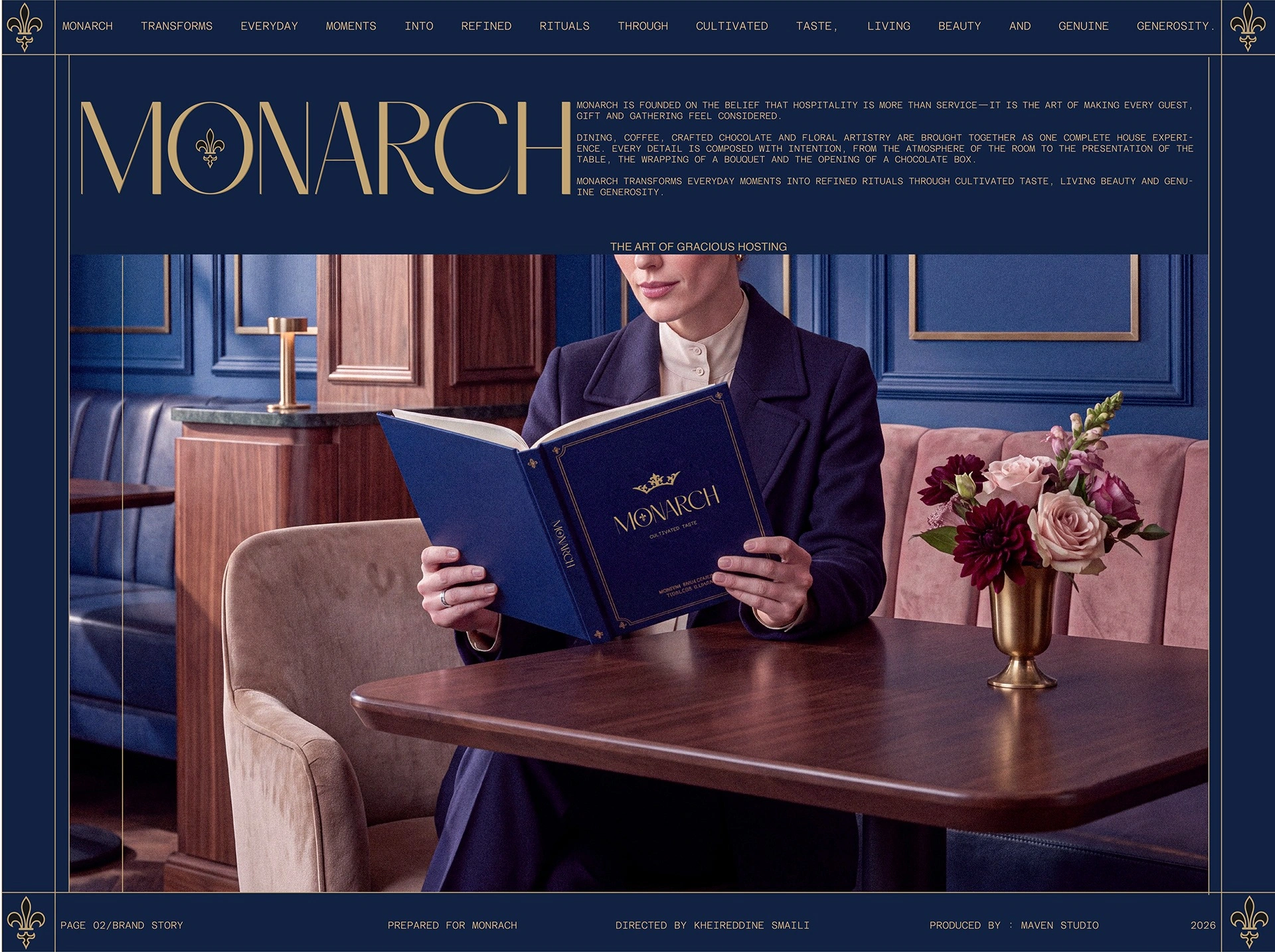
The closing campaign presents the complete world through a recognisable service ritual.
01Brand identity02Restaurant applications03Cup system04Chocolate packaging05Flower packaging06Uniform direction07Editorial presentation
04 / POSITION AFTER THE WORK
One gracious-hosting system able to move from the table to flowers, chocolate and packaged goods without losing its centre.
AUDIENCE
Dining guests / café visitors / gifting customers
GEOGRAPHY
Doha, Qatar
STATUS
Brand-world development / Maven Studio client work
AUTHORSHIP
Created for a client under Maven Studio
Luxury feels generous when the guest experiences care before status.
The human lens informs the creative choices; it is not presented as a claim that design can control behaviour.
06 / ROLE
Identity · Packaging · Dining applications
PROJECT TYPE
Client work / Maven Studio
PROJECT CREDIT
View the extended visual case on Behance↗Maven Studio client work
Kheireddine Smaili / Brand & visual design